Statistic Chart
Introduction
Portal offers an all-new statistic charts widget, designed to empower users with deeper insights into their tasks, cases, overall productivity and more customization capabilities.
How to use
To utilize the Statistic feature on the Dashboard Configuration, follow these steps:
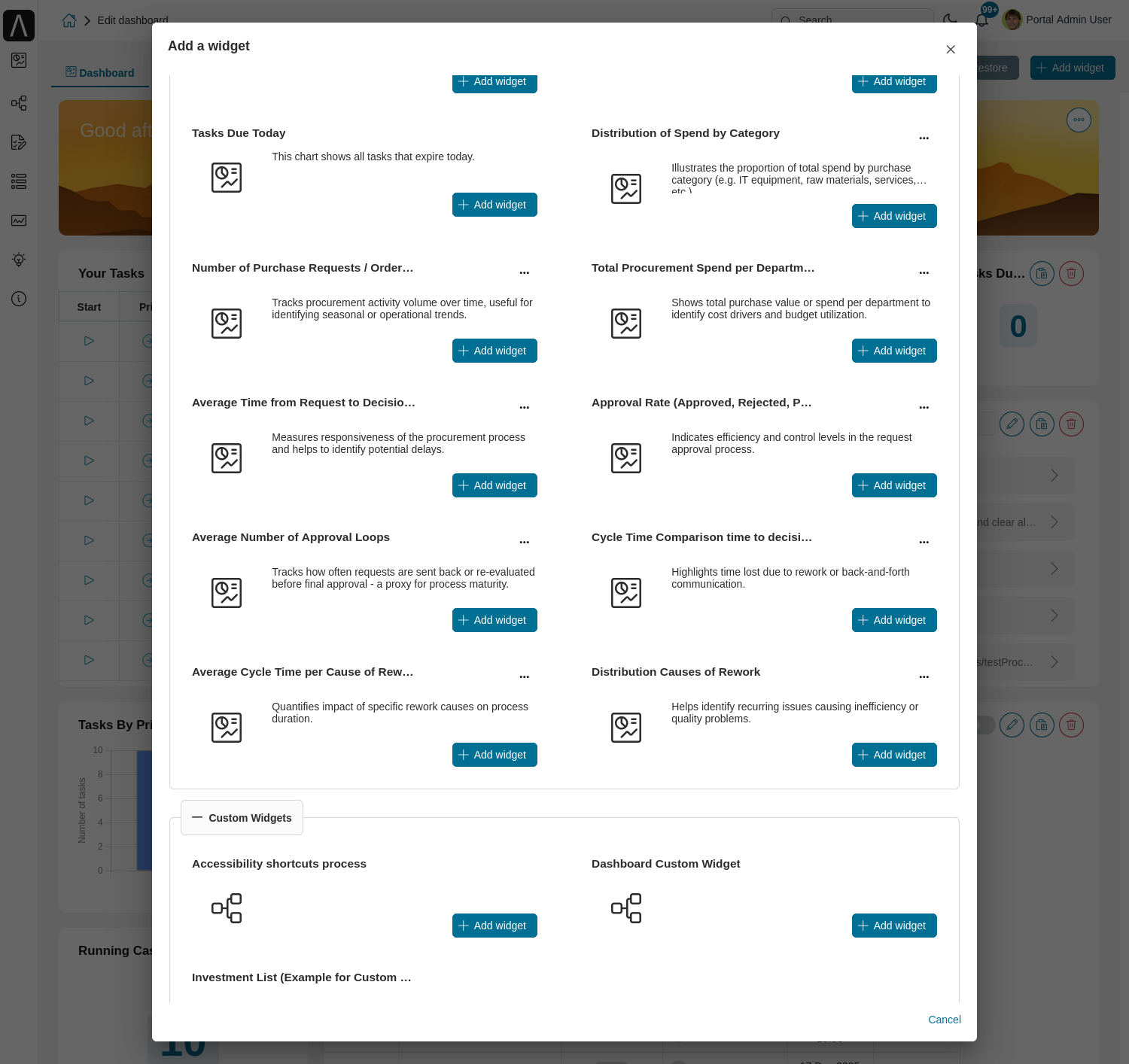
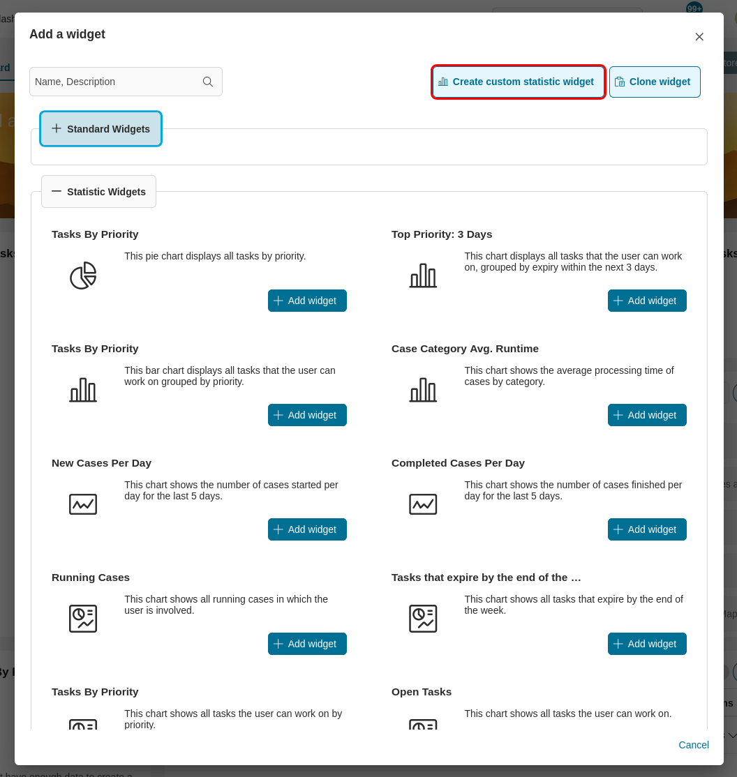
Navigate to Dashboard Configuration of the dashboard where you want to add the widget and select Add Widget for predefined Standard Charts or Create custom statistic widget for configuring new statistic chart.
From the dropdown menu labeled Statistic Widgets, choose from a variety of insightful charts.
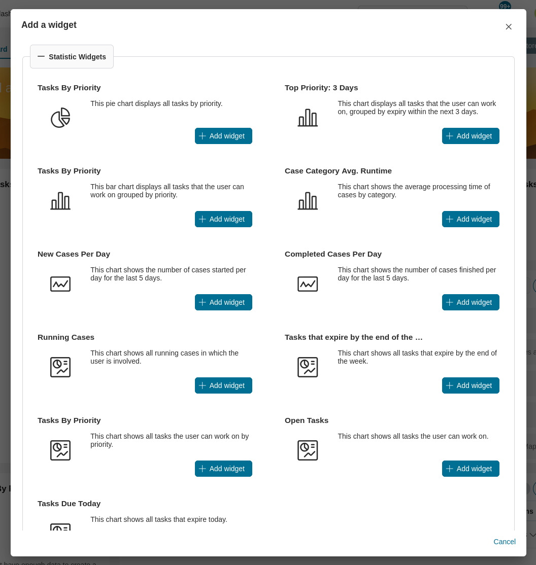
Available Standard Charts
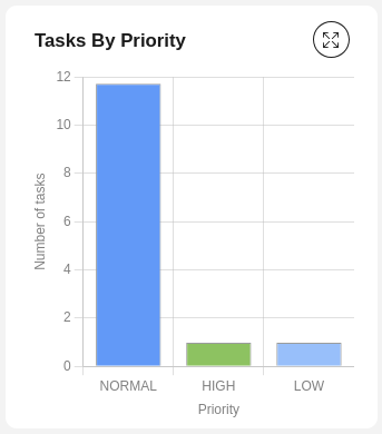
Tasks By Priority
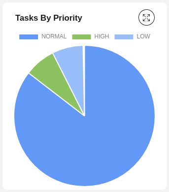
This pie chart displays all tasks by priority.
Chart type: Pie
Top Priority: 3 Days
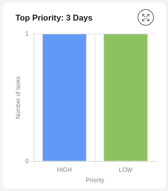
This chart displays all tasks that the user can work on, grouped by expiry within the next 3 days.
Chart type: Bar
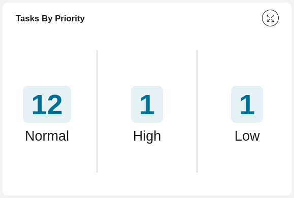
Tasks By Priority
This bar chart displays all tasks that the user can work on grouped by priority.
Chart type: Bar
Case Category Avg. Runtime
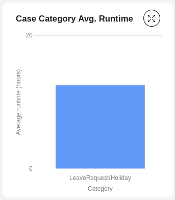
This chart shows the average processing time of cases by category.
Chart type: Bar
New Cases Per Day
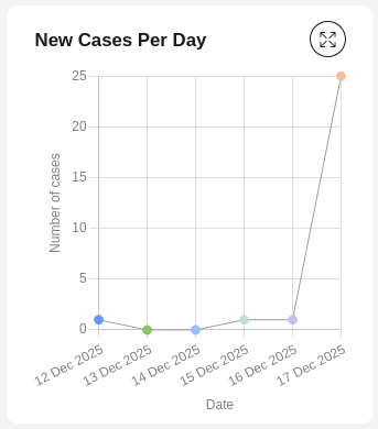
This chart shows the number of cases started per day for the last 5 days.
Chart type: Line
Completed Cases Per Day
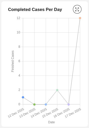
This chart shows the number of cases finished per day for the last 5 days.
Chart type: Line
Running Cases
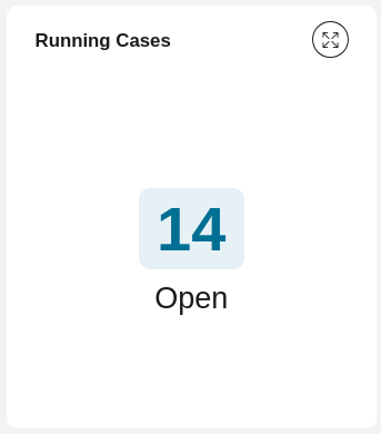
This chart shows all running cases in which the user is involved.
Chart type: Number
Tasks that expire by the end of the week
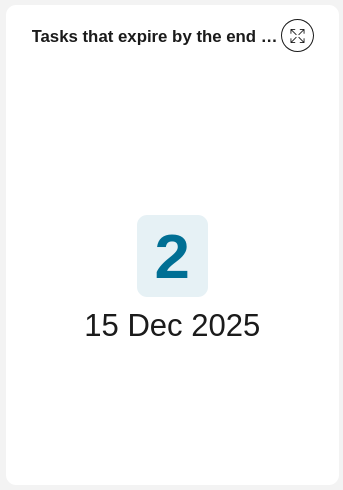
This chart shows all tasks that expire by the end of the week.
Chart type: Number
Tasks By Priority
This chart shows all tasks the user can work on by priority.
Chart type: Number
Open Tasks
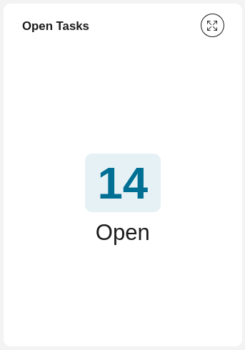
This chart shows all tasks the user can work on.
Chart type: Number
Tasks Due Today
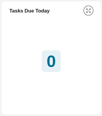
This chart shows all tasks that are due today.
Chart type: Number
How to configure new statistic chart
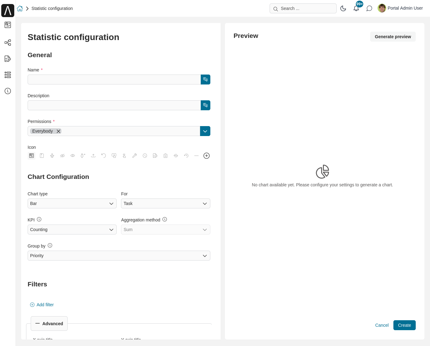
Navigate to Dashboard Configuration of the dashboard and select Create custom statistic widget.
From the configuration for statistic chart, fill in the form to create new statistic chart.
Advanced Configuration
The advanced configuration options allow you to customize your statistic charts with enhanced features for better data visualization and user interaction.
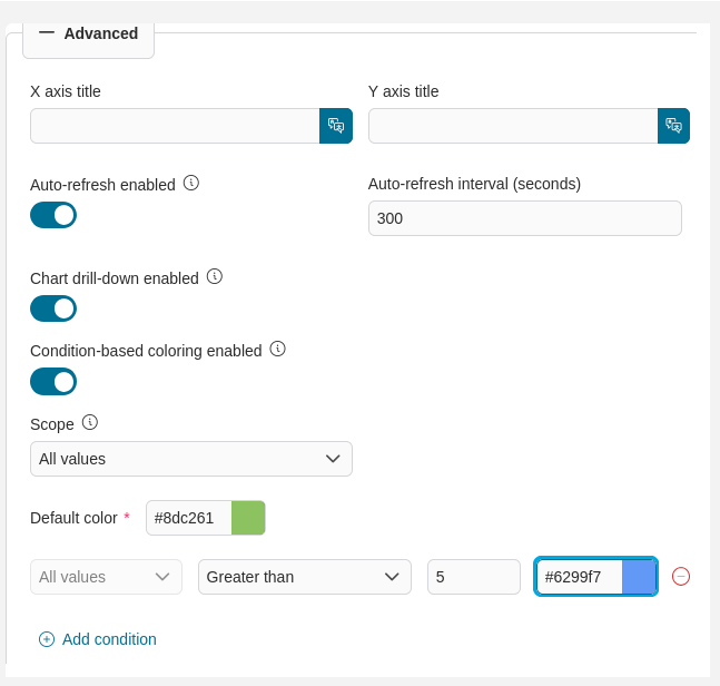
Chart Drill-down Enabled
Enable drill-down functionality for interactive data exploration. Users can click chart elements to view detailed lists of the underlying tasks or cases.
Chart drill-down enabled: When activated, users can click on chart elements to navigate to a detailed view of the underlying data.
All chart types support the drill-down feature.
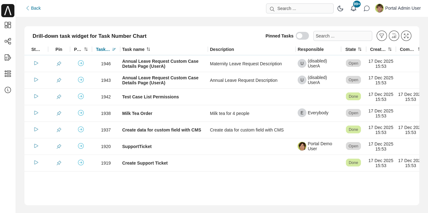
When users click a chart element, the Portal navigates to the drill-down dashboard containing a widget that shows the detailed list filtered by the selected value. Features that the user can use on the widget are the same as those on a standard widget, including sorting, complex filtering, quick search, etc.
There is a back button on the top left corner to return to the main dashboard. When going back, all configured filters, quick search inputs and sorts on the detailed list widget are reset.
Important
Users must have the necessary permissions TaskReadAll for task and CaseReadAll for case to view the detailed data when using the drill-down feature.
Condition-based Coloring Enabled
Apply dynamic coloring rules to your charts based on data conditions:
When deactivated, all chart elements will use the default color scheme.
Condition-based coloring enabled: When enabled, you can define rules that automatically apply different colors to chart elements based on specific conditions.
Condition-based coloring is available for Bar, Line, and Pie charts only.
There are two scopes for applying condition-based coloring:
All values: The coloring rules apply to all values in the chart.
Specific value: The coloring rules apply only to specific values defined in the conditions.
To make it work effectively, you need to:
Define clear conditions.
When multiple conditions are satisfied, the first condition defined wins.
Keep it simple.
Available values for configuring statistic chart
Value |
Usage Guideline |
Name |
Name of the statistic chart.
|
Description |
Description for the statistic chart.
|
Icon |
Icon for custom statistic chart.
Click on the plus icon at the end of the line to see full list of icons.
|
Chart type |
Type of the chart (Bar, Line, Pie, Number).
|
For |
Chart target (Task, Case).
|
KPI |
List of numeric custom fields is shown alongside with Counting.
The calculation using below aggregation method will be performed on selected KPI.
If Counting is selected to count numbers of tasks or cases, the aggregation method
selection will be disabled.
|
Aggregation method |
List of 4 aggregation methods: Sum, Average, Max, Min.
|
Group by |
Aggregation to group all the results, the drop down values depend on the chart target.
Currently we don’t support aggregations have type number.
|
Filters |
Works like complex filter of Portal.
Please refer to Complex Filter for more details.
|
Permissions |
Permission for the current statistic chart.
|
Auto-refresh enabled |
The statistic can be auto-refreshed after a certain prediod.
Click on this button to turn on/off the feature.
|
Auto-refresh interval (seconds) |
The time for statistic chart to be auto-refreshed in second.
Minimum number is 60.
|
X axis title |
X title for the statistic chart.
|
Y axis title |
Y title for the statistic chart.
|
Chart drill-down enabled |
Toggle to enable/disable chart drill-down feature.
|
Condition-based coloring enabled |
Toggle to enable/disable condition-based coloring feature.
|
Color 1-8 |
Colors for data in the chart.
|
Hide label |
Toggle to show label of number chart.
|
Sample: KPI Procurement Overview
The dashboards shown in the images below demonstrate the capabilities of Custom Statistics Widgets, which are available starting from version 13.2 of the Axon Ivy Portal. These widgets enable you to visualize KPIs and other information in a fully customizable way.
Specifically, this example is designed for procurement processes, these dashboards provide insights into various aspects of procurement activities.
You can access this statistic demonstration in Axon Ivy Engine Demo Mode. If you are working with Axon Ivy Designer, run the process Init sample dashboard (UPDATE PORTAL DASHBOARD AND STATISTIC VARIABLES) by yourself to set up the sample dashboards, but please be aware that this action will update the sample’s configuration to your Portal.Dashboard and Portal.CustomStatistic variables.
You will see the item KPI Procurement Overview in the left menu, and more data can be generated by starting the process Procurement Data For Sample Statistic Dashboard.
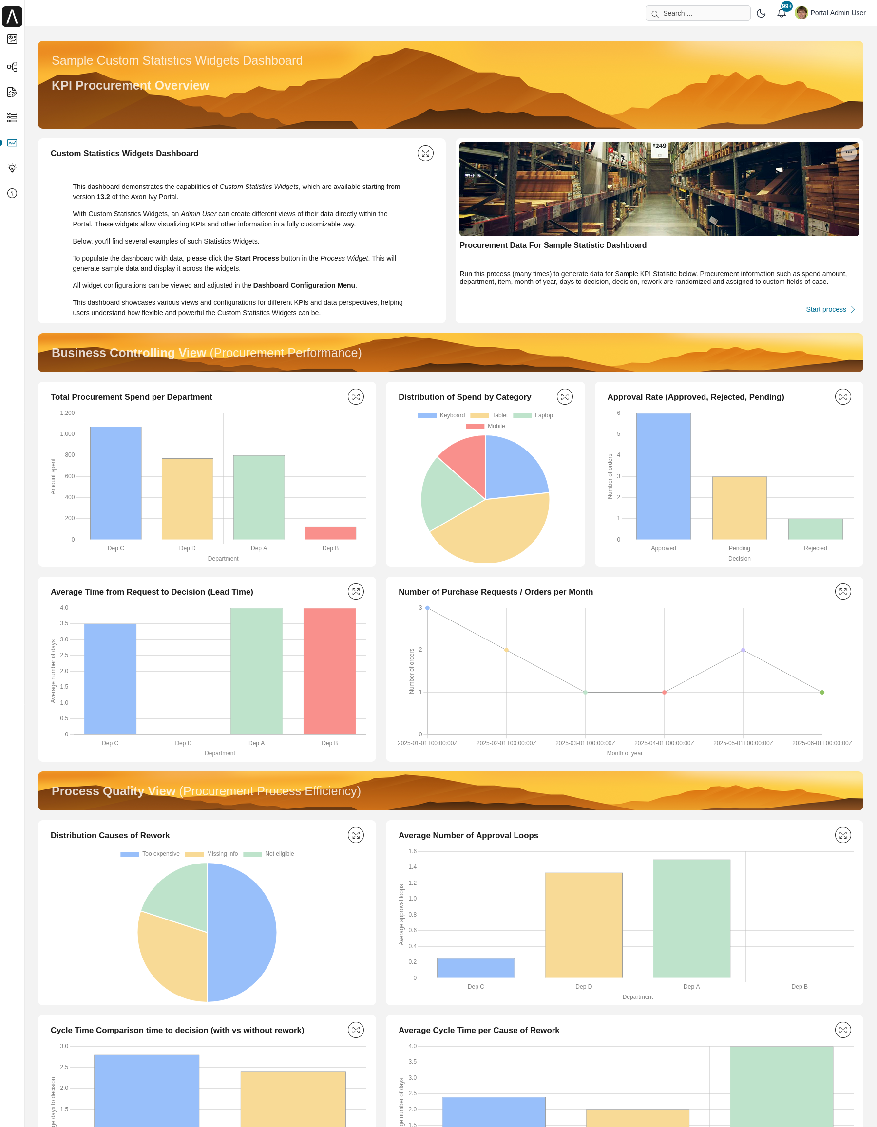
You can also view the configuration of these example statistic widgets in a similar way with other statistic widgets, follow these steps:
In the dashboard configuration page, click the Add widget button.
Select Edit to review their configurations.