Configure Custom Widget
The custom widget allows you to embed custom content on the Portal dashboard using iframes. You can display either an Ivy process or an external webpage URL, enabling integration of specialized functionality like weather widgets, charts, or custom applications directly on the dashboard.
Define An Ivy Process For The Custom Widget
The custom widget can display a predefined Ivy process, allowing users to interact with custom functionality directly on the Portal Dashboard without opening another page.
Process Setup Requirements
To create an Ivy process for use in a custom widget:
Set the Dashboard Custom Field
Set custom field
isDashboardProcesstotruefor your process.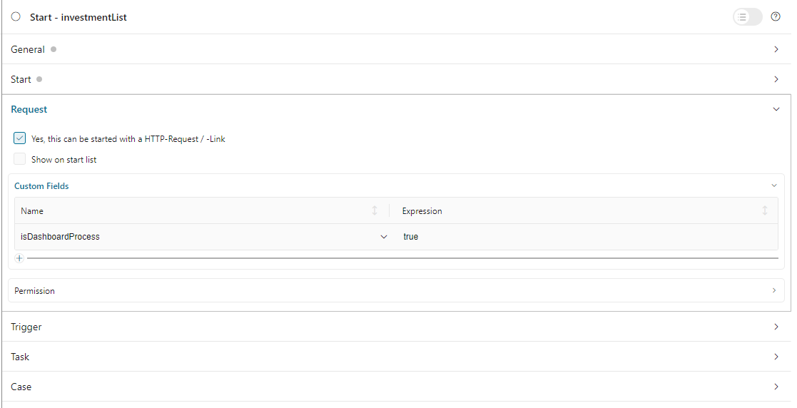
Define Parameters with Special Format
Parameters must be String variables named in format:
type__name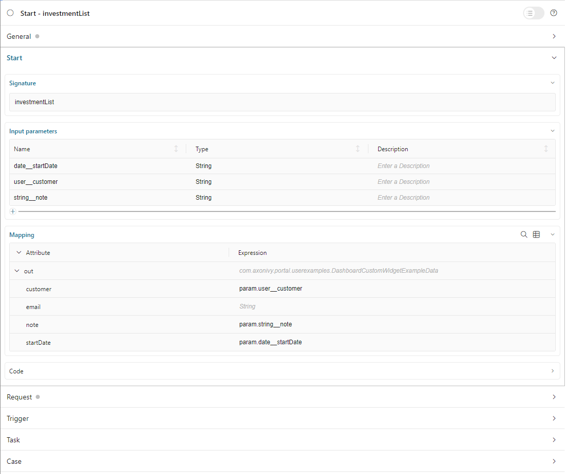
Parameter Type Prefixes:
user__- Username of an Ivy userstring__- String value (java.lang.String)boolean__- Boolean value (java.lang.Boolean)date__- Date value (java.util.Date)
Parameter Name:
The part after
__becomes the field label in the widget configuration dialog. If the name is empty, the widget header is hidden.Example: Parameter
user__customerdisplays a dropdown labeled “customer” to select an Ivy user.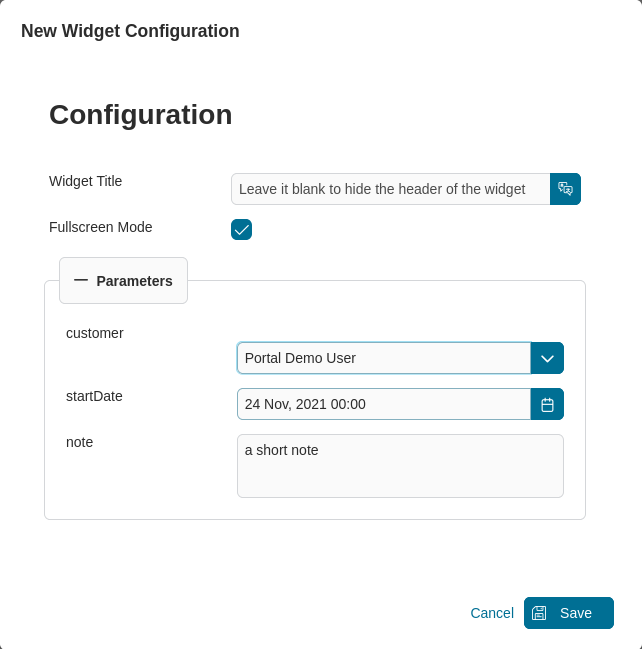
Define A Custom Widget Using JSON
A custom dashboard widget allows users to interact with an external webpage or an Ivy process on the dashboard through iframes.
Configuration Example
Below is a standard JSON definition of the custom widget in the Portal dashboard.
{
   "type": "custom",
   "id": "custom-widget",
   "showFullscreenMode": true,
   "names": [
      {
         "locale": "en",
         "value": "Custom Widget"
      },
      {
         "locale": "de",
         "value": "Benutzerdefiniertes Widget"
      }
   ],
   "layout": {
      "x": 0,
      "y": 0,
      "w": 6,
      "h": 8
   },
   "data": {
      "processPath": "designer/portal-user-examples/Start Processes/DashboardCustomWidgetExample/investmentList.ivp",
      "params": [
         {
            "type": "user",
            "name": "customer",
            "value": "demo"
         },
         {
            "type": "date",
            "name": "startDate",
            "value": "11/19/2021"
         },
         {
            "type": "string",
            "name": "note",
            "value": "a short note for demo process"
         }
      ]
   }
}
JSON Configuration Reference
Required Properties
Property |
Type |
Description |
|---|---|---|
|
string |
Widget type. Must be |
|
string |
Unique identifier for the widget |
|
array |
Multilingual display names. Each entry: |
|
object |
Widget position and size (see Layout Properties below) |
|
object |
Custom widget content definition (see Data Properties below) |
Layout Properties
Property |
Type |
Description |
|---|---|---|
|
number |
Column position in 12-column grid (0-11). CSS left = |
|
number |
Row position. CSS top = |
|
number |
Width in grid columns (1-12). Pixel width = |
|
number |
Height in grid rows (min 4). Pixel height = |
Tip
Recommended custom widget size: Width 4-8 columns, Height 6-10 rows for optimal content display.
Display Properties
Property |
Type |
Default |
Description |
|---|---|---|---|
|
boolean |
|
Show/hide fullscreen mode icon |
Data Properties
The data object defines the custom widget content:
Property |
Type |
Description |
|---|---|---|
|
string |
IWebStartable identifier of the Ivy process |
|
array |
(Optional) Process parameters (see Parameter Configuration below) |
|
string |
(Alternative to processPath) External webpage URL to display in iframe |
Parameter Configuration
Each parameter object in the params array:
Property |
Type |
Description |
|---|---|---|
|
string |
Parameter name (matches process parameter after |
|
string |
Parameter type: |
|
string |
Predefined value for the parameter |
Parameter Types
string- Text input field in configuration dialog. Accepts any string value.user- User selection dropdown in configuration dialog. Accepts Ivy usernames only.date- Date picker in configuration dialog. Accepts formats:dd.MM.yyyyorMM/dd/yyyy.boolean- Radio button in configuration dialog. Accepts"true"or"false".
Note
Before defining parameters in JSON, ensure your Ivy process parameters follow the type__name format as described in Define An Ivy Process for the Custom Widget.
Parameter Type Examples
String Parameter
Displays as a text input field in the configuration dialog:
{
   "params": [
      {
         "type": "string",
         "name": "note",
         "value": "a short note for demo process"
      }
   ]
}
User Parameter
Displays as a dropdown with Ivy users in the configuration dialog:
{
   "params": [
      {
         "type": "user",
         "name": "customer",
         "value": "demo"
      }
   ]
}
Date Parameter
Displays as a date picker in the configuration dialog. Accepts formats: dd.MM.yyyy or MM/dd/yyyy:
{
   "params": [
      {
         "type": "date",
         "name": "startDate",
         "value": "01/01/2024"
      }
   ]
}
Boolean Parameter
Displays as radio buttons (true/false) in the configuration dialog:
{
   "params": [
      {
         "type": "boolean",
         "name": "isActive",
         "value": "true"
      }
   ]
}
Tip
For detailed examples, refer to variables.Portal.Dashboard.json and process DashboardCustomWidgetExample/investmentList.ivp in the portal-user-examples project.