Legacy Portal home
Before beginning
This guide assumes that you are already familiar with CSS to integrate your own widgets.
Introduction
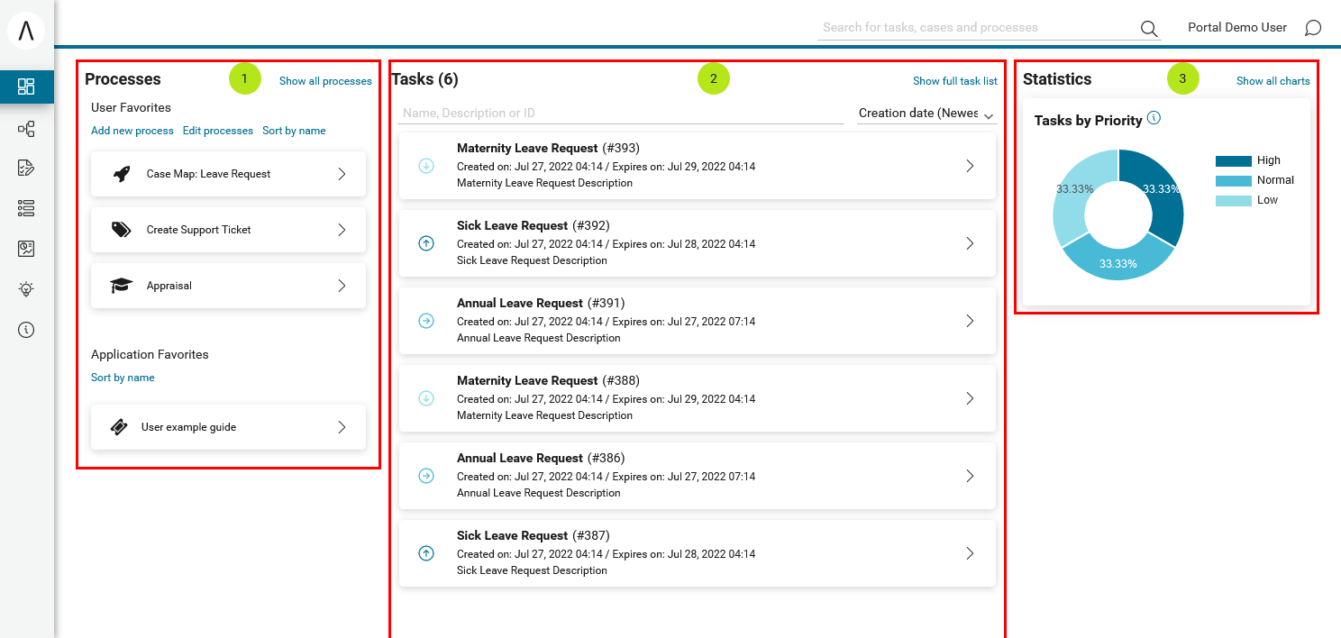
The default home page of Portal has three built-in widgets in order:
Process widget (1), Task widget (2), Statistic widget (3). If it does
not fit your needs, you can replace it by your own one. We decided that
based on screen size, widget may become hidden, not smaller.
Basic usage
Following these steps to have your own Portal Home:
Create a new home page which uses the
DefaultHomePageTemplate.xhtmltemplate. By doing this, your new home page will inherit the widgets from the default home page and has a place holder for your own widgets.Your custom home page should look like below:
<ui:composition template="/layouts/DefaultHomePageTemplate.xhtml">
<ui:define name="customWidget">
...
</ui:define>
</ui:composition>
Create a new process start named
DefaultApplicationHomePage.ivpfor the new home page. Now you will use this process start as the entry point of your Portal instead of the default one. To let Portal know about your new Portal home, you have to set default pages to your project, follow this chapter to customize standard processes: Standard Processes
Advanced usage
The DefaultHomePageTemplate.xhtml template supports some
customizations.
Display/hide the default widgets
The template has three parameters: displayProcessWidget,
displayTaskWidget, displayStatisticWidget to display or hide the
default widgets. Their default values are true, you can set them to
boolean values (true/false) to display or hide them as you need.
<ui:composition template="/layouts/DefaultHomePageTemplate.xhtml">
<ui:param name="displayTaskWidget" value="false" />
</ui:composition>
Note
Task widget now is hidden.
Customize the default widget’s sections
The template has the placeholders to redefine the default widgets’ sections.
<ui:composition template="/layouts/DefaultHomePageTemplate.xhtml">
<ui:define name="statisticWidget">
<div class="js-dashboard-main-content-3rd-col dashboard-main-content-3rd-col layout-col">
<h:panelGroup layout="block" styleClass="js-statistic-widget" id="statistic-widget-container">
<!-- KEEP THE STATISTIC WIDGET -->
<ic:ch.ivy.addon.portalkit.component.StatisticWidget id="statistics-widget" compactMode="true" tasks="#{tasks}">
<!-- ADD THE WEATHER WIDGET BELOW STATISTIC WIDGET -->
<ic:my.namespace.WeatherWidget />
</h:panelGroup>
</div>
</ui:define>
</ui:composition>
Add your own widgets
The template has a placeholder to add your own widgets. Your own widgets’ default positions are next to statistic widget, you can change them by setting the default widgets’ positions.
<ui:composition template="/layouts/DefaultHomePageTemplate.xhtml"  >
<ui:define name="customWidget">
<ic:my.namespace.ComponentName  />
</ui:define>
</ui:composition>
Note
This custom widget will show below the 3 default widget
Change the page’s title
The default page title is Dashboard. Apply the following code to change it:
<ui:composition template="/layouts/DefaultHomePageTemplate.xhtml" >
<ui:define name="title">YOUR PAGE'S TITLE</ui:define>
</ui:composition>
Customize user guide
When user guide is shown, default order of guide steps is Welcome > Main Menu > Processes > Tasks > Username > Statistics.
If you want to customize the guide, define the sections and using the GuideOverlayPanel components,
refer to CustomizedGuide.xhtml in the portal-developer-examples project.
The supported sections: welcomeGuide, mainMenuGuide, processWidgetGuide, taskWidgetGuide, statisticWidgetGuide, userSettingsGuide
<ui:define name="welcomeGuide">
  <ic:ch.ivy.addon.portalkit.component.WelcomePortalDialog id="welcome-portal-guide-component"
    title="Welcome to Customized Guide"
    onNext="PF('left-menu-guide').show()" updatedComponentAfterGuide="#{updatedComponentAfterGuide}"
    rendered="#{guideBean.isGuideShown}" />
</ui:define>

<ui:define name="taskWidgetGuide">
  <ic:ch.ivy.addon.portalkit.component.GuideOverlayPanel id="task-widget-guide-component"
    targetComponent="task-widget" targetCssSelector="#task-widget" icon="fa-check-square-o"
    title="#{ivy.cms.co('/ch.ivy.addon.portalkit.ui.jsf/components/guide/task/title')}"
    content="#{ivy.cms.co('/ch.ivy.addon.portalkit.ui.jsf/components/guide/task/content')}"
    updatedComponentAfterGuide="#{updatedComponentAfterGuide}"
    rendered="#{guideBean.isGuideShown}" />
</ui:define>