Case Widget (Deprecated)
Warning
Deprecated: This feature is marked for removal in version LTS 12.
CaseWidget is a built-in component of the Portal that contains the cases which users can interact with. To show needed case information, the Portal allows to override the CaseWidget. Each CaseWidget consists of two parts:
UI : CaseListHeader, CaseHeader and CaseFilter
Data query : select and display the cases you need by modifying the data query
Important
The case header customization currently supports responsive design. Refer to this part for details.
The case header buttons cannot be modified (they stay where they are).
How to Override the Case Widget UI
We provide a code sample in portal-developer-examples.
Follow these steps to override the case Widget UI:
Create an Axon Ivy project and add
portalas a required library.To customize the case widget, you have to customize Portal Home first. Refer to Customize Portal home to create and set a new home page.
Copy the
PortalStartprocess fromportalto your project. Point the PortalHome element to your custom home page created in the previous step. This process is the new home page. The Portal administrator has to register this link in the Portal Admin Settings.Use Axon Ivy HtmlOverride wizard to override the
PortalCasesHTML dialog.Tip
This action overrides
Case widgetin the CaseList page and the Case Search result page.After you completed these steps, you can override CaseHeader and CaseListHeader and CaseFilter
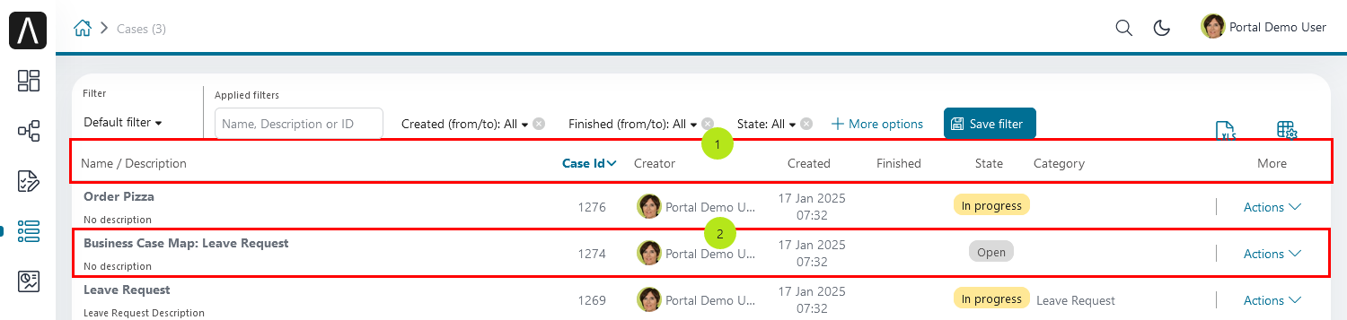
Case List Header and Case Header
Refer to the caseListHeader (1) and caseHeader (2) sections in
PortalCases.xhtml in portal. If your case widget has
new columns, you have to override the CaseLazyDataModel to make the sort
function of these columns work:
Create a Java class that which extends CaseLazyDataModel
Override the
extendSortmethod and extend the sort function for the added columns (see the method’s Javadoc comments).The default case list allows the user to configure display or hide the following columns: -
Custom SortFields (1)-Custom Checkboxes (2)-Custom header column (3).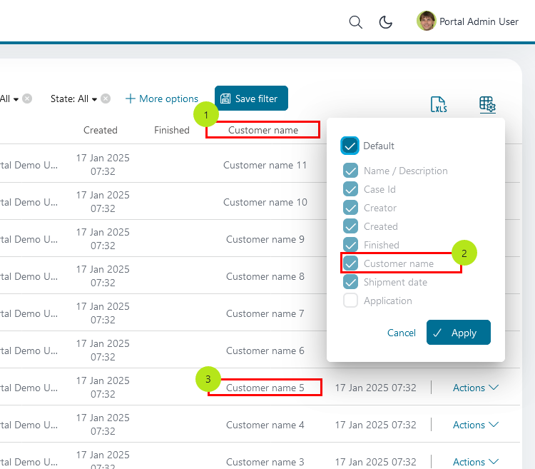
If you added new columns, override method
getDefaultColumnsof the extended class from CaseLazyDataModel to display checkboxes in the configure columns panel and hide or display sortFields (see the methods’ Javadoc comments).To add a CMS for checkbox label, add new entries to folder
/ch.ivy.addon.portalkit.ui.jsf/caseList/defaultColumns/inportalor override methodgetColumnLabel(see the methods’ Javadoc comments)In the
caseListHeadersection, use theCaseColumnHeadercomponentIn the
caseHeadersection, use theCaseCustomFieldcomponent for each additional column. This component will handle display/hide new columns on case list.Currently, CaseCustomField only supports text fields. If you want to create your own component, remember to add
rendered="#{caseView.dataModel.isSelectedColumn('YOUR_CUSTOM_COLUMN')}"To show the custom field
customer namestored incase.customFields().stringField('CustomVarCharField1')
<ic:ch.ivy.addon.portalkit.component.cases.column.CaseCustomField id="case-customer-name-component" panelGroupId="customVarCharField1-column-case-header-panel" componentId="customVarCharField1-column-case-header-text" column="customVarCharField1" dataModel="#{caseView.dataModel}" labelValue="#{case.customFields().stringField('CustomVarCharField1')}" />
Use Axon Ivy Override to override the
InitializeCaseDataModelcallable and initialize the data model with your customized one.In your customized Cases HTMLDialog, the customized data model has to be passed as a parameter to components (refer to
PortalCases.xhtml).
Case Filter
Refer to the
caseFiltersection inPortalCases.xhtmlofportal.To add a new filter, create a new Java class which extends CaseFilter and overrides its methods (see javadoc comments)
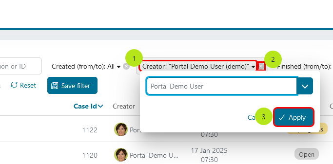
Filter
label()andvalue()method.Filter
resetValue()is called when click onXicon.Filter
validate()is called when click onApplybutton.
Introduce a Java class which extends CaseFilterContainer. This filter container contains your filters, you can reuse default filters, refer to
DefaultCaseFilterContainer.javaTip
StateFilter is added as a default to the case filter container. If you don’t need it, use this code in constructor:
filters.remove(stateFilter);Create a Java class which extends CaseLazyDataModel. Override the
initFilterContainermethod and initialize filter container (see javadoc comments)Use Axon Ivy Override to override the
InitializeCaseDataModelcallable and initialize data model by your customized one.In your customized Cases HTMLDialog, the customized data model and filter container have to be passed as parameters to components (refer to
PortalCases.xhtml).Portal supports storing and loading filters. Your filter class (that extends
CaseFilter) is stored in business data. Persist properties that store user input values. Do not persist properties controlled by logic, as this would unnecessarily increase the amount of data stored in business data. Use annotation@JsonIgnoreto exclude properties. By default, Portal takes care of storing and loading filters. If you want to customize the persisted filter data, do it in your data model class (which extendsCaseLazyDataModel).By default, filters are stored and loaded at process model level. You can change this by setting the ui:param
filterGroupIdinPortalCases.xhtmlto a new Long value.Tip
If you have multiple case lists in your project, you may want to set
filterGroupIdto a unique identifier for each of yourPortalCases.xhtmlacross your projects
How to Override Case Widget’s Data Query
Override the BuildCaseQuery callable process of portal to build
a query that changes the data passed to the case widget.
To provide data to the case list after navigating to case list from your page, apply the following steps:
Use the
OpenPortalCasescallable process with theCaseViewparameter. It is used to define which information is displayed in CaseWidget.Refer to CaseView, CaseSearchCriteria to build your CaseView
CaseLazyDataModel dataModel = new CaseLazyDataModel();
dataModel.getCriteria().setCustomCaseQuery(YOUR_CASE_QUERY); // Set your CaseQuery
dataModel.getCriteria().setAdminQuery(true); // Display the cases of all users
out.caseView = CaseView.create().dataModel(dataModel)
.withTitle("My Cases").buildNewView();
How to Override the Export Feature
Extend the CaseExporter Java class of
portal.Override the
getColumnNamemethod.
@Override
protected String getColumnName(String column) {
   String columnName = getSpecialColumnName(column);
   return columnName != null ? columnName : Ivy.cms().co("/DefaultColumns/caseList/" + column);
}
Override the
getColumnValuemethod.
@Override
protected Object getColumnValue(String column, ICase caseItem) {
   switch (column) {
      case CustomizedCaseLazyDataModel.CUSTOM_VARCHAR_FIELD1:
         return caseItem.customFields().stringField(CustomFields.CUSTOM_VARCHAR_FIELD1).getOrNull();
      case CustomizedCaseLazyDataModel.CUSTOM_TIMESTAMP_FIELD1:
         return caseItem.customFields().timestampField(CustomFields.CUSTOM_TIMESTAMP_FIELD1).getOrNull();
      default:
         return getCommonColumnValue(column, caseItem);
   }
}
Override the ExportCaseToExcel callable process and apply your extended CaseExporter Java class.
CaseExporter exporter = new CustomizedCaseExporter(in.columnsVisibility);
in.exportedFile = exporter.getStreamedContent(in.collectedCasesForExporting);
How to Make a Responsive Case List
If you have customized the case list and want it to be responsive, implement the following steps.
You can refer to portal-developer-examples project for examples.
Add responsiveStyleClass param (in case you’re using Portal component), or styleClass (in case you’re using Primefaces or JSF component) with the same responsive css class for both caseListHeader and caseHeader. You can find responsive class in this part.
      <!-- New field -->
      <ic:ch.ivy.addon.portalkit.component.cases.column.CaseColumnHeader id="customVarCharField1-column-header"
      styleClass="TexAlCenter customized-case-header-column"
      responsiveStyleClass="u-hidden-lg-down
      js-hidden-when-expand-menu"
      value="#{ivy.cms.co('/DefaultColumns/caseList/customVarCharField1')}" sortedField="customVarCharField1"
      sortable="true" dataModel="#{caseView.dataModel}" />
      <ic:ch.ivy.addon.portalkit.component.cases.column.CaseColumnHeader id="customTimestampField1-column-header"
      styleClass="TexAlCenter customized-case-header-column"
      responsiveStyleClass="u-hidden-lg-down
      js-hidden-when-expand-menu "
      value="#{ivy.cms.co('/DefaultColumns/caseList/customTimestampField1')}" sortedField="customTimestampField1"
      sortable="true" dataModel="#{caseView.dataModel}" />
</ui:define>

<ui:define name="caseHeader">
      <div class="case-header-name-desc-cell u-truncate-text">
      <ic:ch.ivy.addon.portalkit.component.cases.column.CaseName caseNameId="case-header-name-cell"
      caseDescriptionId="description-cell" case="#{case}" dataModel="#{caseView.getDataModel()}" />
      </div>
      <ic:ch.ivy.addon.portalkit.component.cases.column.CaseId componentId="case-id-cell" case="#{case}"
      dataModel="#{caseView.getDataModel()}" />
      <ic:ch.ivy.addon.portalkit.component.cases.column.CaseCreator componentId="case-creator-cell" case="#{case}"
      dataModel="#{caseView.getDataModel()}" />
      <ic:ch.ivy.addon.portalkit.component.cases.column.CaseDate componentId="case-creation-date-cell"
      rendered="#{caseView.dataModel.isSelectedColumn('CREATION_TIME')}" value="#{case.startTimestamp}" />
      <ic:ch.ivy.addon.portalkit.component.cases.column.CaseDate componentId="case-expiry-date-cell"
      rendered="#{caseView.dataModel.isSelectedColumn('FINISHED_TIME')}" value="#{case.endTimestamp}"
      responsiveStyleClass="js-hidden-when-expand-menu u-hidden-md-down" />
      <ic:ch.ivy.addon.portalkit.component.cases.column.CaseState componentId="case-state-cell" case="#{case}"
      dataModel="#{caseView.getDataModel()}" />

      <!-- New field -->
      <h:panelGroup styleClass="customized-case-header-column js-hidden-when-expand-menu
      u-hidden-lg-down"
      rendered="#{caseView.dataModel.isSelectedColumn('customVarCharField1')}">
      <h:outputText value="#{case.customFields().stringField('CustomVarCharField1').getOrNull()}"
      styleClass="case-header-default-cell customized-case-header-column" />
      </h:panelGroup>
      <h:panelGroup styleClass="customized-case-header-column js-hidden-when-expand-menu
      u-hidden-lg-down"
      rendered="#{caseView.dataModel.isSelectedColumn('customTimestampField1')}">
      <h:outputText value="#{case.customFields().timestampField('CustomTimestampField1').getOrNull()}"
      styleClass="case-header-default-cell">
      <f:convertDateTime pattern="#{dateTimePatternBean.configuredPattern}" />
      </h:outputText>
      </h:panelGroup>
</ui:define>
Tip
The
CaseCustomFieldcomponent has a default responsiveStyleClassu-hidden-sm-down
Anchoring the left menu breaks responsiveness. To maintain the responsiveness, you could hide some columns by adding
js-hidden-when-expand-menuto the responsiveStyleClass or styleClass parameter of caseListHeader and caseHeader.<!-- New field --> <ic:ch.ivy.addon.portalkit.component.cases.column.CaseColumnHeader id="customVarCharField1-column-header" styleClass="TexAlCenter customized-case-header-column" responsiveStyleClass="u-hidden-lg-down js-hidden-when-expand-menu" value="#{ivy.cms.co('/DefaultColumns/caseList/customVarCharField1')}" sortedField="customVarCharField1" sortable="true" dataModel="#{caseView.dataModel}" /> <ic:ch.ivy.addon.portalkit.component.cases.column.CaseColumnHeader id="customTimestampField1-column-header" styleClass="TexAlCenter customized-case-header-column" responsiveStyleClass="u-hidden-lg-down js-hidden-when-expand-menu " value="#{ivy.cms.co('/DefaultColumns/caseList/customTimestampField1')}" sortedField="customTimestampField1" sortable="true" dataModel="#{caseView.dataModel}" /> </ui:define> <ui:define name="caseHeader"> <div class="case-header-name-desc-cell u-truncate-text"> <ic:ch.ivy.addon.portalkit.component.cases.column.CaseName caseNameId="case-header-name-cell" caseDescriptionId="description-cell" case="#{case}" dataModel="#{caseView.getDataModel()}" /> </div> <ic:ch.ivy.addon.portalkit.component.cases.column.CaseId componentId="case-id-cell" case="#{case}" dataModel="#{caseView.getDataModel()}" /> <ic:ch.ivy.addon.portalkit.component.cases.column.CaseCreator componentId="case-creator-cell" case="#{case}" dataModel="#{caseView.getDataModel()}" /> <ic:ch.ivy.addon.portalkit.component.cases.column.CaseDate componentId="case-creation-date-cell" rendered="#{caseView.dataModel.isSelectedColumn('CREATION_TIME')}" value="#{case.startTimestamp}" /> <ic:ch.ivy.addon.portalkit.component.cases.column.CaseDate componentId="case-expiry-date-cell" rendered="#{caseView.dataModel.isSelectedColumn('FINISHED_TIME')}" value="#{case.endTimestamp}" responsiveStyleClass="js-hidden-when-expand-menu u-hidden-md-down" /> <ic:ch.ivy.addon.portalkit.component.cases.column.CaseState componentId="case-state-cell" case="#{case}" dataModel="#{caseView.getDataModel()}" /> <!-- New field --> <h:panelGroup styleClass="customized-case-header-column u-hidden-lg-down js-hidden-when-expand-menu " rendered="#{caseView.dataModel.isSelectedColumn('customVarCharField1')}"> <h:outputText value="#{case.customFields().stringField('CustomVarCharField1').getOrNull()}" styleClass="case-header-default-cell customized-case-header-column" /> </h:panelGroup> <h:panelGroup styleClass="customized-case-header-column u-hidden-lg-down js-hidden-when-expand-menu " rendered="#{caseView.dataModel.isSelectedColumn('customTimestampField1')}"> <h:outputText value="#{case.customFields().timestampField('CustomTimestampField1').getOrNull()}" styleClass="case-header-default-cell"> <f:convertDateTime pattern="#{dateTimePatternBean.configuredPattern}" /> </h:outputText> </h:panelGroup> </ui:define>
Tip
The smallest browser width you can anchor the left menu is 1025. To test which columns need to be hidden, reduce your window’s width to 1025.