Case Item Details
CaseItemDetails is a built-in component of the Portal that contains the case information which users can interact with. To show additional required case information, the Portal supports overriding the CaseItemDetails.
Each CaseItemDetails contains
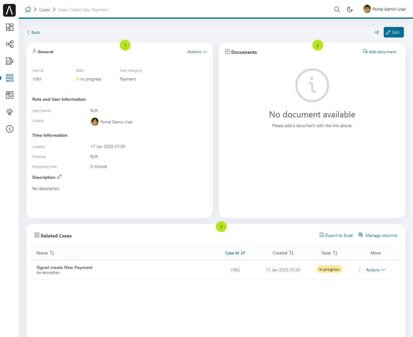
CaseItemGeneralInformation
1CaseItemDetailsDocuments
2CaseItemDetailsRelatedCases
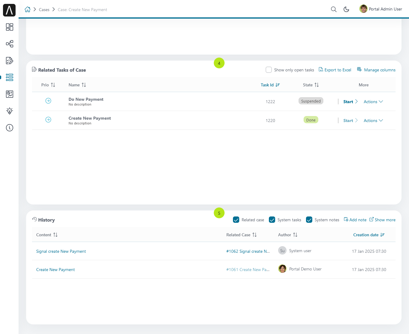
3CaseItemDetailsRelatedTasks
4CaseItemDetailsHistories
5Case Details custom panel:
caseItemDetailCustomTop,caseItemDetailCustomMiddle,caseItemDetailCustomBottom
Important
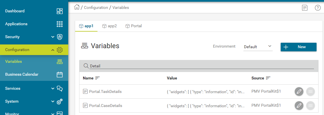
All visible widgets are configured in variable Portal.CaseDetails
How to Configure Widgets in Case Details
Settings of all visible widgets on the Case Details page are saved in the variable Portal.CaseDetails.
In the Engine Cockpit, an administrator can configure widgets in the variable Portal.CaseDetails on the Settings page.
The default configuration includes five widgets:
[{
   "id": "default-case-detail",
   "widgets": [{
         "type": "information",
         "id": "information",
         "layout": {
            "w": 6, "h": 8, "x": 0, "y": 0
           }
      }, {
         "type": "document",
         "id": "document",
         "layout": {
            "w": 6, "h": 8, "x": 6, "y": 0
           }
      }, {
         "type": "technicalCase",
         "id": "technicalCase",
         "layout": {
            "w": 12, "h": 6, "x": 0, "y": 8
           }
      }, {
         "type": "relatedTask",
         "id": "relatedTask",
         "layout": {
            "w": 12, "h": 6, "x": 0, "y": 14
           }
      }, {
         "type": "history",
         "id": "history",
         "layout": {
            "w": 12, "h": 6, "x": 0, "y": 20
           }
        }
      ]
   }
]
The structure of each Case Details layout is saved in variable Portal.CaseDetails:
id: ID of layout.widgets: definition of widgets in layout.filters: conditions to determine which cases are eligible to use the layout. There are two types of case filters:categories(case categories)states(case states).
The structure of each widget inside the case details layout is stored in variable Portal.CaseDetails:
id: ID of widget.type: type of widget, there are 6 types: -information-document-technicalCase-relatedTask-history-custom.layout: defines the UI styling of the widget.x: HTML DOM Styleleftis computed asx / 12 * 100%.y: HTML DOM Styletopis computed asy / 12 * 100%.w: HTML DOM Stylewidthis computed as60 * w + 20 * (width - 1).h: HTML DOM Styleheightis computed as60 * h + 20 * (height - 1).styleClass(optional): add CSS Classes to HTML DOM.style(optional): add inline style to HTML DOM.data(for custom widget): data for custom widget, refer to Show custom widgets
Important
Do not change
typeandidof widgets.You can change
x,y,wandhto update size and position of widgets.x,y,wandhhave to be integers.x + wmust not be larger than 12.We support all case states in filter type
states.
How to Customize the Case Details UI
Warning
Deprecated: This feature is marked for removal in version LTS 12.
We included sample code for this customization in portal-developer-examples.
Create an Axon Ivy project which has
portalas a required library.To customize the case details UI, you have to customize Portal Home first. Refer to Customize Portal home to set a new home page.
Copy the
PortalStartprocess fromportalto your project. Point the PortalHome element to your custom home page created in the previous step. This process is the new home page. The Portal administrator has to register this link in the Portal Admin Settings.Use Axon Ivy HtmlOverride wizard to override the
CaseInformationHTML dialog.After the above steps are done, you can override Case Details UI elements by some options below:
To show/hide, please use the
showItemDetailsHeaderandshowItemBackButtoncode. For details, please refer to Show/Hide components.And to show a new elements in
CaseInformationcustomized, please refer to Show custom widgets code.
Show/Hide Components by Keywords
Warning
Deprecated: This feature is marked for removal in version LTS 12.
Refer to the ui:param tag list in CaseInformation.xhtml of
portal. In case, we want to show/hide any elements on
CaseItemDetails, we should override value of ui:param
List valid parameters:
ui:param name="showItemDetailsHeader" value="true"to show/hide case header, by default it’s true, you should set asfalseif you set alwaysShowDetails for CaseItem.ui:param name="showItemBackButton" value="true"to show/hide back button, by default it’s true.
Show custom widgets
For the custom widget, we have a new node is data inside of case details widget. The structure of data on each custom widget will be:
type: type of custom widget panel, there are 3 types:caseItemDetailCustomTop,caseItemDetailCustomMiddle,caseItemDetailCustomBottom.
url: URL for external website
processPath: the user-friendly request path of the Ivy process which will be displayed in custom widget
params: parameters for the Ivy process above, each parameter can be defined as follows:
Key name that will be the parameter name for the Ivy process above. Note: don’t use
caseId.The key value for the case has to start with
case.. Supported are two values:case.id,case.category.Key value for case custom fields: must start with
case.customFields., followed by custom field name.Other key values will be treated as a hard coded value.
Tip
To quickly understand how the JSON of custom case details looks like.
Refer to
variables.Portal.CaseDetails.jsonfile inportal-developer-examples/resources/filesproject.Copy to the corresponding application folder located in the designer.
e.g: AxonIvyDesigner/configuration/applications/designer.
Create some destroyed case or start the process
Start Processes/CaseDetailsCustomWidgetExample/CreateEventTest.ivpinportal-developer-examplesproject.Go to the example homepage by the process
Start Processes/ExamplePortalStart/DefaultApplicationHomePage.ivp.And then go to case details to check the new custom layout.
About how to configure Variables, refer to Axon Ivy Variables
Adding New Custom Panels
The following two steps are necessary to add new custom panels:
The Engine Administrator has to configure the variable Portal.CaseDetails on the Cockpit Page to add custom widgets.
This is an example Portal.CaseDetails configuration that includes three custom widgets:
 [{
    "id": "default-case-detail",
    "widgets": [{
          "type": "information",
          "id": "information",
          "layout": {
             "w": 6, "h": 8, "x": 0, "y": 0
          }
       }, {
          "type": "document",
          "id": "document",
          "layout": {
             "w": 6, "h": 8, "x": 6, "y": 0
          }
       }, {
          "type": "history",
          "id": "history",
          "layout": {
             "w": 12, "h": 6, "x": 0, "y": 8
          }
       }, {
          "type": "custom",
          "id": "customTop",
          "layout": {
             "x": 0, "y": 14, "w": 12, "h": 6
          },
          "data" : {
             "type": "caseItemDetailCustomTop"
          }
       }, {
          "type": "custom",
          "id": "customMiddle",
          "layout": {
             "x": 0, "y": 20, "w": 12, "h": 6
          },
          "data" : {
             "type": "caseItemDetailCustomMiddle"
          }
       }, {
          "type": "custom",
          "id": "customBottom",
          "layout": {
             "x": 0, "y": 26, "w": 12, "h": 6
          },
          "data" : {
             "type": "caseItemDetailCustomBottom"
           }
        }
     ]
   }
]
Refer to the
caseItemDetailCustom*section inCaseInformation.xhtmlofportal.Warning
Deprecated: This feature is marked for removal in version LTS 12.
You need to define
ui:definewith a valid name such ascaseItemDetailCustomTop,caseItemDetailCustomMiddleandcaseItemDetailCustomBottom.Add your custom code into the tags above.
Finally, your custom widget will be displayed on the CaseItemDetails page.
Below, find a code example for adding custom widgets to case details
<!--!!!!!!!!!!!!!!!!!!!!!!!!!!!!!!!!!!!!!!!!!!!!!!!!!!!!!!!!!!!!!!!!!!!!!!!!!!!!!!!!!!!!!!!!!!!!!!!!!!!!!!!!!!!!!!!!!!!!!!!!!!!!!!!!!!
   !!!! START: AREA SHOULD BE CUSTOMIZED !!!!!!!!!!!!!!!!!!!!!!!!!!!!!!!!!!!!!!!!!!!!!!!!!!!!!!!!!!!!!!!!!!!!!!!!!!!!!!!!!!!!!!!!!!!!!
   !!!!!!!! START: TO SHOW /HIDE ANY SECTIONS OF CASE DETAILS, YOU CAN TURN TRUE/FALSE FOR BELOW PARAMETERS !!!!!!!!!!!!!!!!!!!!!!!!!!
   !!!!!!!!!!!!!!!!!!!!!!!!!!!!!!!!!!!!!!!!!!!!!!!!!!!!!!!!!!!!!!!!!!!!!!!!!!!!!!!!!!!!!!!!!!!!!!!!!!!!!!!!!!!!!!!!!!!!!!!!!!!!!!!!!!!
   Attribute showItemDetailsHeader: To show the header of case details. By default it's true
   !!!!!!!! END SHOW /HIDE SECTIONS !!!!!!!!!!!!!!!!!!!!!!!!!!!!!!!!!!!!!!!!!!!!!!!!!!!!!!!!!!!!!!!!!!!!!!!!!!!!!!!!!!!!!!!!!!!!!!!!!!-->

<ui:param name="id" value="#{cc.clientId}" />
<ui:param name="showItemDetailsHeader" value="#{cc.attrs.showItemDetailsHeader}" />
<ui:param name="descriptionComponentToUpdate" value="#{cc.attrs.descriptionComponentToUpdate}" />
<ui:param name="isWorkingOnTask" value="#{cc.attrs.isWorkingOnTask}" />

<!--!!!!!!!!!!!!!!!!!!!!!!!!!!!!!!!!!!!!!!!!!!!!!!!!!!!!!!!!!!!!!!!!!!!!!!!!!!!!!!!!!!!!!!!!!!!!!!!!!!!!!!!!!!!!!!!!!!!!!!!!!!!!!!!!!!
   !!!!!!!! START: TO ADD YOUR CUSTOMIZATION CODE TO THE CASE DETAILS PAGE, WE PROVIDE THE 3 SECTIONS BELOW !!!!!!!!!!!!!!!!!!!!!!!!!!
   !!!!!!!!!!!!!!!!!!!!!!!!!!!!!!!!!!!!!!!!!!!!!!!!!!!!!!!!!!!!!!!!!!!!!!!!!!!!!!!!!!!!!!!!!!!!!!!!!!!!!!!!!!!!!!!!!!!!!!!!!!!!!!!!!!!-->

<ui:define name="caseItemDetailCustomTop">
   <h:panelGroup styleClass="ui-g-12" layout="block">
      <div class="card card-w-title case-detail-card">
         <div class="case-detail-section-title u-truncate-text">
         <h:outputText value="This is custom panel on top section" />
         </div>
         <div class="Separator" />

         <div class="custom-task-details-panel-top">
         <h1>This is custom content on top</h1>
         <p>Custom height to auto</p>
         <p>Custom font size to 1.6rem</p>
         </div>
      </div>
   </h:panelGroup>
</ui:define>

<ui:define name="caseItemDetailCustomMiddle">
   <h:panelGroup styleClass="ui-g-12" layout="block">
      <div class="card card-w-title case-detail-card">
         <div class="case-detail-section-title u-truncate-text">
         <h:outputText value="This is custom panel on middle section" />
         </div>
         <div class="Separator" />

         <div class="custom-task-details-panel-middle">
         <h1>This is custom content on middle</h1>
         <p>Custom height to auto</p>
         <p>Custom font size to 1.6rem</p>
         </div>
      </div>
   </h:panelGroup>
</ui:define>

<ui:define name="caseItemDetailCustomBottom">
   <h:panelGroup styleClass="ui-g-12" layout="block">
      <div class="card card-w-title case-detail-card">
         <div class="case-detail-section-title u-truncate-text">
         <h:outputText value="This is custom panel on bottom section" />
         </div>
         <div class="Separator" />

         <div class="custom-task-details-panel">
         <h1>This is custom content on bottom</h1>
         <p>Custom height to auto</p>
         <p>Custom font size to 1.6rem</p>
         </div>
      </div>
   </h:panelGroup>
</ui:define>

<!-- !!!!!!!! END ADD YOUR CUSTOMIZATION  !!!!!!!!!!!!!!!!!!!!!!!!!!!!!!!!!!!!!!!!!!!!!!!!!!!!!!!!!!!!!!!!!!!!!!!!!!!!!!!!!!!!!!-->
<!-- !!!! END: AREA SHOULD BE CUSTOMIZED! !!!!!!!!!!!!!!!!!!!!!!!!!!!!!!!!!!!!!!!!!!!!!!!!!!!!!!!!!!!!!!!!!!!!!!!!!!!!!!!!!!!!!!-->
We have full flexibility in the page layout if we use
ui-g-*class to define the width of the panel
To customize case details using an IFrame, you have to define one of the following two input parameters in the
datanode:urlif you want to use an external URL.processPathif you want to use an Ivy process start. You may predefine parameters for the process by addingparamsto thedatanode.Important
Use only one of
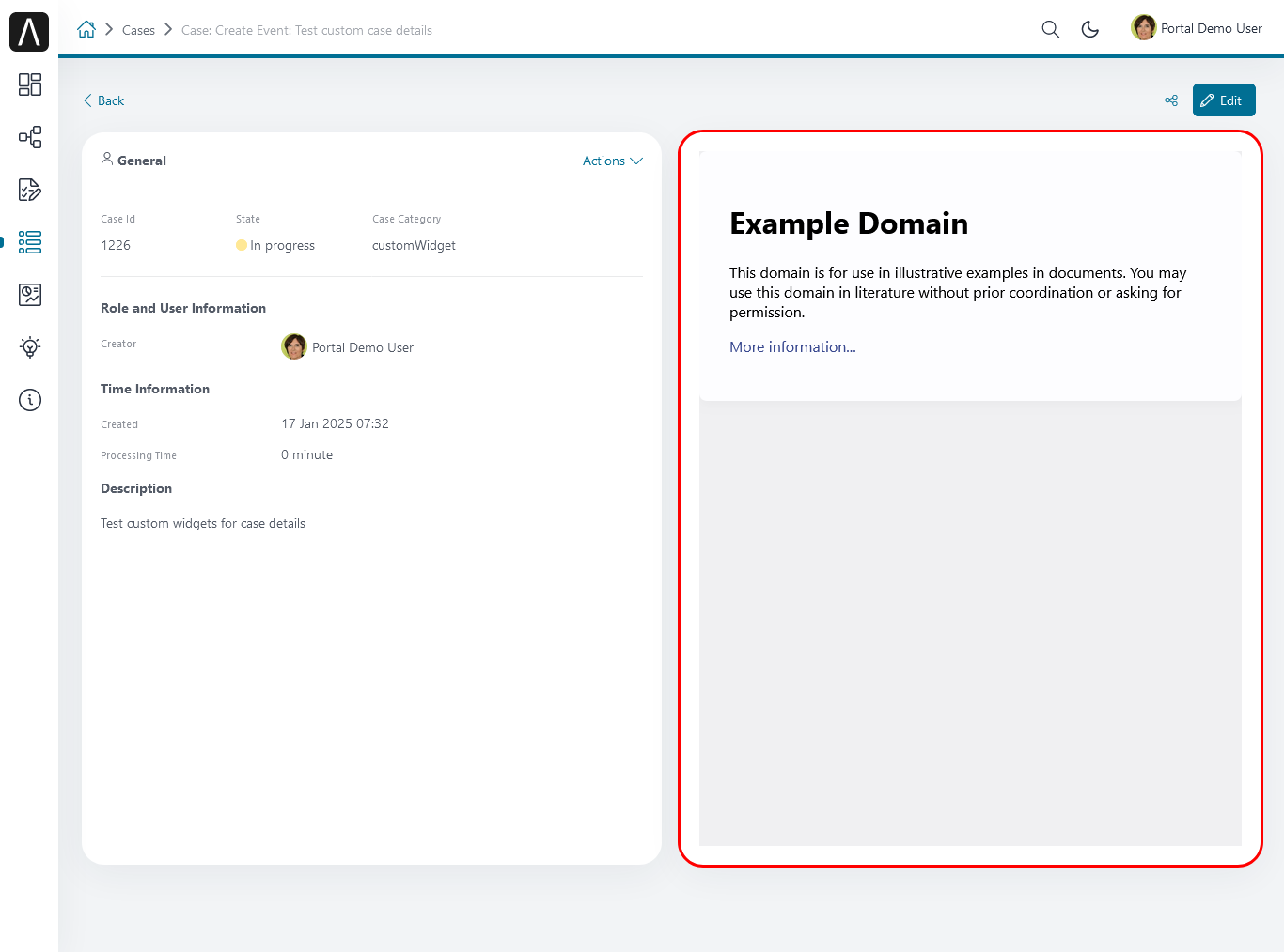
processPathandurl.Here is an example of a customized case details page using an external URL:
 [
    {
    "id": "case-detail",
    "widgets": [
       {
          "type": "information",
          "id": "information",
          "layout": {
             "x": 0, "y": 0, "w": 6, "h": 8
          }
       },
       {
          "type": "custom",
          "id": "customURL",
          "layout": {
             "x": 6, "y": 0, "w": 6, "h": 8
          },
          "data" : {
              "url": "https://www.axonivy.com/"
          }
       }
     ]
  }
]
Result:
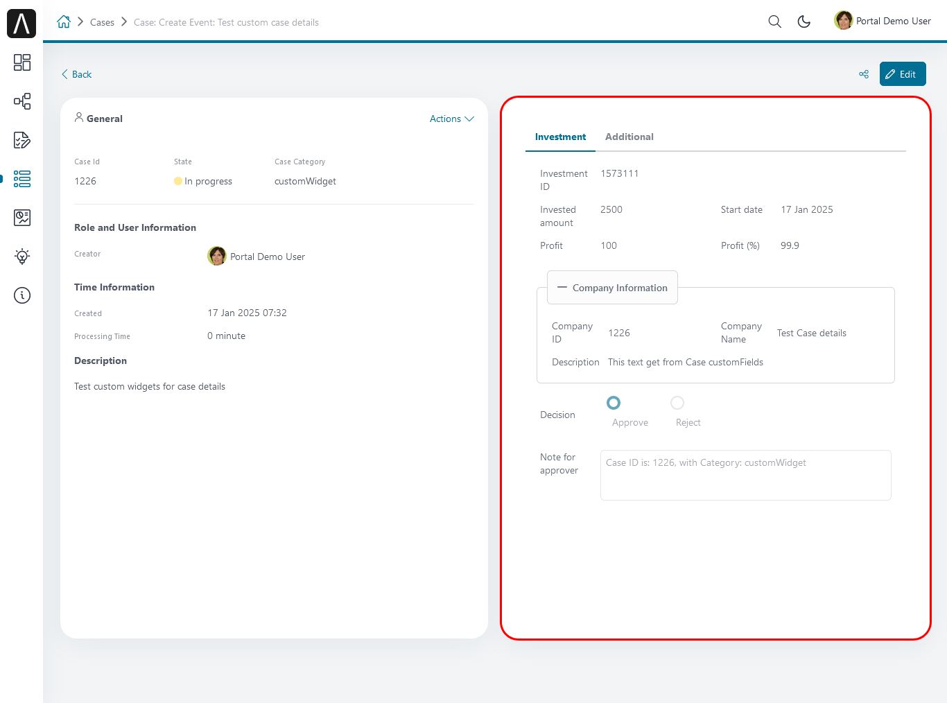
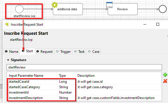
The following example shows a customized case details page using an ivy process start. Please refer to the
CaseDetailsCustomWidgetExampleprocess inportal-developer-examplesfor details.[{ "id": "case-detail", "widgets": [ { "type": "information", "id": "information", "layout": { "x": 0, "y": 0, "w": 6, "h": 8 } }, { "type": "history", "id": "history", "layout": { "x": 6, "y": 0, "w": 6, "h": 8 } }, { "type": "custom", "id": "customIvyProcess", "layout": { "x": 0, "y": 6, "w": 12, "h": 8 }, "data": { "processPath": "Start Processes/CaseDetailsCustomWidgetExample/startReview.ivp", "params": { "startedCaseId": "case.id", "startedCaseCategory": "case.category", "investmentId": "1573111", "investmentDescription": "case.customFields.investmentDescription" } } } ] } ]Provide case custom fields:
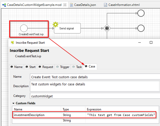
Map parameters to process data:
Result: