Task item details
TaskItemDetails is a built-in component of Portal which contains the case info which users can interact with. In order to show needed task’s information, Portal supports overriding concept for TaskItemDetails.
Each TaskItemDetails contains
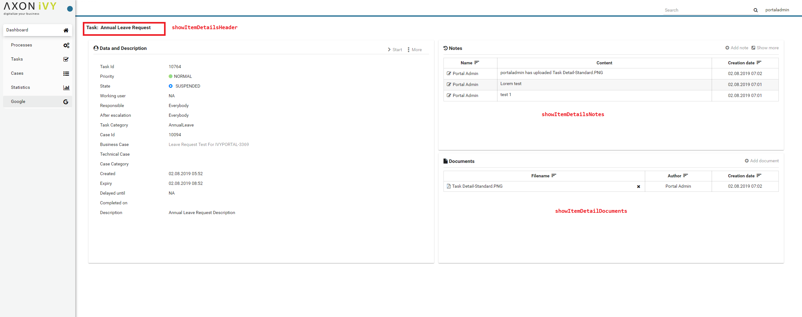
showItemDetailsHeader
showItemDetailsNotes
showItemDetailDocuments
TaskItemDetail custom panel: taskItemDetailCustomPanelTop, taskItemDetailCustomPanelBottom
Important
Task Data and Description box always display, we cannot override the content or hidden/show (they stay where they are)
How to custom Task item details UI
Refer to PortalExamples project for examples.
Introduce an Axon Ivy project which has
PortalTemplateas a required library.To customize task item detail, you must customize Portal Home first. Refer to Customize Portal home to set new home page.
Copy the
PortalStartprocess fromPortalTemplateto your project. Point PortalHome element to your custom home page in previous step. This process is new home page and administrator should register this link by Portal’s Admin Settings.Custom the Task item details:
Introduce a new HTMLDialog which uses template
/layouts/PortalTaskDetailsTemplate.xhtml. You can take a look atPortalTaskDetails.xhtmlto see how to customize it.Tip
Highly recommend to copy the
PortalTaskDetailsHTMLDialog in PortalTemplate. Removeui:removeand change the copied one’s view.Use Axon Ivy Override to override the
OpenPortalTaskDetailcallable. The original implementation of this callable is callingPortalTaskDetails, change it to call the customized Page introduced in the step above. The signature of this callable iscall(ITask)and customized page must receive thisITaskinstance, put in the dialog’sDatawith the exact nametaskData.
After previous steps, you can override Task item details UI elements as shown/hidden element by keywords:
To show/hide, please using
showItemDetailsHeader,showItemDetailsNotes,showItemDetailDocumentscode. For more details, please refer to Show/Hide components.And to add a new elements, please refer to Add new Custom panel code
Show/Hide components by keywords
Refer to the ui tag list in PortalTaskDetails.xhtml of
PortalTemplate. In case, we want to show/hide any elements on
TaskItemDetails, we should override value of ui:param
List valid parameters:
ui:param name="showItemDetailsHeader" value="true"To show/hide Task header, by default it’s true.
ui:param name="showItemDetailsNotes" value="true">To show/hide Task Notes component, by default it’s true.
ui:param name="showItemDetailDocuments" value="true"To show/hide Task Documents component, by default it’s true.
Add new Custom panel
Refer to the taskItemDetailCustomPanel* section in
PortalTaskDetails.xhtml of PortalTemplate.
We need to define the
ui:definewith the valid name such astaskItemDetailCustomPanelTopandtaskItemDetailCustomPanelBottom.The
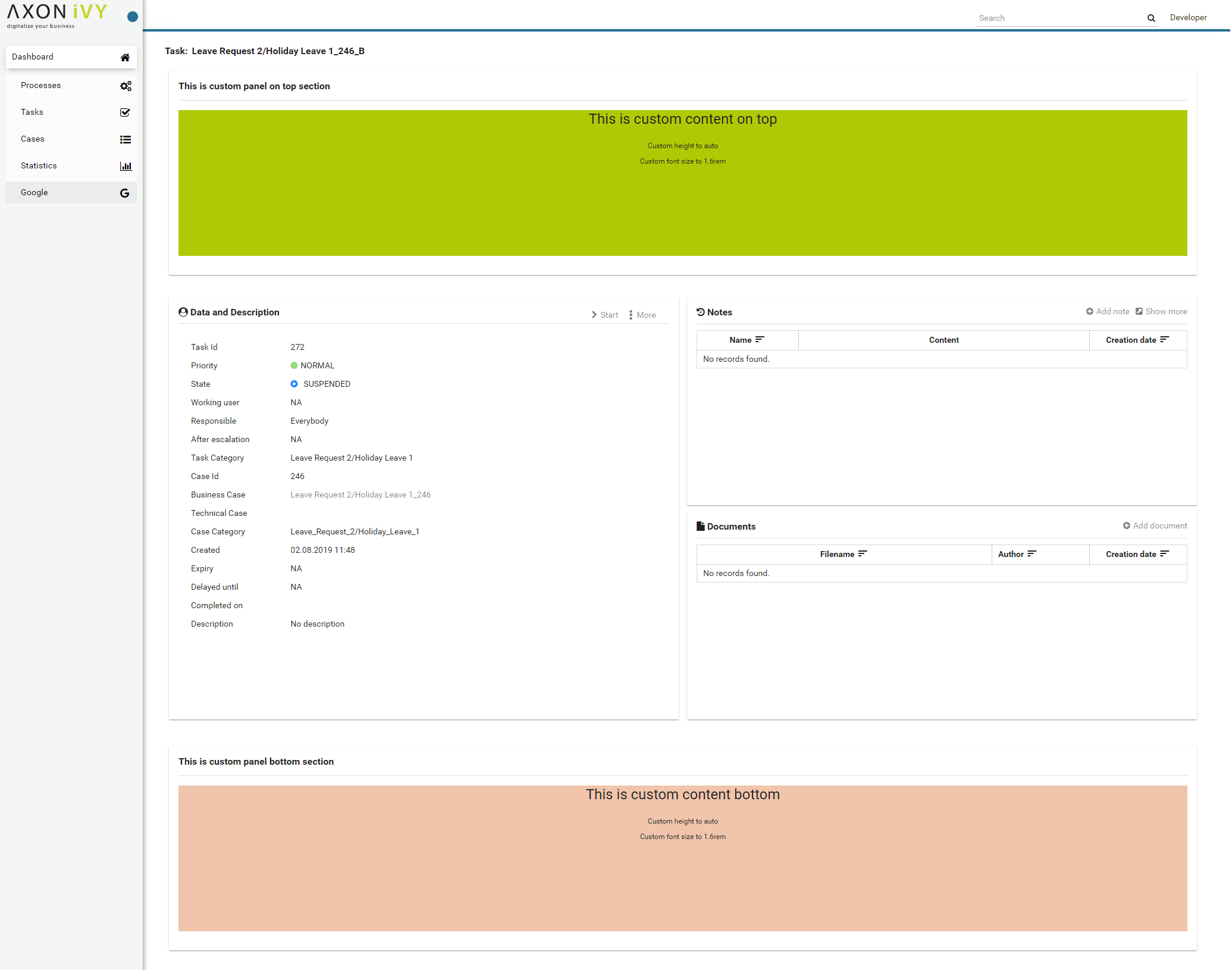
taskItemDetailCustomPanelTop: will be shown on the top of the componentThe
taskItemDetailCustomPanelBottom: will be shown on the bottom of the componentAdd your custom code into that tag
Finally, your custom panel will be displayed inside of TaskItemDetails page
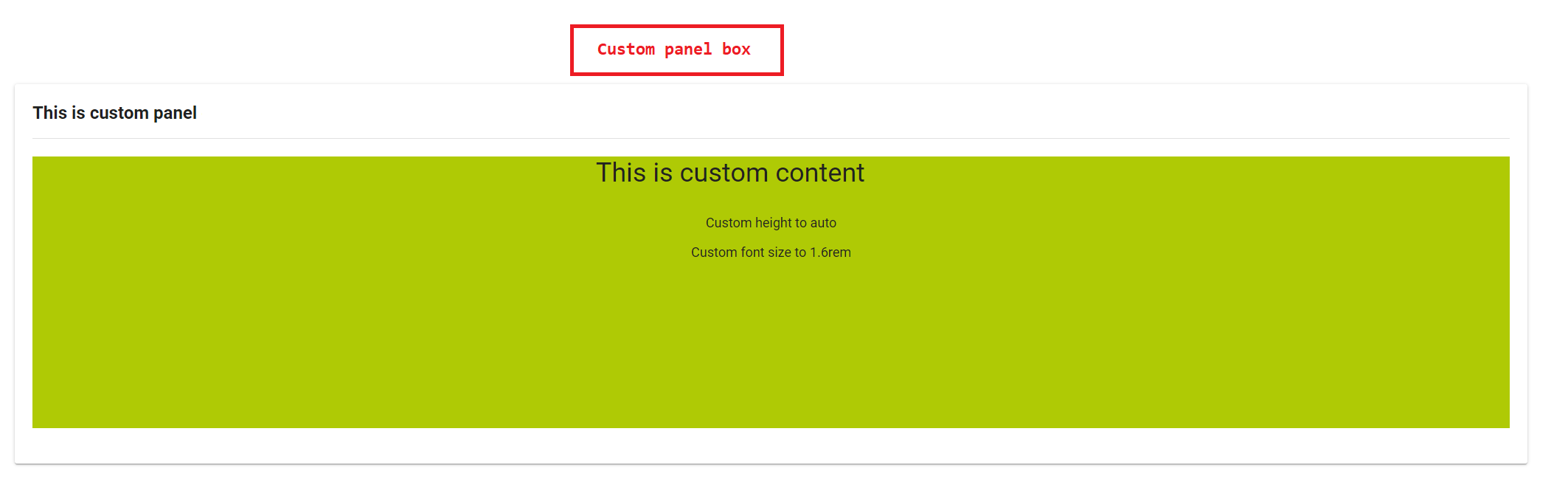
Below is example code for override custom panel box of task details
<!-- In this HTML dialog, we override task list header, task header, task filter, and task body -->

<ui:composition template="/layouts/PortalTaskDetailsTemplate.xhtml">
<ui:param name="task" value="#{data.task}" />
<ui:param name="dataModel" value="#{data.dataModel}" />
<ui:param name="portalPage" value="#{data.portalPage}" />
<ui:param name="isFromTaskList" value="#{data.isFromTaskList}" />
<ui:param name="isTaskStartedInDetails" value="#{data.isTaskStartedInDetails}" />
<ui:define name="title">#{ivy.cms.co('/Labels/TaskItemDetail')}</ui:define>

<!-- To show/hidden any sections of Task detail, you can turn true/false for below parameters -->
<!-- To show the Header component inside Task details body. By default it's true -->
<ui:param name="showItemDetailsHeader" value="true" />
<!-- To show the Notes component inside Task details body. By default it's true -->
<ui:param name="showItemDetailsNotes" value="true" />
<!-- To show the Documents component inside Task details body. By default, it's true -->
<ui:param name="showItemDetailDocuments" value="true" />


<!--!!!!!!!!!!!!!!!!!!!!!!!!!!!!!!!!!!!!!!!!!!!!!!!!!!!!!!!!!!!!!!!!!!!!!!!!!!!!!!!!!!!!!!!!!!!!!!!!!!!!!!!!!!!!!!!!!!!!!!!!!!!!!!!
!!!!!!!!!!! TO ADD YOUR CUSTOMIZATION CODE ON THE TASK DETAILS PAGE, WE PROVIDE 2 SECTIONS AS BELOW HELP YOU CAN DO IT !!!!!!!!!!!!
!!!!!!!!!!!!!!!!!!!!!!!!!!!!!!!!!!!!!!!!!!!!!!!!!!!!!!!!!!!!!!!!!!!!!!!!!!!!!!!!!!!!!!!!!!!!!!!!!!!!!!!!!!!!!!!!!!!!!!!!!!!!!!!!-->
<!-- Add a content as a Custom panel for Task Detail on top section -->

<!-- Add a content as Custom panel for Task Detail on top -->
<ui:define name="taskItemDetailCustomPanelTop">
      <h:panelGroup styleClass="ui-g-12 ui-sm-12 custom-task-panel">
      <div class="card card-w-title ">
      <div class="task-detail-section-title u-truncate-text">
            <h:outputText value="This is custom panel on top section" />
      </div>
      <div class="Separator" />

      <div class="custom-task-details-panel-top">
            <h1>This is custom content on top</h1>
            <p>Custom height to auto</p>
            <p>Custom font size to 1.6rem</p>
      </div>
      </div>
      </h:panelGroup>
</ui:define>

      <!-- Add content as Custom panel for Task Detail on bottom-->
<ui:define name="taskItemDetailCustomPanelBottom">
      <h:panelGroup styleClass="ui-g-12 ui-sm-12 custom-task-panel">
      <div class="card card-w-title #{cc.attrs.customPanelStyleClass}">
      <div class="task-detail-section-title u-truncate-text">
            <h:outputText value="This is custom panel bottom section" />
      </div>
      <div class="Separator" />

      <div class="custom-task-details-panel">
            <h1>This is custom content bottom</h1>
            <p>Custom height to auto</p>
            <p>Custom font size to 1.6rem</p>
      </div>
      </div>
      </h:panelGroup>
</ui:define>

<ui:define name="css">
      <h:outputStylesheet library="css" name="examples.css" />
</ui:define>
</ui:composition>
After applied above code to your custom page, the custom panel will display as below
Finally, we have a custom Task details page