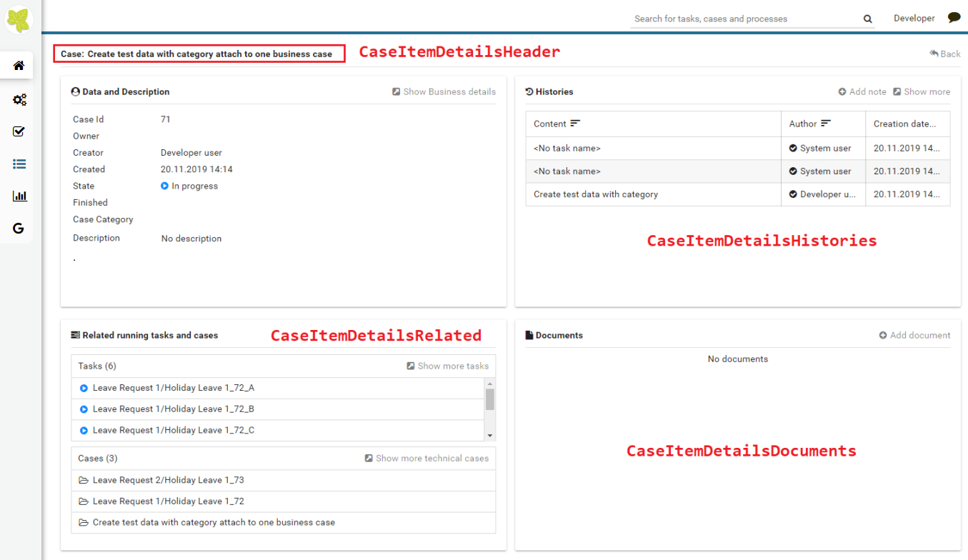
Case item details
CaseItemDetails is a built-in component of Portal which contains the case info which users can interact with. In order to show needed case’s information, Portal supports overriding concept for CaseItemDetails.
Each CaseItemDetails contains
CaseItemDetailsHeader
CaseItemDetailsRelated
CaseItemDetailsHistories
CaseItemDetailsDocuments
CaseItemDetail custom panel: caseItemDetailCustomTop, caseItemDetailCustomMiddle, caseItemDetailCustomBottom
Important
“Data and Description” panel always displays, we cannot override its content or hide/show this panel.
How to custom Case item details UI
Refer to PortalExamples project for examples.
Introduce an Axon Ivy project which has
PortalTemplateas a required library.To customize case item detail, you must customize Portal Home first. Refer to Customize Portal home to set new home page.
Copy the
PortalStartprocess fromPortalTemplateto your project. Point PortalHome element to your custom home page in previous step. This process is new home page and administrator should register this link by Portal’s Admin Settings.Custom the Case item details:
Introduce a new HTMLDialog which uses template
/layouts/PortalCaseDetailsTemplate.xhtml. You can take a look atPortalCaseDetails.xhtmlto see how to customize it.Tip
Highly recommend to copy the
PortalCaseDetailsHTMLDialog in PortalTemplate. Removeui:removeand change the copied one’s view.Use Axon Ivy Override to override the
OpenPortalCaseDetailscallable. The original implementation of this callable is callingPortalCaseDetails, change it to call the customized Page introduced in the step above. The signature of this callable iscall(ICase)and customized page must receive this ICase instance, put in the dialog’sDatawith the exact namecaseData.
After previous steps, you can override Case item details UI elements as shown/hidden element by keywords:
To show/hide, please using
showItemDetailsHeader,showItemDetailRelated,showItemDetailsHistories,showItemDetailDocumentsandshowItemBackButtoncode. For more details, please refer to Show/Hide components.And to add a new elements, please refer to Add new Custom panel code
Show/Hide components by keywords
Refer to the ui:param tag list in PortalCaseDetails.xhtml of
PortalTemplate. In case, we want to show/hide any elements on
CaseItemDetails, we should override value of ui:param
List valid parameters:
ui:param name="showItemDetailsHeader" value="true"To show/hide Case header, by default it’s true. You should set as false in case we set alwaysShowDetails for CaseItem.
ui:param name="showItemDetailsHistories" value="true"To show/hide Case Histories component, by default it’s true.
ui:param name="showItemDetailDocuments" value="true"To show/hide Case Documents component, by default it’s true.
ui:param name="showItemDetailRelated" value="true"To show/hide Case Related Tasks/Cases component, by default it’s true.
ui:param name="showItemBackButton" value="true"To show/hide Back button, by default it’s true.
Add new Custom panel
Refer to the caseItemDetailCustom* section in
PortalCaseDetails.xhtml of PortalTemplate.
We need to define
ui:definewith a valid name such ascaseItemDetailCustomTop,caseItemDetailCustomMiddleandcaseItemDetailCustomBottom.The
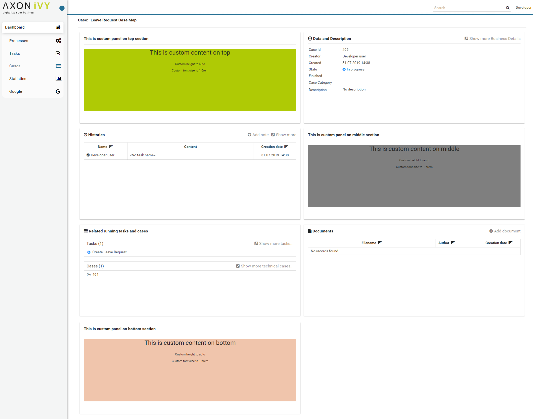
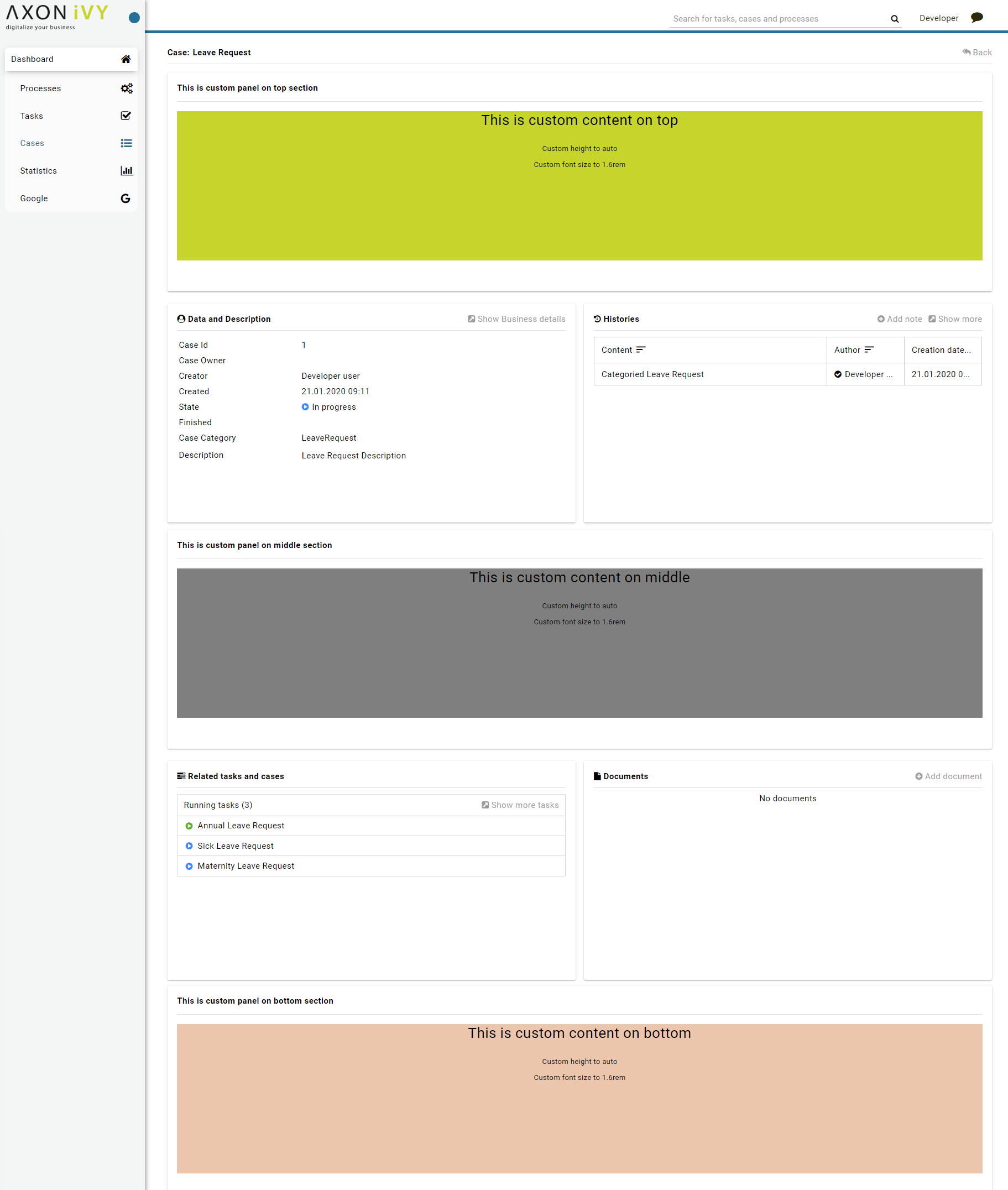
caseItemDetailCustomTop: will be shown on the top of the componentThe
caseItemDetailCustomMiddle: will be shown on the middle of the componentThe
caseItemDetailCustomBottom: will be shown on the bottom of the componentAdd your custom code into tags above.
Finally, your custom panel will be displayed inside of CaseItemDetails page.
Below is example code for override custom panel box of case details
<ui:composition template="/layouts/PortalCaseDetailsTemplate.xhtml">
<ui:param name="caseInfo" value="#{data.caseInfo}" />
<ui:param name="isShowBackButton" value="#{data.isShowBackButton}" />
<ui:param name="isTaskStartedInDetails" value="#{data.isTaskStartedInDetails}" />
<ui:define name="title">#{ivy.cms.co('/Dialogs/ch/ivy/addon/portalkit/component/CaseWidget/CaseDetail/CaseDetailTitle')}</ui:define>

<!--!!!!!!!!!!!!!!!!!!!!!!!!!!!!!!!!!!!!!!!!!!!!!!!!!!!!!!!!!!!!!!!!!!!!!!!!!!!!!!!!!!!!!!!!!!!!!!!!!!!!!!!!!!!!!!!!!!!!!!!!!!!!!!!
!!!!!!!!!!!!!!!!!!!!!! TO SHOW /HIDDEN ANY SECTIONS OF CASE DETAILS, YOU CAN TURN TRUE/FALSE FOR BELOW PARAMETERS !!!!!!!!!!!!!!!!!
!!!!!!!!!!!!!!!!!!!!!!!!!!!!!!!!!!!!!!!!!!!!!!!!!!!!!!!!!!!!!!!!!!!!!!!!!!!!!!!!!!!!!!!!!!!!!!!!!!!!!!!!!!!!!!!!!!!!!!!!!!!!!!!!-->
<!-- To show the header of case details. By default it's true -->
<ui:param name="showItemDetailsHeader" value="true" />
<!-- To show the Histories component inside Case details body. By default it's true -->
<ui:param name="showItemDetailsHistories" value="true" />
<!-- To show the Documents component inside Case details body. By default, it's true -->
<ui:param name="showItemDetailDocuments" value="true" />
<!-- To show the RelatedTask component inside Case details. By default, it's true -->
<ui:param name="showItemDetailRelated" value="true" />

<!--!!!!!!!!!!!!!!!!!!!!!!!!!!!!!!!!!!!!!!!!!!!!!!!!!!!!!!!!!!!!!!!!!!!!!!!!!!!!!!!!!!!!!!!!!!!!!!!!!!!!!!!!!!!!!!!!!!!!!!!!!!!!!!!
!!!!!!!!!!! TO ADD YOUR CUSTOMIZATION CODE ON THE CASE DETAILS PAGE, WE PROVIDE 3 SECTIONS AS BELOW HELP YOU CAN DO IT !!!!!!!!!!!!
!!!!!!!!!!!!!!!!!!!!!!!!!!!!!!!!!!!!!!!!!!!!!!!!!!!!!!!!!!!!!!!!!!!!!!!!!!!!!!!!!!!!!!!!!!!!!!!!!!!!!!!!!!!!!!!!!!!!!!!!!!!!!!!!-->
<!-- Add a content as a Custom panel for Case Detail on top section -->
<ui:define name="caseItemDetailCustomTop">
      <h:panelGroup styleClass="ui-g-12" layout="block">
      <div class="card card-w-title case-detail-card">
      <div class="case-detail-section-title u-truncate-text">
            <h:outputText value="This is custom panel on top section" />
      </div>
      <div class="Separator" />

      <div class="custom-task-details-panel-top">
            <h1>This is custom content on top</h1>
            <p>Custom height to auto</p>
            <p>Custom font size to 1.6rem</p>
      </div>
      </div>
      </h:panelGroup>
</ui:define>

<!-- Add a content as a Custom panel for Case Detail on middle section, below the General & description box -->
<ui:define name="caseItemDetailCustomMiddle">
      <h:panelGroup styleClass="ui-g-12" layout="block">
      <div class="card card-w-title case-detail-card">
      <div class="case-detail-section-title u-truncate-text">
            <h:outputText value="This is custom panel on middle section" />
      </div>
      <div class="Separator" />

      <div class="custom-task-details-panel-middle">
            <h1>This is custom content on middle</h1>
            <p>Custom height to auto</p>
            <p>Custom font size to 1.6rem</p>
      </div>
      </div>
      </h:panelGroup>
</ui:define>

<!-- Add a content as a Custom panel for Case Detail on bottom section -->
<ui:define name="caseItemDetailCustomBottom">
      <h:panelGroup styleClass="ui-g-12" layout="block">
      <div class="card card-w-title case-detail-card">
      <div class="case-detail-section-title u-truncate-text">
            <h:outputText value="This is custom panel on bottom section" />
      </div>
      <div class="Separator" />

      <div class="custom-task-details-panel">
            <h1>This is custom content on bottom</h1>
            <p>Custom height to auto</p>
            <p>Custom font size to 1.6rem</p>
      </div>
      </div>
      </h:panelGroup>
</ui:define>

<ui:define name="css">
      <h:outputStylesheet library="css" name="examples.css" />
</ui:define>
</ui:composition>
After applied above code to your custom page, custom panels will be displayed as below
Other example, we have a full flexibility page if we use
ui-g-*class to define the width of panelWe used
ui-g-6class to define width for 3 custom panels in the custom page below