Statistic Chart
Introduction
Portal offers an all-new statistic charts widget, designed to empower users with deeper insights into their tasks, cases, overall productivity and more customization capabilities.
How to use
To utilize the Statistic feature on the Dashboard Configuration, follow these steps:
Navigate to Dashboard Configuration of the dashboard where you want to add the widget and select Add Widget.
From the dropdown menu labeled Statistic Widgets, choose from a variety of insightful charts.
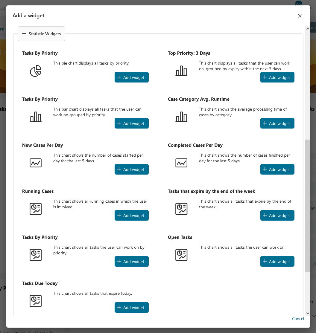
Available Standard Charts
Tasks By Priority
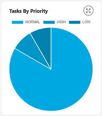
This pie chart displays all tasks by priority.
Chart type: Pie
Top Priority: 3 Days
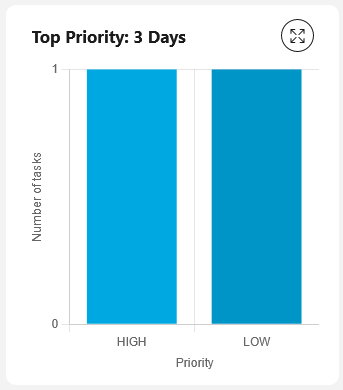
This chart displays all tasks that the user can work on, grouped by expiry within the next 3 days.
Chart type: Bar
Tasks By Priority
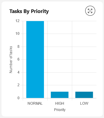
This bar chart displays all tasks that the user can work on grouped by priority.
Chart type: Bar
Case Category Avg. Runtime
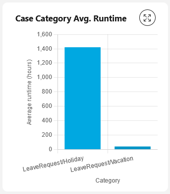
This chart shows the average processing time of cases by category.
Chart type: Bar
New Cases Per Day
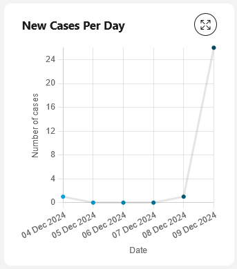
This chart shows the number of cases started per day for the last 5 days.
Chart type: Line
Completed Cases Per Day
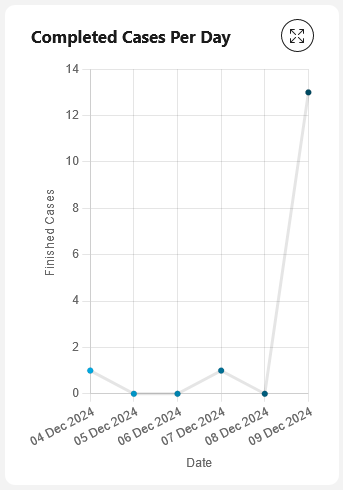
This chart shows the number of cases finished per day for the last 5 days.
Chart type: Line
Running Cases
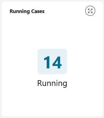
This chart shows all running cases in which the user is involved.
Chart type: Number
Tasks that expire by the end of the week
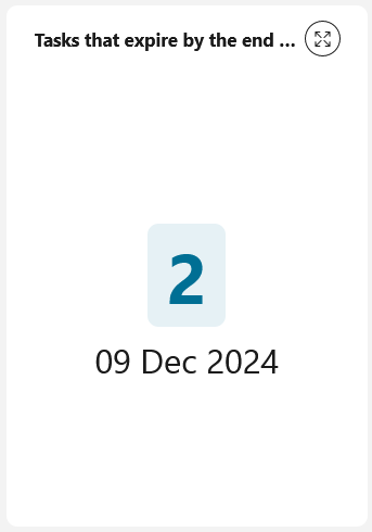
This chart shows all tasks that expire by the end of the week.
Chart type: Number
Tasks By Priority
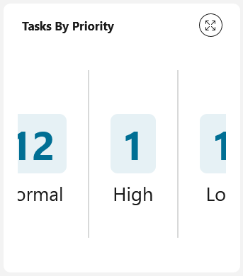
This chart shows all tasks the user can work on by priority.
Chart type: Number
Open Tasks
This chart shows all tasks the user can work on.
Chart type: Number
Tasks Due Today
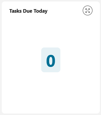
This chart shows all tasks that are due today.
Chart type: Number