Dashboard
Introduction
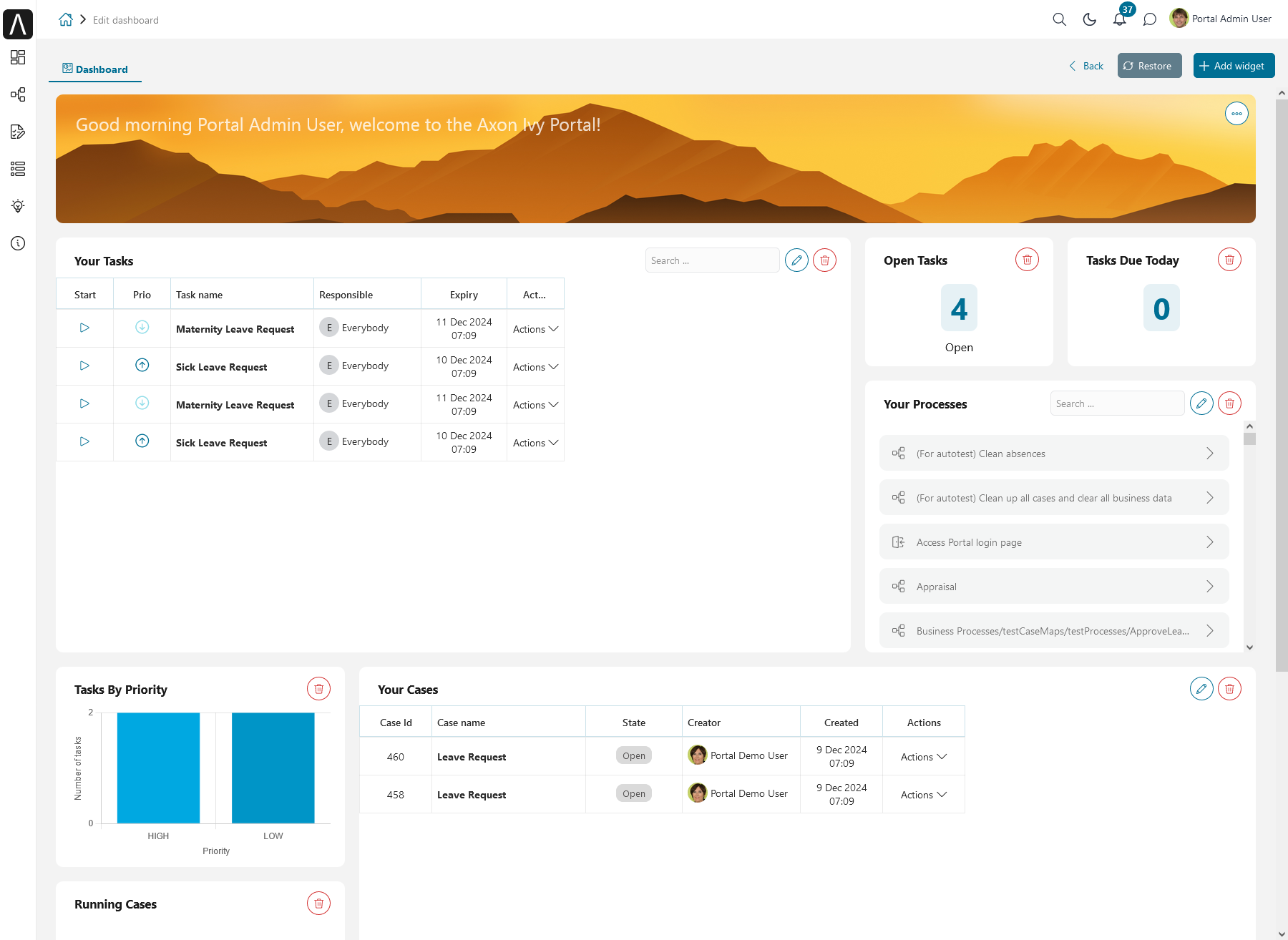
The Axon Ivy Portal Dashboard is the first page you encounter after successful login. You can always get back to the dashboard using the Dashboard link in the Axon Ivy Portal navigation menu. Alternatively, you can click on the logo image at the top left of the header.
The dashboard itself contains a set of widgets arranged on the page, according to the defined standards in your company.
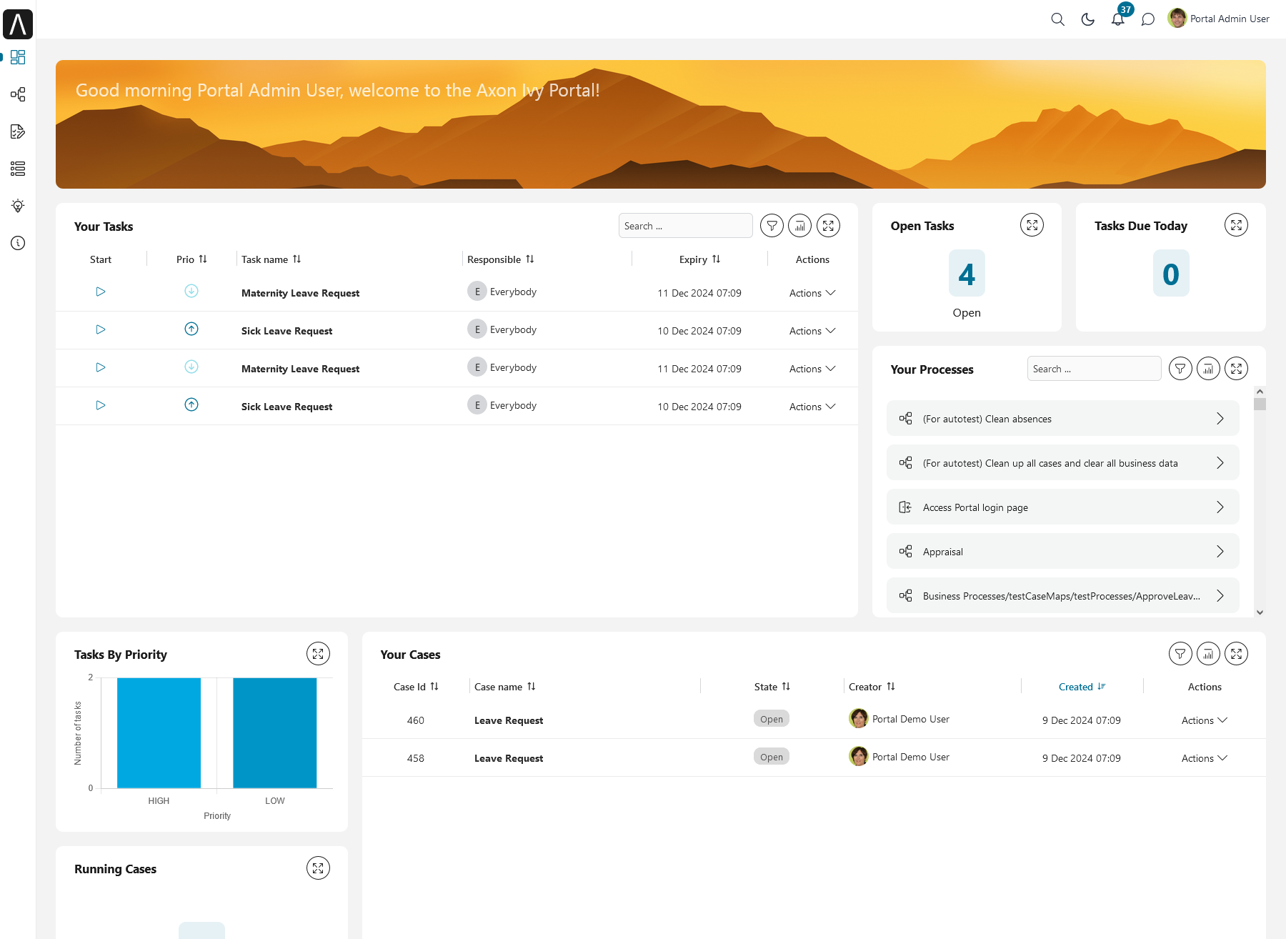
The following default widgets are available:
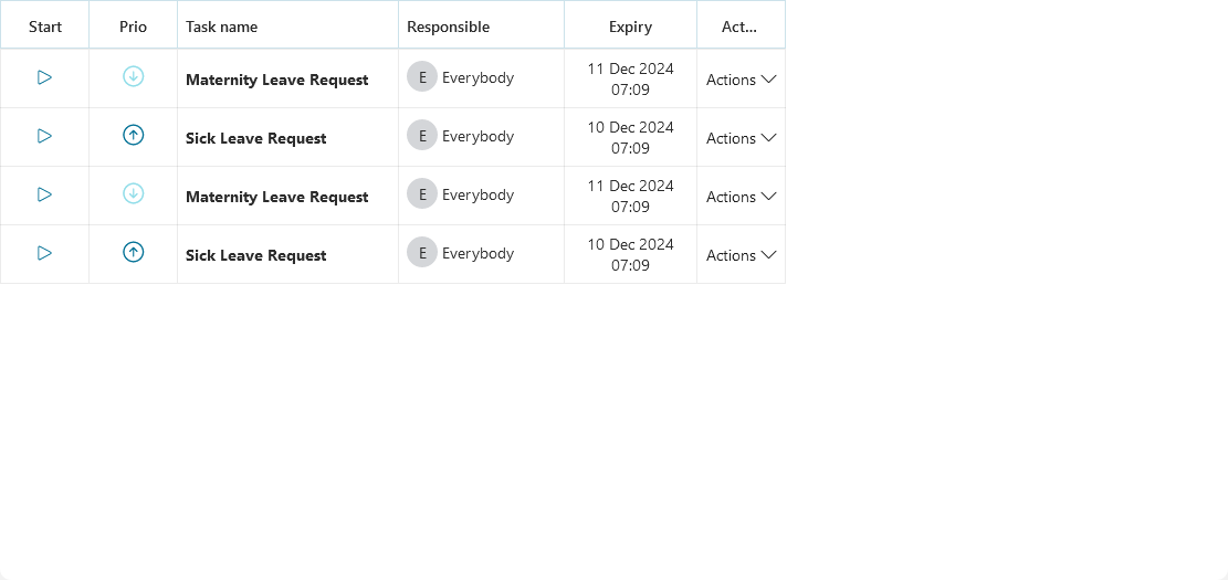
Task list widget: This widget displays relevant task information according to defined settings.
Case list widget: This widget displays relevant case information according to defined settings.
Process list widget: This widget displays available process starts. You can choose between different formats.
Process viewer widget: This widget provides a visual representation of the process flow.
Client Statistic chart widget: This widget provides graphical display of client statistical data.
Welcome widget: This widget greets the user based on the local time and enables a friendlier approach.
News feed widget: This widget shares relevant information as a News Feed into Axon Ivy.
External page widget: This widget displays an external webpage on your dashboard.
Notifications widget: This widget displays all Notifications based on your notification settings.
In addition, a developer can provide custom widgets to add relevant project information to your dashboard.
Task list widget, Case list widget, Process list widget (compact mode) have the following standard features:
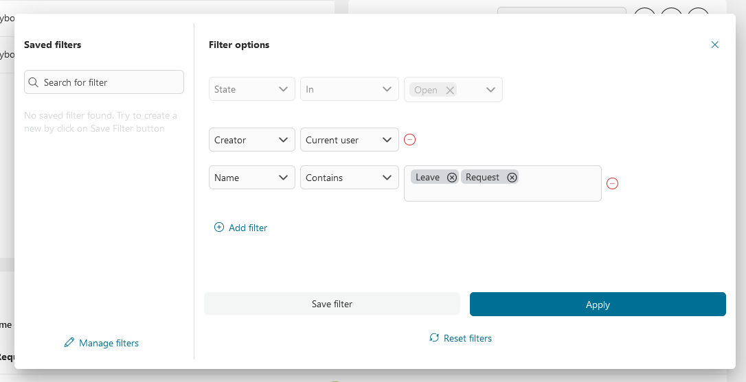
Saved filters and Filter options
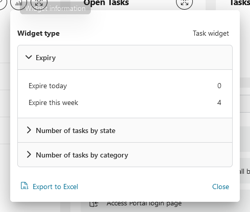
Widget information
If you have the permission, you can re-size, re-arrange, create, or delete widgets using Edit button in the upper right corner of your dashboard:
In edit mode, you can:
Move widgets using drag-and-drop: click on the widget you want to move and drop again. Helper lines will support you.
Edit existing widgets: open the configuration panel to edit widget by clicking on Edit button.
Delete existing widgets: the widget will be deleted.
Add new widgets: a wizard will guide you through creating and adding new widgets to your dashboard.
Reset to the standard dashboard: Do you want to undo your changes? Just reset to the default dashboard.
Resize column width (Task list/Case list widget): click on the gridlines of header which you want to resize, then drop again. Helper lines will support you.
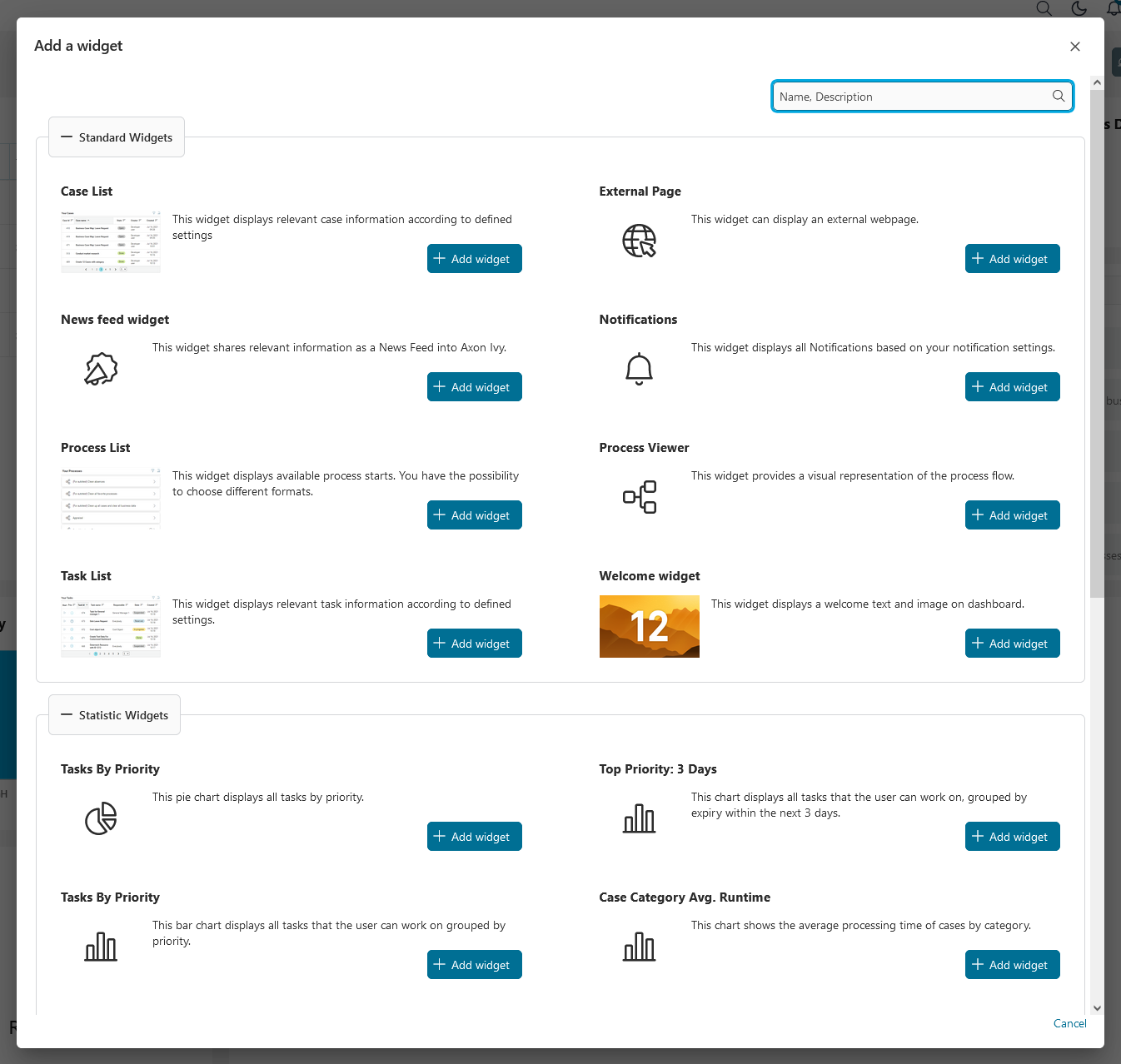
Add a new widget
To add a new widget in the edit mode, press on the + Add widget button and select one of the available widgets to add:
Task list widget
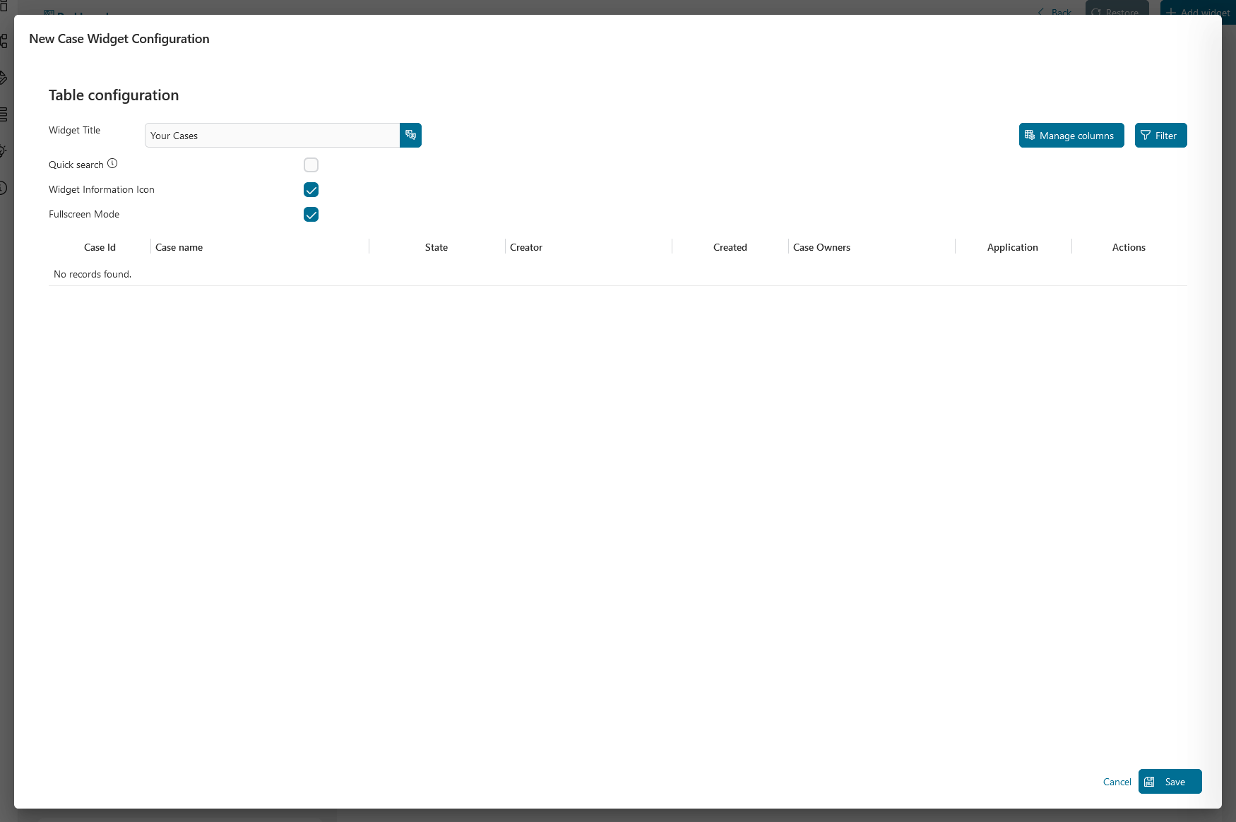
Adding a task list widget will give you total flexibility about what you want to see and how.
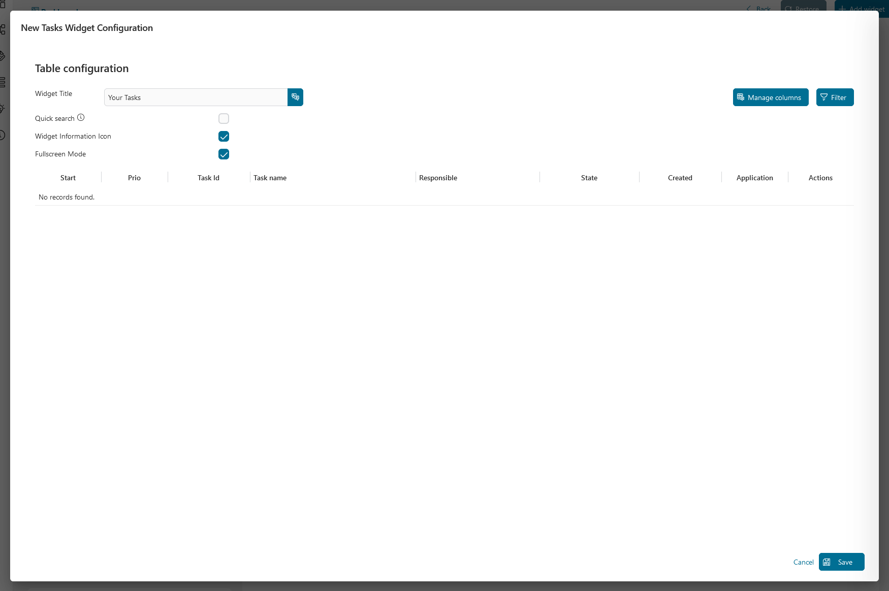
On the widget configuration panel, you can define the widget name, enable the quick search function, show or hide the widget information and fullscreen mode icons, manage columns and filters, edit the default sort order of the table columns by clicking on the column headers.
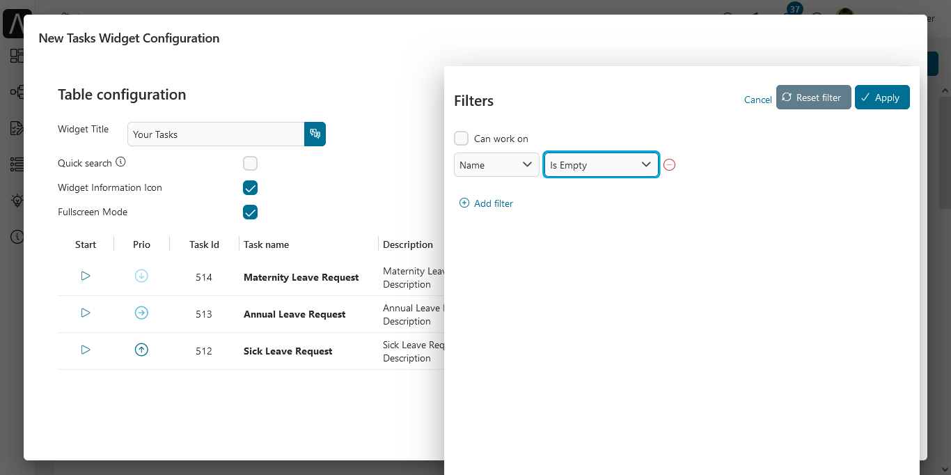
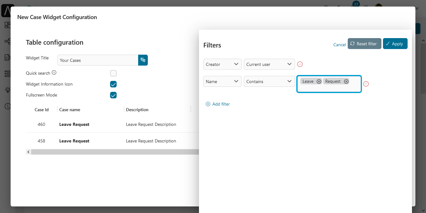
Filters panel
By clicking on the Filter button, you can configure the complex filter for your widget and get a preview of it by clicking on the Apply button. Please refer to Complex Filter for more details.
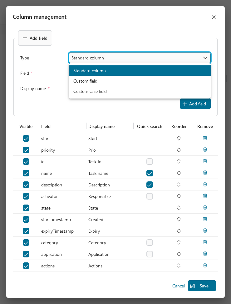
Column Management
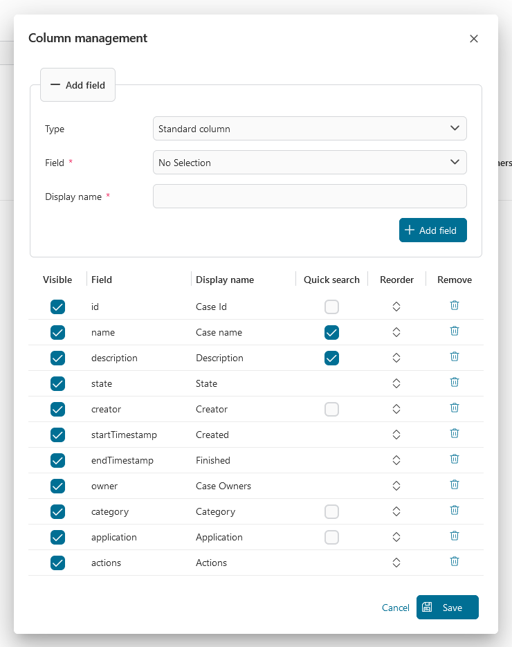
By clicking on the Manage Columns button at the top right of the configuration panel. You get the following dialog:
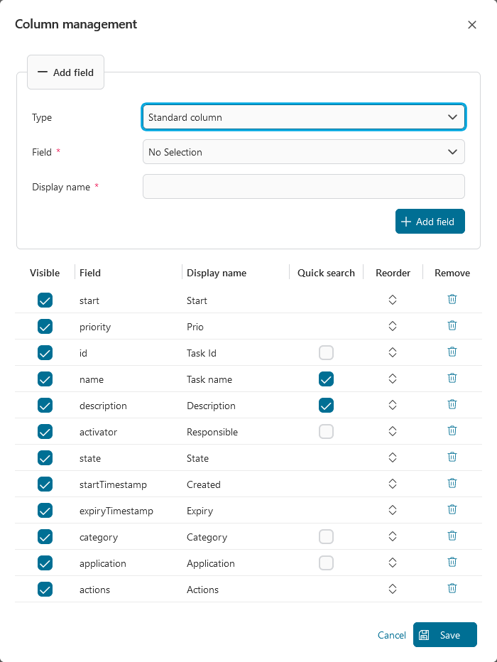
In the column management dialog, you find two sections to configure the table columns:
Add field section: add any available fields to your widget table
Columns section: configure the widget table itself as follows:
Enable visibility
Enable the quick search by selecting the quick search checkbox
Reorder the columns by drag and drop using the arrows
Remove columns
Important
The Quick search feature is supporting these fields:
Standard fields: Id, name, description, category, responsible (display name), and application.
Task custom fields: fields that have type
STRINGorTEXT.Case custom fields: fields that have type
STRINGorTEXT.Quick search is enabled for the standard field name and description by default.

Portal supports to display custom case fields within the task list.
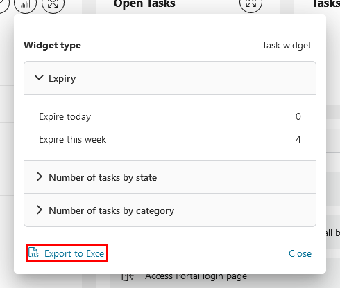
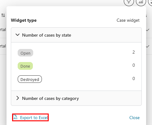
Excel export
In view mode, you can export all data of the task widget by clicking on the link Export to Excel at the bottom left corner of the widget information panel.
If the number of exported tasks exceeds the maximum row number of the Excel file, Portal will separate data into multiple Excel files and put them into a single zip file.
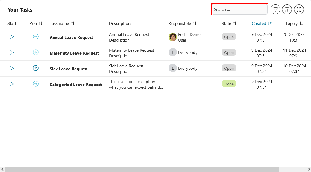
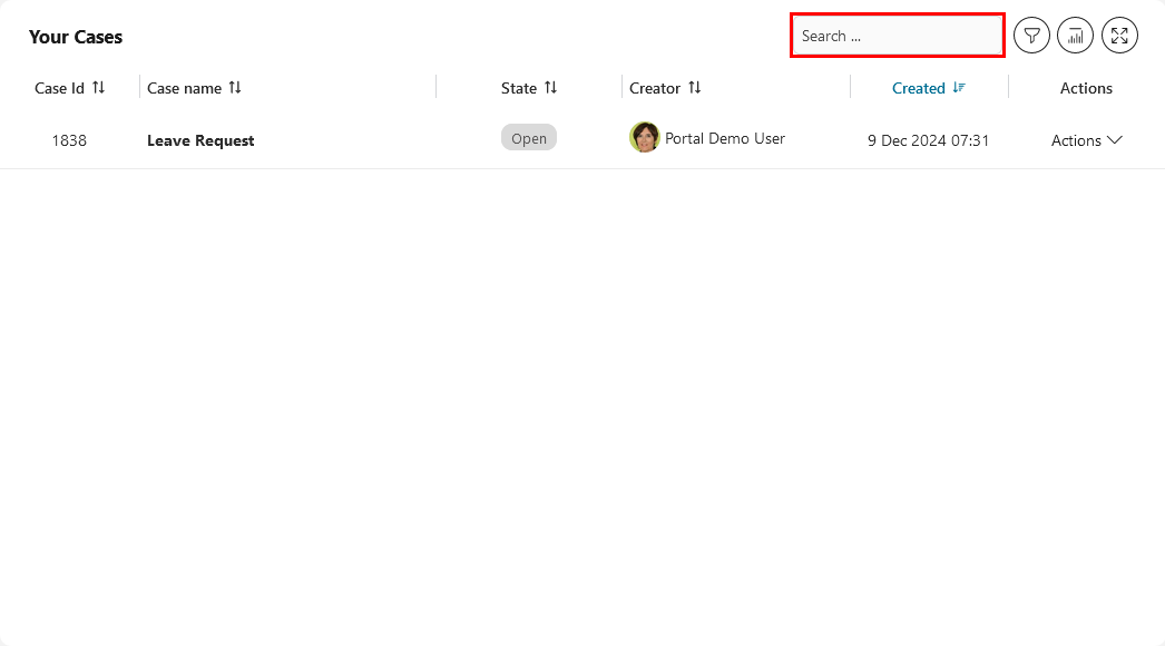
Quick search
In view mode, when quick search is enabled, a text box will appear to allow you to search.
Important
You can define the scope of the quick search feature in the configuration panel.
The result of the quick search function may be affected if you apply a complex filter on the widget.
Adjust column width
In edit mode, you can adjust the width of each column directly within the widget table.
You may also notice gridlines on the table which implemented by Portal to help you adjust the column widths more efficiently.
Important
If the total width of the columns is less than the widget’s width, the Portal will automatically adjust the column widths to match the widget’s width.
Case list widget
Adding a case list widget will give you total flexibility about what you want to see and how.
On the widget configuration panel, you can define the widget name, enable the quick search function, show or hide the widget information and fullscreen mode icons, manage columns and filters, edit the default sort order of the table columns by clicking on the column headers.
Filters panel
By clicking on the Filter button, you can configure the complex filter for your widget and get a preview of it by clicking on the Apply button. Please refer to Complex Filter for more details.
Column Management
By clicking on the Manage Columns button at the top right of the configuration panel. You get the following dialog:
In the column management dialog, you find two sections to configure the table columns:
Add field section: add any available field to your widget table
Columns section: configure the widget table itself as follows:
Enable visibility
Enable quick search by selecting the quick search checkbox
Reorder the columns by drag and drop using the arrows
Remove columns
Important
Quick search feature is supporting these fields:
Standard fields: Id, name, description, category, creator (display name), and application.
Custom fields: fields that have type
STRINGorTEXT.Quick search is enabled for the standard field name and description by default.
Excel export
In view mode, you can export all data of the case widget by clicking on the link Export to Excel at the end of the widget information panel.
If the number of exported cases exceeds the maximum row number of the Excel file, Portal will separate data into multiple Excel files and put them into a single zip file.
Quick search
In view mode, when quick search is enabled, a text box will appear to allow you to search.
Important
You can define the scope of the quick search feature in the configuration panel.
The result of the quick search function may be affected if you apply a complex filter on the widget.
Adjust column width
In edit mode, you can adjust the width of each column directly within the widget table.
You may also notice gridlines on the table which implemented by Portal to help you adjust the column widths more efficiently.
Important
If the total width of the columns is less than the widget’s width, the Portal will automatically adjust the column widths to match the widget’s width.
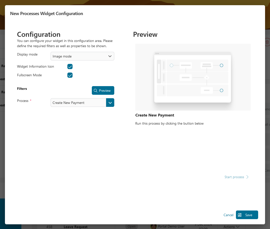
Process list widget
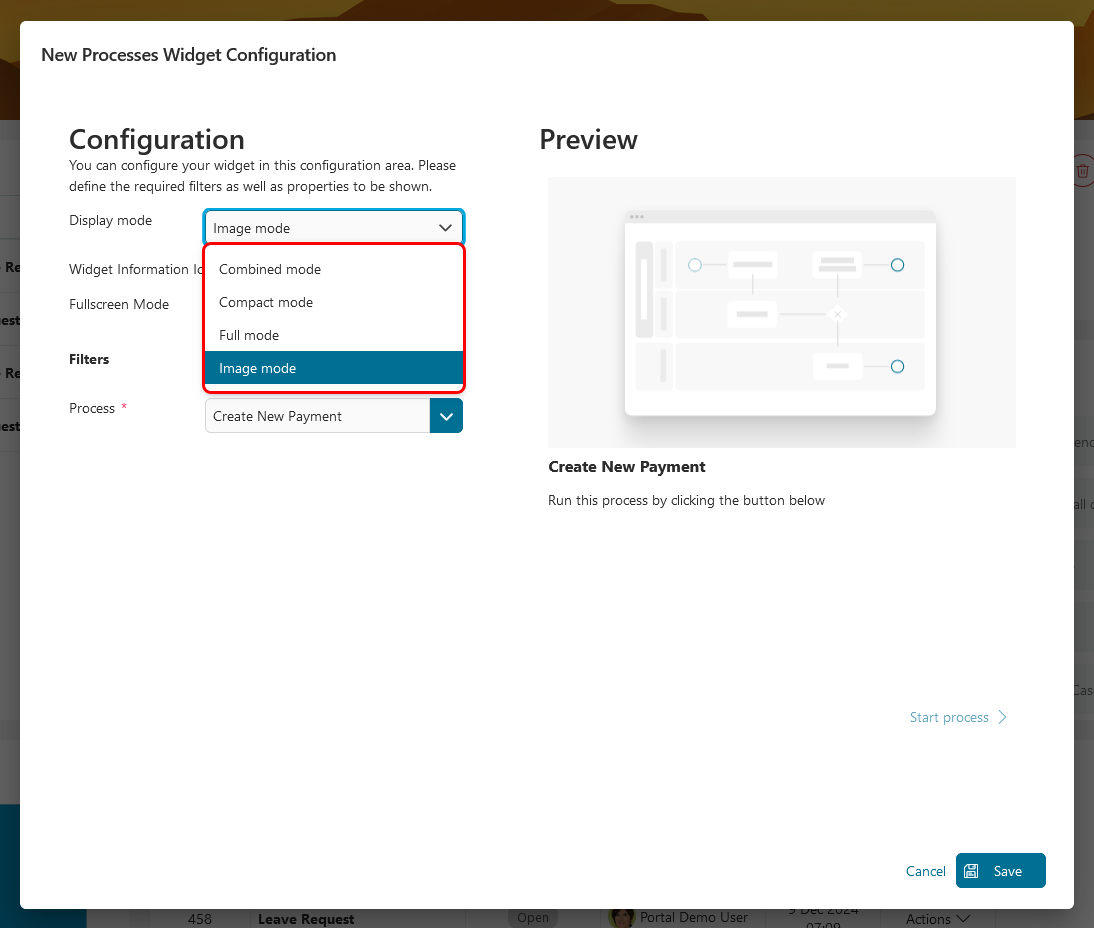
There are four process widget modes available:
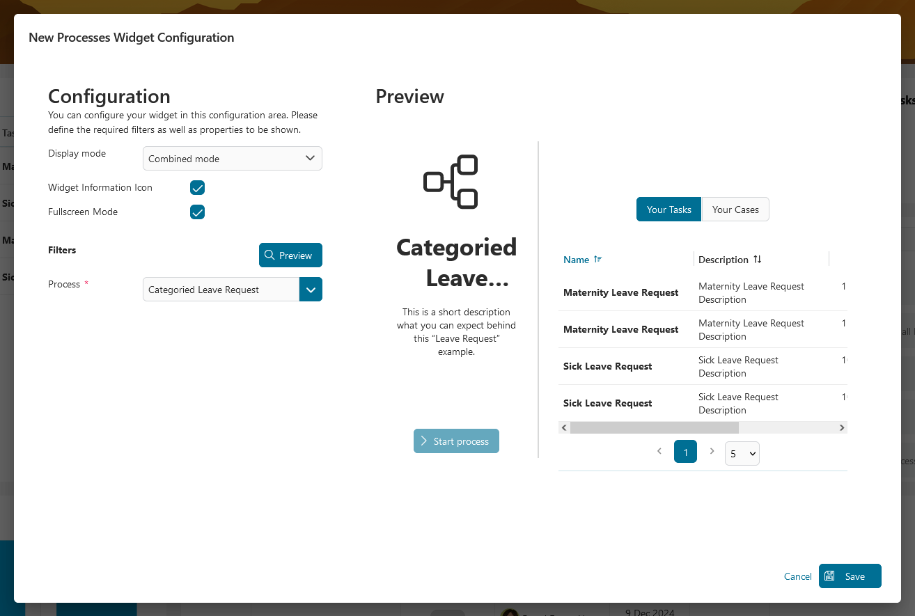
Combined mode
Compact mode
Full mode
Image mode
In the widget configuration, you can choose the display mode, show or hide widget information and fullscreen mode icons.
Combined mode
This widget displays the selected process start and all related cases and tasks combined in one single widget. This widget configuration will help you find tasks specifically to a particular process:
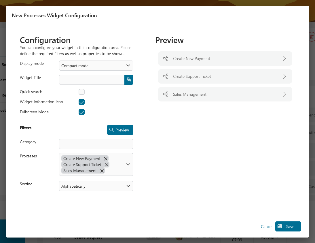
Compact mode
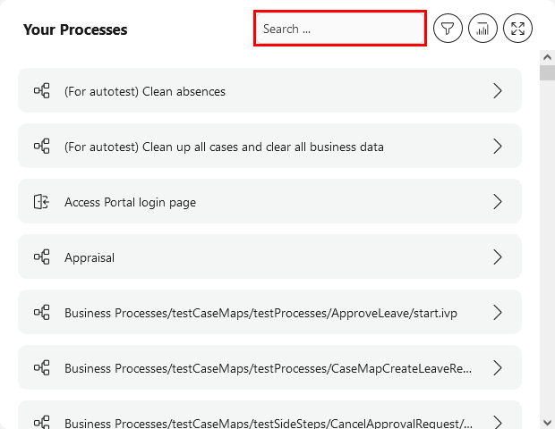
This widget displays a list of all selected process starts. You can sort your processes by index, alphabetical order or custom order. You can change your custom order by drag and drop the processes and enable quick search by selecting the quick search checkbox.
In view mode, when quick search function is enabled, a text box will appear to allow you to search.
Important
Quick search function can only be used when process widget mode is
Compact Mode.Quick search function supports searching by
process name.
Full mode
You can create a widget with a card layout including an icon for a single process.
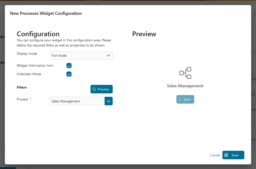
Image mode
You can create a widget with a card layout, including a nice picture for a single process.
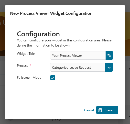
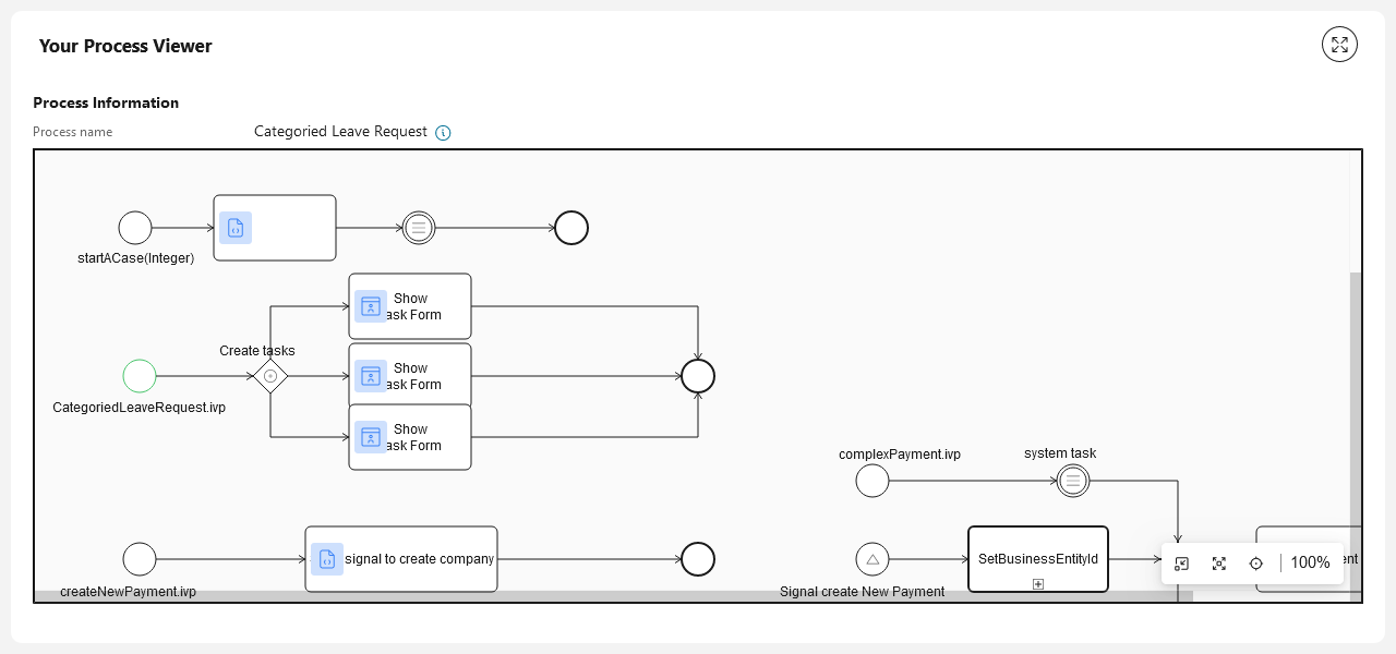
Process viewer widget
You can define the widget name and process to be displayed.
Configuration of a process viewer widget:
This is sample output of the widget configured above:
Statistic chart widget
Portal has deprecated the legacy statistic chart widget and now offers a wide range of new standard statistical charts. For more information, please refer to the Statistic Chart section.
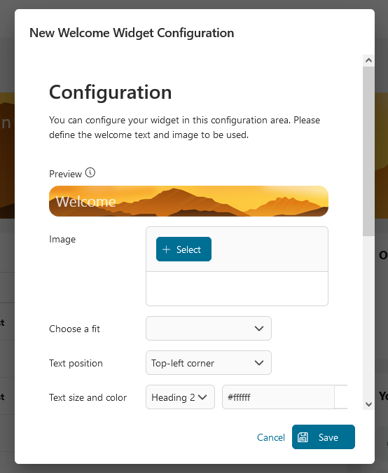
Welcome widget
You can define a welcome widget with a background image and a welcome text.
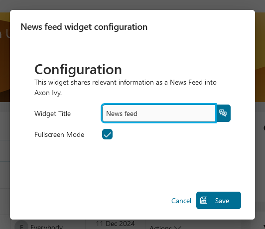
News feed widget
You can define a news feed widget to display all news entries to the user
Configuration of the news feed widget:
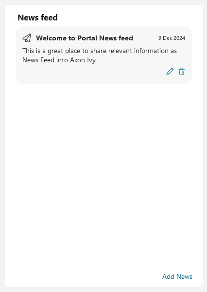
This is sample output of the widget configured above:
Manage news feed content
Note
Grant permission 🔑NewsManagement to allow a user to manage the content of the news feed.
If the user has permission, then the user can:
Add news message: add a new entry for the news feed by clicking Add News: button.
Edit news message: edit an existing entry for the list by clicking on the
 icon in the lower right corner of each entry.
Delete news message: delete entry directly from the list, by clicking on the
 icon in the lower right corner of each entry.
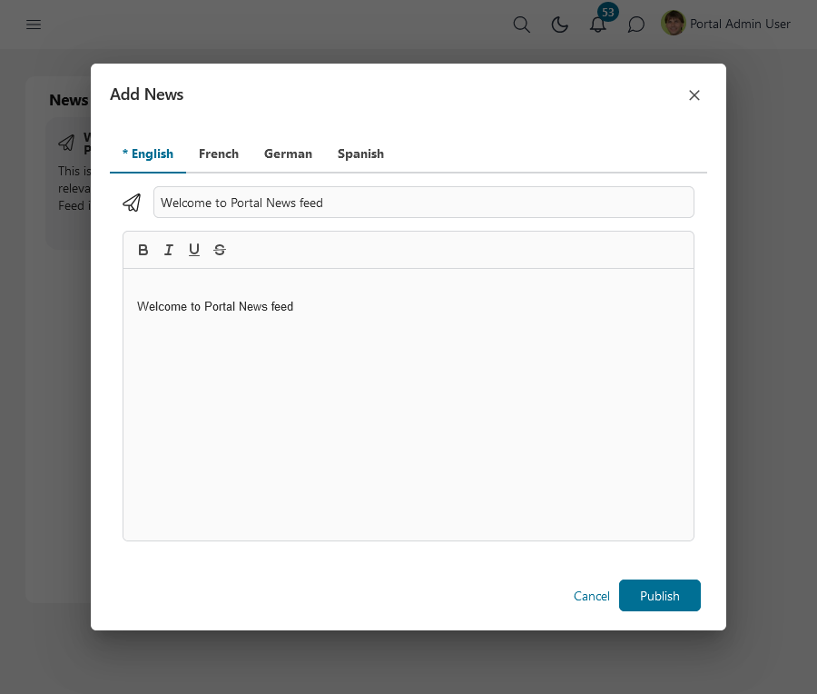
The Manage News dialog.
In manage news, the user can:
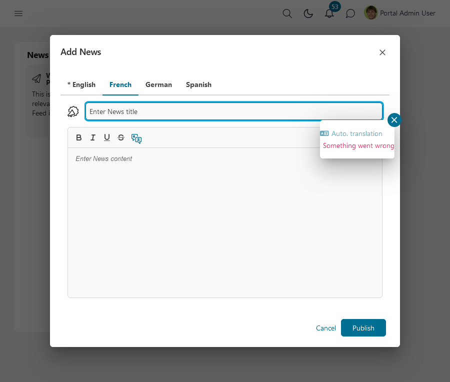
Create one entry in multiple languages. When creating the entry, the user can switch between the available languages with a click on the tab view header.
Translate the title by clicking on the input label. Translate the content by clicking on the
 icon. If you see something wrong with the translation, please prefer to HowTo: Enable the translation
Choose an icon for the news by clicking directly on the icon, the Icon browser browser will be shown.
Define the news title. Its length is limited to 200 characters.
Provide news content, i.e., the main information for the news feed. The content is limited to a maximum of 1,000 characters.
After setting up everything, simply click on the Share this dashboard link at the bottom of your dashboard to share it with colleagues.
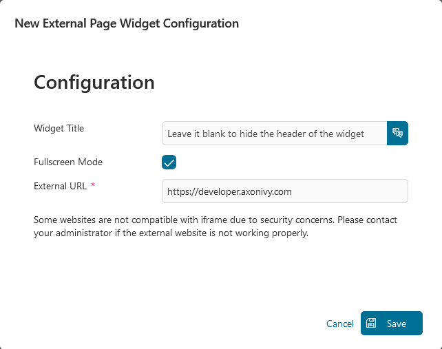
External page widget
You enter an URL to embed an external webpage into the Portal dashboard.
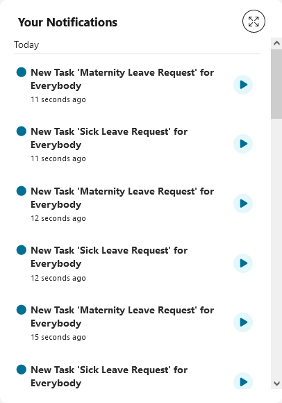
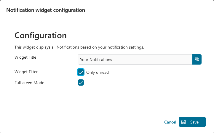
Notifications widget
You can define a Notifications widget to display all Notifications based on your notification settings.
This is the sample output of the widget configured above: