ユーザーの選択
概要
このコンポーネントは、ロール名のリストで定義されたユーザーのリストから 1 人のユーザーを選択するのに使用します。 ロール名のリストを定義していない場合は、すべてのユーザーがロードされます。 コンポーネントには、ラベル、オートコンプリート、そのオートコンプリート要素に関連するメッセージを表示する 1 つのメッセージ要素が含まれます。
使用方法
このコンポーネントは任意のページに挿入できます。以下の 2 つのスタイルでラベルを表示します。
デフォルトのスタイル

Code example:
<ic:com.axonivy.portal.components.UserSelection componentId="default-user-autocomplete"
   selectedUser="#{data.selectedUser}" label="Default user selection"
   isRequired="true" labelPanelStyleClass="ui-g-6 ui-md-6 ui-sm-12"
   autoCompleteStyleClass="width-100" autoCompletePanelStyleClass="ui-g-6 ui-sm-12" />
フローティングラベル
Code example:
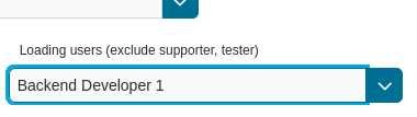
<ic:com.axonivy.portal.components.UserSelection componentId="all-user-autocomplete"
   hightlight="false" selectedUser="#{data.selectedUserForExcludingUsers}"
   label="Loading users (exclude gm1, gm2, admin)" autoCompleteStyleClass="width-100"
   autoCompletePanelStyleClass="ui-g-12 floating-label-margin-top"
   excludedUsernames="#{data.excludedUsernames}" floatingLabel="true" />
Tip
ユーザーの選択コンポーネントのオートコンプリート要素を使用して、子イベントや Ajax イベントを挿入できます( UserSelection.xhtml を参照)。
UserSelection コンポーネントの任意の子は、 insertChildren タグの位置にあるこのオートコンプリートにリペアレントされます。
また、Ajax イベントを入れ子にできるように、 event という名前のオートコンプリートのファセットを導入します。
例:
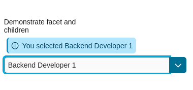
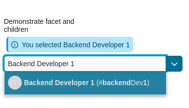
「<氏名> (<ユーザー名>)」という形式のドロップダウンリストでユーザーを表示します。 ユーザーを選択すると、メッセージが表示されます。
<ic:com.axonivy.portal.components.UserSelection id="item-select-event-component"
   componentId="item-select-event-for-user-selection" floatingLabel="true"
   fromRoleNames="#{data.definedRoleNames}" label="Demonstrate facet and children"
      selectedUser="#{data.selectedUserForInsertChildren}"
   autoCompleteStyleClass="width-100"
   autoCompletePanelStyleClass="ui-g-12 floating-label-margin-top" hasCustomizedSelectionList="true">
      <p:column>
         <pc:securityMemberNameAndAvatar displayName="#{user.getDisplayName()} (#{user.getMemberName()})" securityMember="#{user}" isStandAlone="false" />
      </p:column>
      <f:facet name="event">
         <p:ajax event="itemSelect" listener="#{logic.showSelectedUser}"
            update="#{p:component('item-select-event-for-user-selection-message')}"/>
      </f:facet>
</ic:com.axonivy.portal.components.UserSelection>
詳細については、 portal-components-examples プロジェクトの UserSelectionExample.xhtml を参照してください。
このコンポーネントには以下の属性が用意されています。
Name |
Default |
Type |
Description |
|---|---|---|---|
fromRoleNames |
null |
List<String> |
User list will be generated based on this list. If empty, all users will be loaded. |
componentId |
user-selection |
String |
Id of user autocomplete. |
selectedUser |
null |
UserDTO |
Required input and output value for selected user. |
excludedUsernames |
null |
List<String> |
Users to be excluded from user selection. This is applied if you use the default completeMethod. |
requiredMessage |
This field is required |
String |
Message to be displayed when user autocomplete validation fails. |
forceSelection |
true |
Boolean |
If true, only accepts user from the list. |
minQueryLength |
1 |
Boolean |
N”umber of characters to be typed before starting to offer autocomplete.” |
completeMethod |
completeUser |
Method Expression |
Method for user autocomplete. |
isDisabled |
false |
Boolean |
If true, disable User Selection. |
isRequired |
false |
Boolean |
If true, User Selection is required. |
isReadOnly |
false |
Boolean |
If true, User Selection cannot be changed. |
isRenderedMessage |
true |
Boolean |
If true, message for user field is rendered. |
hightlight |
true |
Boolean |
If true, highlight the first suggested user automatically. |
floatingLabel |
false |
Boolean |
If true, display label with floating style and labelPanelStyleClass can’t be applied. |
autocompleteStyleClass |
null |
String |
Style class of user autocomplete. |
autoCompletePanelStyleClass |
null |
String |
Style class of user autocomplete panel. |
inputStyleClass |
null |
String |
Style class of user autocomplete input. |
labelPanelStyleClass |
null |
String |
Style class of label panel. |
labelStyleClass |
null |
String |
Style class of label. |
label |
null |
String |
Text of label for User Selection component. |
size |
null |
Integer |
Number of characters used to determine the width of the input element. |
messageStyleClass |
null |
String |
Style class of message. |
itemLabel |
displayName |
String |
Displayed text of selected user item and users in dropdown list. |
cache |
true |
Boolean |
If true, autocomplete caches search result list. |
moreText |
More… |
String |
The text shown in panel when the suggested list is greater than maxResults. |
queryDelay |
300 |
Integer |
Delay in milliseconds before sending a query to the server. |
maxResults |
100 |
Integer |
Maximum number of results to be displayed. |
scrollHeight |
400 |
Integer |
scrollHeight attribute of primefaces autocomplete. |
hasCustomizedSelectionList |
false |
Boolean |
If true, the customized selection list is displayed. |
isShowAvatarInSelectionList |
Boolean |
Boolean value to specify avatar showing. Set to true to show avatar.
The setting will detect Portal setting Portal.ShowAvatar as its default value, refer to HowTo: Update HowTo: Update Portal Settings for more details.
If the Portal setting is not available, defaults to true.
|
|
displayNameRenderedInSelectionList |
true |
Boolean |
If false, the name of security member in the selection list is hidden. |
displayNameInSelectionListStyleClass |
null |
String |
Style class of display name in the selection list |
selectionListContainerStyleClass |
null |
String |
Style class of item’s container in the selection list |
emptyMessage |
No results |
String |
Message to show when there’s no option in selection list. |
非推奨のユーザーの選択からの移行
HTML ファイルのコードを置き換えます。
ic:ch.ivy.addon.portalkit.component.UserSelectionをic:com.axonivy.portal.components.UserSelectionに置き換えてください。ch.ivy.addon.portalkit.dto.UserDTOをcom.axonivy.portal.components.dto.UserDTOに置き換えます。Note
データベースに
ch.ivy.addon.portalkit.dto.UserDTOクラスを格納した場合は、データベースを手動で更新する必要があります。