Accessibility
Why is Accessibility Important?
In today’s digital landscape, ensuring that front-end UIs are accessible to all users is not just a nice-to-have — it’s essential. At Axon Ivy, we recognize the importance of making our portal available to everyone, regardless of their abilities or disabilities. With this in mind, we’ve put significant thought into enhancing the accessibility features within the Axon Ivy Portal. This is only the beginning, and we are committed to continually improving these features. To ensure the highest quality, we have used tools such as the Microsoft Lighthouse Accessibility Checker and adhered to the guidelines of the WCAG 2.1 standard to evaluate and refine our UI.
Accessibility Approach in the Axon Ivy Portal
We have taken a comprehensive approach to accessibility, addressing the most crucial aspects to create a more inclusive experience. Below are the key areas where we have evaluated and implemented improvements.
Contrast
The contrast between text, buttons, and background elements is vital for users with visual impairments. We have optimized the UI for both Dark Mode and Light Mode in line with the contrast ratios set by WCAG 2.1 standards. This ensures that all components — buttons, widgets, and backgrounds — meet the necessary contrast thresholds to enhance visibility and readability.
Zoom Capabilities
We have revamped the zoom functionalities for both desktop and mobile versions of the portal. Users can now easily zoom in and out while maintaining the clarity and usability of the UI, ensuring accessibility for users who require larger text and images to interact comfortably with the portal.
Keyboard Navigation
We have introduced basic keyboard shortcuts to streamline the user experience in the portal, enabling users to quickly and effortlessly navigate between the main sections:
Alt + 1: Jump to the Dashboard.
Sub-navigation in the Dashboard: If multiple dashboards are available in the navigation bar, users can use the Tab key to cycle through them. Once the desired dashboard is highlighted, pressing Enter will open it.
Alt + 2: Jump to the Process section.
Alt + 3: Jump to the Task section.
Alt + 4: Jump to the Case section.
Alt + 5: Jump to the Statistics section.
Alt + 6: Jump to the Search section.
Alt + 7: Jump to User Settings.
Advanced Features
Task Widget Navigation
You can also use Task widget navigation to jump directly to the pop-ups for canceled tasks.
You can also navigate to the actions within the widget
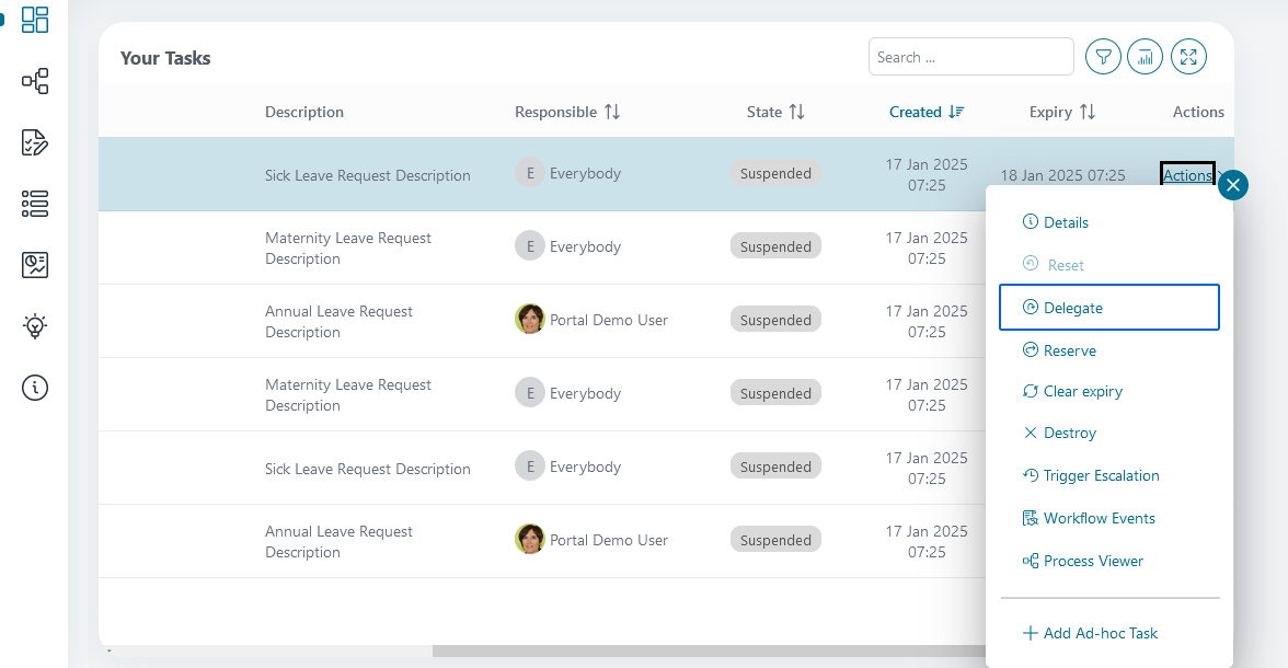
By pressing the Tab key, the focus can be set to the actions of a task. Once you are in the desired row, pressing Enter will open the context menu. You can then use the keyboard shortcut again to navigate through the menu. The Esc key can be used to exit the context menu at any time.
Case Widget Navigation
With the Case widget navigation, you can also navigate into the actions of a case.
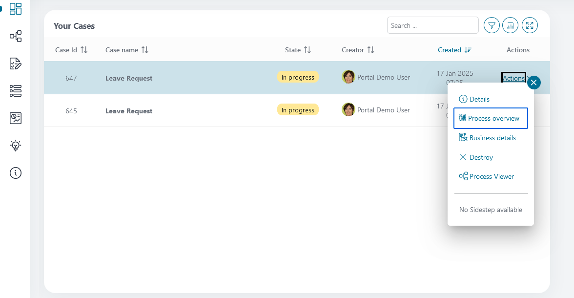
Press the keyboard shortcut to focus on the case, then press Enter to open the context menu. You can navigate through it by pressing the shortcut again, or exit the menu by pressing Esc.
Browser & Keyboard Compatibility
These shortcuts are available in Chrome, Firefox, and Edge and work seamlessly with European, Asian, and American keyboard layouts.
Extended Descriptive Elements in the Task and Case List
To improve navigation and accessibility in the portal, we have not only implemented shortcuts for quick access to processes, tasks, and cases, but also added more descriptive elements to the widgets. These enhancements provide a clearer and more detailed display of key information, ensuring optimal support for screen readers.
Support for the Microsoft Narrator Screen Reader
We rely on Microsoft Narrator to support screen readers. You can activate it via the keyboard shortcut Ctrl + Windows key + Enter. This ensures that users with visual impairments can easily navigate through the portal and understand the information provided.
Descriptive Elements in the Task Widget
The shortcut activates the first highlighted element in the task list, which then reads out the following information.
Task Name: The name or title of the task.
Priority: The priority level of the task (e.g., High, Medium, Low).
Status: The current status of the task (e.g., In Progress, Completed, Open).
Expiry Date: The due date of the task.
When a user focuses on the first task element using a keyboard shortcut, the screen reader reads the information in the following format: “Task Start - Task Name: <task name> - Priority: <priority> - Status: <status> - Expiry Date: <expiry date>.”
Descriptive Elements in the Case Widget
In the case list, additional information is also integrated into the highlighted action field:
Case Name: The name or title of the case.
State: The current state of the case (e.g., Open, Done, Deleted).
Created On: The creation date of the case.
Finished On: The completion date of the case.
Owner: The current owner of the case.
When a user jumps to the first case element using a shortcut, the screen reader reads the information in the following format: “Case Name: <case name> - State: <state> - Created On: <creation date> - Finished On: <finish date> - Owner: <owner name>.” If the selected task or case is not in the “Completed” state, all relevant details are read aloud to inform the user of the current status.
Language Support for Screen Readers
To ensure screen readers function correctly, we have incorporated language settings directly into the HTML page element. These settings respect the user’s language preferences, allowing the screen reader to read the content in the user’s preferred language. These adjustments ensure full accessibility for visually impaired users and greatly enhance their experience with the portal.
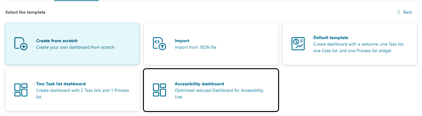
Accessibility Dashboard Templates
To further enhance usability, we have created an Accessibility Dashboard that simplifies navigation for users with disabilities. This dashboard features a dedicated element that displays available shortcuts. When the screen is opened, this element is automatically focused and read aloud by the screen reader. Each time the dashboard is accessed, the shortcuts are read aloud to ensure accessibility.
Additionally, we have enriched the task and case elements with metadata such as name, assignee, and other relevant details. These are included as descriptive elements, allowing screen readers to provide immediate feedback upon focusing on these items.
Integrating the Accessibility Dashboard
You can easily integrate this feature by selecting the “Accessibility Dashboard” template when creating a dashboard.
The dashboard contains the following elements:
A Shortcuts Widget that displays and reads the available shortcuts aloud via a screen reader.
A Process List Widget to display the ongoing processes.
A Task List Widget to show tasks.
A Case List Widget for managing cases.
These widgets are optimized for use with accessibility features and for displaying them on the dashboard.
Adding the Shortcut Widget to any Dashboard
The Shortcut Widget can also be integrated into any other dashboard. Follow these steps:
Create a custom dashboard widget.
Select the widget type: “Custom Dashboard Widget”.
Choose the Accessibility Shortcut Widget.
Add it to the screen.