Additional Components
Deprecated Process History
Introduction
This component is deprecated since version 8.0.27, use Process History of
portal-componentsproject instead.This component is a lazy loading list which displays all business cases of a business entity in your application. You can include this component everywhere:
In a page
In a dialog
How to use
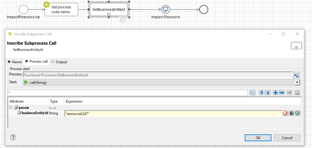
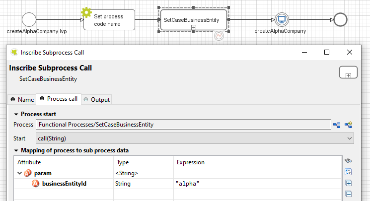
First you need to link the cases to the business entity. Call the
subprocess SetBusinessEntityId in the process which need to be
linked and input an identifier unique to your business entity. The
subprocess will set the id to the additional property
“CASE_BUSINESS_ENTITY_PROPERTY” of the business case.
Include the process history component into your page:
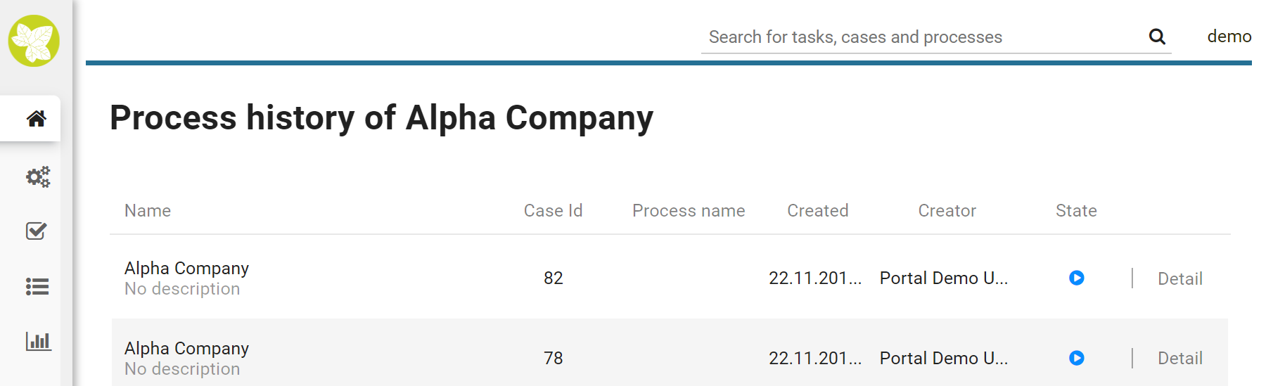
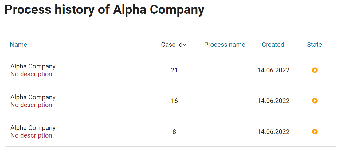
<ic:ch.ivy.addon.portal.component.ProcessHistory businessEntityId="resourceA247" >
The value of the attribute businessEntityId must match the id input
into the subprocess in the first step.
By default the component will load 20 cases at a time. You can change
this by setting the attribute chunkSize to the number you want. You
should use this attribute alongside with the attribute scrollHeight
to configure the scroll bar of the list.
This component using style of Portal, so if you want to customize its style, please refer to Change Portal styles for more details.
If your application is using Iframe approach of Portal, set attribute isOpenInFrame to true.
Note
If you use this component in a dialog, you must run this script
processHistory.setup(); when the dialog is shown. For example:
<p:dialog widgetVar="process-history-dialog" id="process-history-dialog" width="800" height="500" header="Process history of Resource A247" onShow="processHistory.setup();">
  <ic:ch.ivy.addon.portal.component.ProcessHistory businessEntityId="resourceA247" chunkSize="6" scrollHeight="400" />
</p:dialog>
Note
If you use this component in an Iframe, you must set parameter
isOpenInIframe to true. For example:
<ic:ch.ivy.addon.portal.component.ProcessHistory businessEntityId="resourceA247" isOpenInIframe="true" />
Important
If your process has a Trigger component or sends a signal to start another process with the option “Attach to Business Case that triggered this process” selected, the current case of the process will become a technical case and will not be loaded into the process history list. In this case you need to call the SetBusinessEntityId subprocess after the first Trigger or signal sending step.
Process history
Introduction
This component is a part of
portal-componentsproject, which is independent from Portal. You don’t need to import Portal projects to use it.This component is a lazy loading list which displays all business cases of a business entity in your application. You can include this component everywhere:
In a page
In a dialog
Note
If you use this component in Portal, redirect to case details page when clicking on a row line.
How to use
First you need to link the cases to the business entity. Call the
subprocess SetCaseBusinessEntity in the process which need to be
linked and input an identifier unique to your business entity. The
subprocess will set the id to the additional property
“CASE_BUSINESS_ENTITY_PROPERTY” of the business case.
Include the process history component into your page:
<ic:com.axonivy.portal.components.ProcessHistory businessEntityId="alpha" />
Attributes of this component:
Name |
Default |
Type |
Description |
|---|---|---|---|
businessEntityId |
String |
The value of this attribute must match the id input into the subprocess in the first step. |
|
chunkSize |
20 |
Integer |
Integer value to size of cases that will be loaded when scroll down. |
scrollHeight |
600 |
Integer |
Integer value to configure the height of the list. |
emptyMessage |
There are no cases |
String |
The message will be displayed if there are no cases. |
showCasesOfOwner |
false |
Boolean |
Boolean value to specify the displaying cases of owner, when set to true cases of owner will be displayed. |
dateTimePattern |
dd.MM.yyyy HH:mm |
String |
Datetime pattern for |
Note
If you use this component in a dialog, you must run this script
processHistory.setup(); when the dialog is shown. For example:
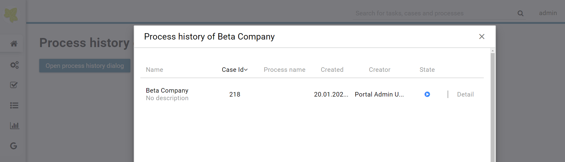
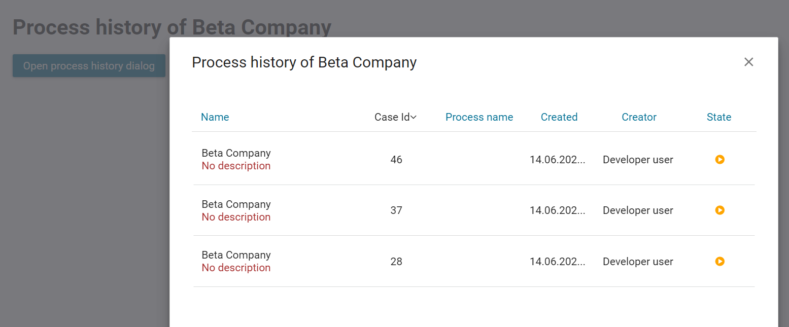
<p:dialog widgetVar="process-history-dialog" id="process-history-dialog" width="800" height="500" resizable="false"
   header="Process history of Beta Company" modal="true" onShow="processHistory.setup();">
   <ic:com.axonivy.portal.components.ProcessHistory businessEntityId="beta" chunkSize="10" scrollHeight="400" />
</p:dialog>
Please refer to ProcessHistoryExample process in portal-components-examples project for more details.
Please refer to ProcessHistoryComponent process in PortalExamples for more details how to customize new Process History with Portal.
If you want to customize its style, please refer to Styles Customization for more details.
Important
If your process has a Trigger component or sends a signal to start another process with the option “Attach to Business Case that triggered this process” selected, the current case of the process will become a technical case and will not be loaded into the process history list. In this case you need to call the SetBusinessEntityId subprocess after the first Trigger or signal sending step.
Migrate from Deprecated Process History
Replace the code in HTML files:
ic:ch.ivy.addon.portal.component.ProcessHistorytoic:com.axonivy.portal.components.ProcessHistory.Consider updating value of new attributes
showCasesOfOwneranddateTimePatternby your business.From the project you want to use the new component, override the subprocess
OpenCaseDetailsHook.mod.If your application using Portal without IFrame:
Copy content of the subprocess
OpenPortalCaseDetails.modinPortalTemplateproject to the overrided subprocessOpenCaseDetailsHook.mod.
If your application using Portal with IFrame:
Set attribute
isOpenInFrametotrue.Modify the subprocess
OpenCaseDetailsHook.modto generatecaseDetailsUrl. Process History component will navigate to this URL when user click on case item.Please refer to subprocess
OpenCaseDetailsHookOverride.modinPortalExamplesproject to see how to generate this link from Portal.
Task Analysis
Introduction
Task Analysis component of Portal provides features for the user’s own permission StatisticAnalyzeTask in PortalTaskPermissions refer to Security section in Cockpit to analyze not only tasks but also cases. These features are:
Set of filters for both tasks and cases which allow user to filter and to find tasks, cases more better. More, user can create and manage their own filter set for future usage.
Dynamic result table with lots of information for both task and case.
Support export result as Excel files (currently we only support .xlsx extension).
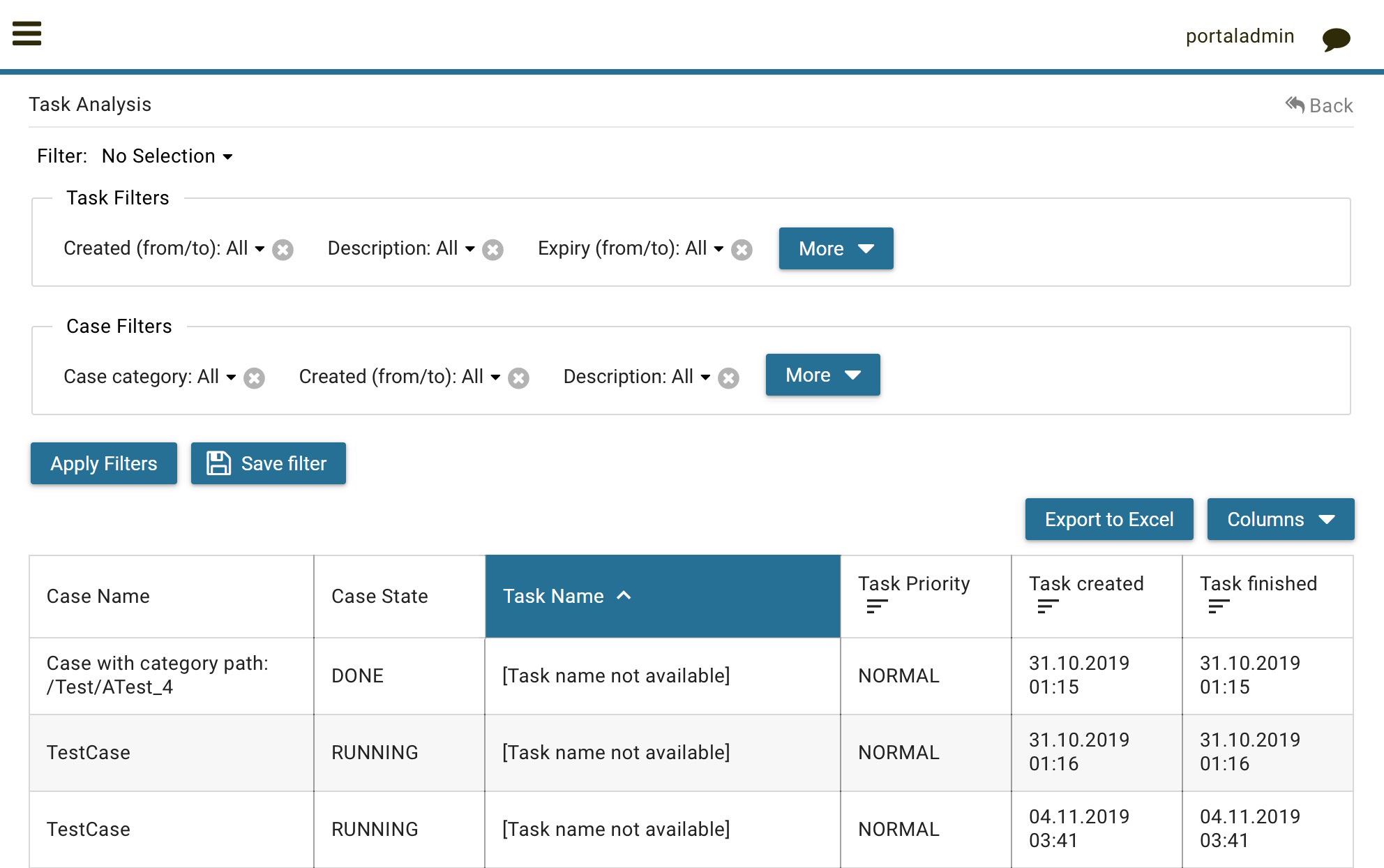
How to use
Task Analysis component is integrated into Statistic widget. You can use this component directly when open Statistic widget. If you want to use this component, you only have to redirect to Task Analysis component with following code:
import javax.faces.context.FacesContext;
String taskAnalysisUrl = ivy.html.startref("Start Processes/TaskAnalysis/start.ivp");
FacesContext.getCurrentInstance().getExternalContext().redirect(taskAnalysisUrl);
Deprecated Process Chain
Introduction
This component is deprecated since version 8.0.27, use Process Chain of
portal-componentsproject instead.Process Chain component of Portal provides features for users to know status of all steps in a process: the step’s working, these steps are done, these steps are not done. These features are:
Support to display all working steps or display only helpful steps as begin, last, current, previous current, next current steps.
Support to change the shape of process chain: circle or line.
Support to change the direction of process chain: horizontal or vertical.
How to use
Process Chain component can be integrated in any widget by including this component into a page. In order to use this component in a page, include this component to this page with following code:
<ic:ch.ivy.addon.portalkit.singleapp.process.ProcessChain id="process-chain-circle-horizontal"
componentId="component-circle-horizontal" shape="CIRCLE" direction="HORIZONTAL"
isShowAllSteps="FALSE" actualStepIndex="#{data.actualCurrentIndex}" steps="#{data.steps}" />
Must set value for
actualStepIndexparameter. This is current step index.Must set value for
stepsparameter. This is list of working steps.Can change
shapeparameter toCIRCLEorLINEbased on the requirement. Default value of this isCIRCLE.Can change
directionparameter toHORIZONTALorVERTICALbased on the requirement. Default value of this isHORIZONTAL.Can change
isShowAllStepsparameter toTRUEorFALSEbased on the requirement. Default value of this isFALSE.
This component using style of Portal, so if you want to customize its style, please refer to Change Portal styles for more details.
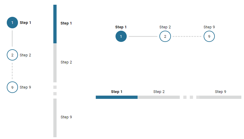
Process Chain
Introduction
This component is a part of
portal-componentsproject, which is independent from Portal. You don’t need to import Portal projects to use it.Process Chain component of Portal provides features for users to know status of all steps in a process: the step’s working, these steps are done, these steps are not done. These features are:
Support to display all working steps or display only helpful steps as begin, last, current, previous current, next current steps.
Support to change the shape of process chain: circle or line.
Support to change the direction of process chain: horizontal or vertical.
How to use
Process Chain component can be integrated in any widget by including this component into a page. In order to use this component in a page, include this component to this page with following code:
<ic:com.axonivy.portal.components.ProcessChain id="process-chain-circle-horizontal" componentId="component-circle-horizontal" shape="CIRCLE" direction="HORIZONTAL"
   isShowAllSteps="false" actualStepIndex="0" steps="#{['Step 1','Step 2','Step 3','Step 4','Step 5','Step 6','Step 7','Step 8','Step 9']}" />
Please refer to ProcessChainExample process in portal-components-examples project for more details.
Important
Must set value for
actualStepIndexparameter. This is current step index.Must set value for
stepsparameter. This is list of working steps.
Attributes of this component:
Name |
Default |
Type |
Description |
|---|---|---|---|
componentId |
process-chain-component-id |
String |
The component identifier. |
steps |
List of step in the process chain. |
||
actualStepIndex |
0 |
Integer |
Actual step index or current step index. |
direction |
HORIZONTAL |
String |
Direction of process chain: VERTICAL, HORIZONTAL. |
shape |
CIRCLE |
String |
Shape of process chain: CIRCLE, LINE. |
isShowAllSteps |
false |
Boolean |
Show all steps of the process chain. |
If you want to customize its style, please refer to Styles Customization for more details.
Migrate from Deprecated Process Chain
Replace the code in HTML files:
ch.ivy.addon.portalkit.singleapp.process.ProcessChaintoic:com.axonivy.portal.components.ProcessChain.
Global growl
Introduction
This component is a global growl introduced in BasicTemplate, you can use it to display your messages in Portal.
<p:growl id="portal-global-growl" widgetVar="portal-global-growl" for="portal-global-growl-message" escape="false" />
Display growl after finishing a task
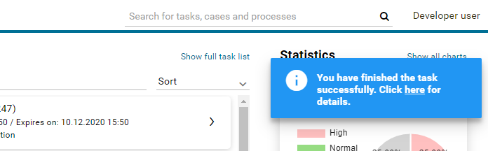
After a task is finished, growl message appears as default via the
DISPLAY_MESSAGE_AFTER_FINISH_TASK Portal variable.
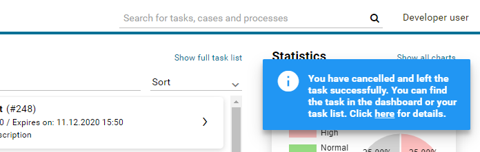
Display growl after leaving a task
If DISPLAY_MESSAGE_AFTER_FINISH_TASK Portal variable is true, growl message will be displayed after a task is left.
Customization global growl message for task not using IFrame
For each task, you can turn it off or override it. Firstly, when you
submit form to interact task, you need to put the overridePortalGrowl
key to flash object with any value
Flash flash = FacesContext.getCurrentInstance().getExternalContext().getFlash();
flash.put("overridePortalGrowl", true);
flash.setRedirect(true);
It’s enough if you want to turn it off. To override the message, add
facesMessage to this component. You can customize for each action as finish or cancellation a task.
import javax.faces.context.Flash;
import javax.faces.context.FacesContext;
import javax.faces.application.FacesMessage;

FacesMessage message = new FacesMessage("Task is done successfully");
FacesContext.getCurrentInstance().addMessage("portal-global-growl-message", message);

Flash flash = FacesContext.getCurrentInstance().getExternalContext().getFlash();
flash.put("overridePortalGrowl", true);
flash.setRedirect(true);
flash.setKeepMessages(true);
Customization global growl message for task using IFrame
If DISPLAY_MESSAGE_AFTER_FINISH_TASK Portal variable is true, before a task is finished/left, you can trigger displaying
customized message after task is finished/left by calling below API:
import ch.ivy.addon.portalkit.publicapi.PortalGlobalGrowInIFrameAPI;

PortalGlobalGrowInIFrameAPI api = new PortalGlobalGrowInIFrameAPI();
api.displayCustomizedMessage("Your customized message");
Please refer to GlobalGrowl Start Process in PortalExamples project for more details.
Deprecated Document table
This component is deprecated since version 8.0.27, use Document Table of
portal-componentsproject instead.This component is case document table with the features: upload, download and delete.

You can override the GetDocumentList, UploadDocument,
DeleteDocument, DownloadDocument sub processes to extend these
features, and add more columns, remove default columns in document
table.
Document table
This component is case document table with the features: upload, download and delete.
This component is a part of
portal-componentsproject, which is independent from Portal. You don’t need to import Portal projects to use it.
You can override the GetDocumentItems, UploadDocumentItem,
DeleteDocumentItem, DownloadDocumentItem sub processes to extend these
features, and add more columns, remove default columns in document
table.
Code Example:
<h:form id="form">
   <ic:com.axonivy.portal.components.DocumentTable id="document-table-component"
      allowedUploadFileTypes="doc,docx,xls,xlsx,xlsm,csv,pdf,ppt,pptx,txt"
      typeSelectionItems="#{documentTableExampleBean.documentTypes}">
      <f:facet name="componentHeader">
         <h2>This is customized document table component header</h2>
      </f:facet>
      <p:column headerText="Creator" styleClass="document-creator-column">
         <h:outputText id="creator" value="#{document.creation.userName}" title="#{document.creation.userName}" />
      </p:column>
      <p:column headerText="Created time" styleClass="document-created-column">
         <h:outputText id="created-time" value="#{document.creation.timestamp}" title="#{document.creation.timestamp}" />
      </p:column>
      <p:column headerText="Customer" styleClass="document-customer-column">
         <h:outputText id="customer" value="#{document.customer}" title="#{document.customer}" />
      </p:column>
      <f:facet name="componentFooter">
         <h2>This is customized document table component footer</h2>
      </f:facet>
   </ic:com.axonivy.portal.components.DocumentTable>
</h:form>
Refer to the DocumentTableExample process in portal-components-examples project for more details.
Attributes of this component:
Name |
Default |
Type |
Description |
|---|---|---|---|
nameColumnRendered |
true |
Boolean |
Boolean value to specify the rendering of the name column, when set to false name column will not be rendered. |
sizeColumnRendered |
true |
Boolean |
Boolean value to specify the rendering of the size column, when set to false size column will not be rendered. |
typeColumnRendered |
true |
Boolean |
Boolean value to specify the rendering of the type column, when set to false type column will not be rendered. |
functionColumnRendered |
true |
Boolean |
Boolean value to specify the rendering of the function column, when set to false function column will not be rendered. |
uploadRendered |
true |
Boolean |
Boolean value to specify the rendering of the upload icon, when set to false upload icon will not be rendered. |
downloadRendered |
true |
Boolean |
Boolean value to specify the rendering of the download icon, when set to false download icon will not be rendered. |
deleteRendered |
true |
Boolean |
Boolean value to specify the rendering of the delete icon, when set to false delete icon will not be rendered. |
messageRendered |
true |
Boolean |
Boolean value to specify the rendering of the message, when set to false message will not be rendered. |
fileLimit |
-1 |
Integer |
Number of files are in the given ICase. |
updatedComponentAfterUploaded |
null |
String |
Component will be triggered the update after document is uploaded. |
downloadIcon |
fa-download |
String |
Icon class will be displayed in download link. |
downloadStyleClass |
null |
String |
Styles for download link. |
deleteIcon |
fa-trash-o |
String |
Icon class will be displayed in delete link. |
deleteStyleClass |
null |
String |
Styles for delete link. |
updatedComponentAfterDeleted |
null |
String |
Component will be triggered the update after document is deleted. |
selectedType |
String |
String value to specify the selected document types, by default it will be first element in |
|
typeSelectionItems |
DOCUMENTATION,CONTRACT,INFORMATION,EMAIL,OTHERS |
String |
String value to specify the list of document type. |
enableScriptCheckingForUploadedDocument |
Boolean |
Boolean value to specify script checking. Set to
true to enable script checking.The setting will detect Portal setting
ENABLE_SCRIPT_CHECKING_FOR_UPLOADED_DOCUMENT as its default value, refer to HowTo: Update Portal settings for more details.If the Portal setting is not available, defaults to
false. |
|
enableVirusScannerForUploadedDocument |
Boolean |
Boolean value to specify virus scanning. Set to
true to enable virus scanning. Refer to Virus Scanning Setting for more details.The setting will detect Portal setting
ENABLE_VIRUS_SCANNER_FOR_UPLOADED_DOCUMENT as its default value, refer to HowTo: Update Portal settings for more details.If Portal setting is not available, default value is
false. |
|
allowedUploadFileTypes |
String |
String value to specify the list of file extension that can be uploaded.
The setting will detect Portal setting
UPLOAD_DOCUMENT_WHITELIST_EXTENSION as its default value, refer to HowTo: Update Portal settings for more details.If Portal setting is not available, default value is
doc,docx,xls,xlsx,xlsm,csv,pdf,ppt,pptx,txt,zip,jpg,jpeg,bmp,png. |
Migrate from Deprecated Document Table
Replace the code in HTML files:
ic:ch.ivy.addon.portalkit.component.document.DocumentTabletoic:com.axonivy.portal.components.DocumentTable.Consider updating value of new attributes
enableScriptCheckingForUploadedDocument,enableVirusScannerForUploadedDocumentandallowedUploadFileTypesby your business.Override sub processes if you want and adapt your business accordingly.
New sub process
Deprecated sub process
GetDocumentItems
GetDocumentList
UploadDocumentItem
UploadDocument
DeleteDocumentItem
DeleteDocument
DownloadDocumentItem
DownloadDocument
Note
You can remove redundant overridden configurations, sub processes and data classes such as GetDocumentListOverride, UploadDocumentOverride, … If you don’t remove it, no problem.
Deprecated User Selection
Introduction
This component is deprecated since version 8.0.27, use User Selection of
portal-componentsproject instead.This component is used for choosing a user from a user list defined by a role name list. If you don’t define role name list, all users will be loaded. It includes 1 label, 1 autocomplete and 1 message element to display message related to that autocomplete element.
How to use
You can include this component to any page. This component supports 2 styles of displaying a label.
Default style

Code example:
<ic:ch.ivy.addon.portalkit.component.UserSelection
      componentId="user-by-role-autocomplete"
      fromRoleNames="#{data.definedRoleNames}"
      selectedUser="#{data.selectedUserForDefinedRoles}"
      isRequired="true"
      label="Users from defined rolenames"/>
2. Floating label

Code example:
<ic:ch.ivy.addon.portalkit.component.UserSelection
componentId="all-user-autocomplete"
selectedUser="#{data.selectedUser}"
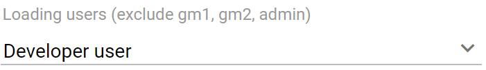
label="Loading with all users (exclude gm2)"
excludedUsernames="#{data.excludedUsernames}"
isRequired="true" floatingLabel="true" />
Tip
Autocomplete element of user selection component allows inserting children and ajax event (Refer to UserSelection.xhtml of PortalKit project).
Any child in UserSelection component will be re-parented into this autocomplete at the point of insertChildren tag.
We introduce a facet named event for autocomplete so that ajax event can be nested.
For example:
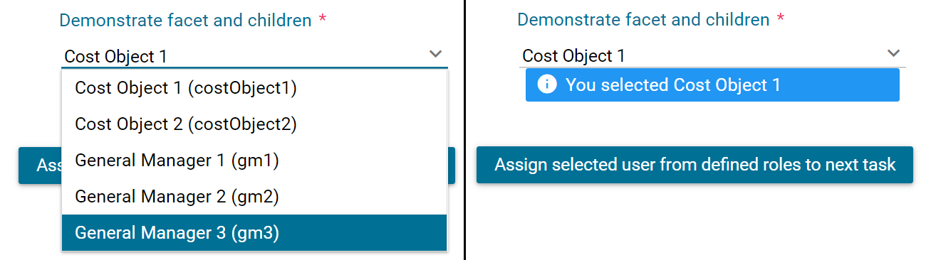
I want to display user in dropdown list with format <Full name> (<username>) and when I select a user, a message will be displayed.
<ic:ch.ivy.addon.portalkit.component.UserSelection
id="item-select-event-component"
componentId="item-select-event-for-user-selection"
fromRoleNames="#{data.definedRoleNames}"
selectedUser="#{data.selectedUserForInsertChildren}"
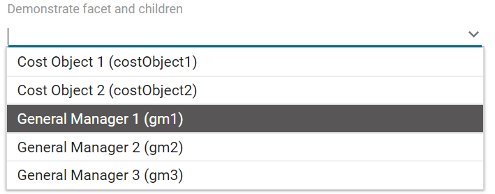
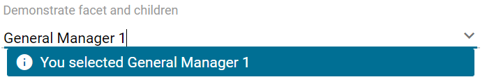
label="Demonstrate facet and children"
isRequired="true" floatingLabel="true" >
<p:column>
<h:outputText value="#{userFormatBean.formatWithTip(user.displayName, user.name)}" />
</p:column>
<f:facet name="event">
<p:ajax event="itemSelect" listener="#{logic.showSelectedUser}"
update="#{p:component('item-select-event-for-user-selection-message')}"/>
</f:facet>
</ic:ch.ivy.addon.portalkit.component.UserSelection>
Attributes of this component:
Name |
Default |
Type |
Description |
|---|---|---|---|
fromRoleNames |
null |
List<String> |
User list will be loaded based on this list. All users will be loaded if you don’t define. |
componentId |
user-selection |
String |
Id of user autocomplete. |
selectedUser |
null |
ch.ivy.addon.portalkit.dto.UserDTO |
Required input and output value for selected user. |
excludedUsernames |
null |
List<String> |
Users will be excluded from user selection. This is applied if you use default completeMethod. |
requiredMessage |
This field is required |
String |
Message to be displayed when user autocomplete validation fails. |
forceSelection |
true |
Boolean |
Only accepts user from the list when it’s enabled. |
minQueryLength |
1 |
Boolean |
Number of characters to be typed before starting to query. |
completeMethod |
completeUser |
Method Expression |
method for user autocomplete. |
isDisabled |
false |
Boolean |
Disable User Selection. |
isRequired |
false |
Boolean |
Marks User Selection as required. |
isReadOnly |
false |
Boolean |
Cannot change user when it’s enabled. |
isRenderedMessage |
true |
Boolean |
Specify the rendering of message for user field. |
hightlight |
true |
Boolean |
Highlights the first suggested user automatically. |
floatingLabel |
false |
Boolean |
Display label with floating style and labelPanelStyleClass can’t be applied if it’s enabled. |
autocompleteStyleClass |
null |
String |
Style class of user autocomplete. |
autoCompletePanelStyleClass |
null |
String |
Style class of user autocomplete panel. |
inputStyleClass |
null |
String |
Style class of user autocomplete input. |
labelPanelStyleClass |
null |
String |
Style class of label panel. |
labelStyleClass |
null |
String |
Style class of label. |
label |
null |
String |
Text of label for User selection component. |
size |
null |
Integer |
Number of characters used to determine the width of the input element. |
messageStyleClass |
null |
String |
Style class of message. |
itemLabel |
displayName |
String |
Displayed text of selected user item and users in dropdown list. |
cache |
true |
Boolean |
Autocomplete caches the searched result list if it’s enabled. |
moreText |
More… |
String |
The text shown in panel when the suggested list is greater than maxResults. |
queryDelay |
300 |
Integer |
Delay to wait in milliseconds before sending each query to the server. |
maxResults |
100 |
Integer |
Maximum number of results to be displayed. |
scrollHeight |
400 |
Integer |
scrollHeight attribute of primefaces autocomplete. |
User Selection
Introduction
This component is used for choosing a user from a user list defined by a role name list. If you don’t define role name list, all users will be loaded. It includes 1 label, 1 autocomplete and 1 message element to display message related to that autocomplete element.
This component is a part of
portal-componentsproject, which is independent from Portal. You don’t need to import Portal projects to use it.
How to use
You can include this component to any page. This component supports 2 styles of displaying a label.
Default style

Code example:
<ic:com.axonivy.portal.components.UserSelection componentId="default-user-autocomplete"
   selectedUser="#{data.selectedUser}" label="Default user selection"
   isRequired="true" labelPanelStyleClass="ui-g-6 ui-md-6 ui-sm-12"
   autoCompleteStyleClass="width-100" autoCompletePanelStyleClass="ui-g-6 ui-sm-12" />
Floating label
Code example:
<ic:com.axonivy.portal.components.UserSelection componentId="all-user-autocomplete"
   hightlight="false" selectedUser="#{data.selectedUserForExcludingUsers}"
   label="Loading users (exclude gm1, gm2, admin)" autoCompleteStyleClass="width-100"
   autoCompletePanelStyleClass="ui-g-12 floating-label-margin-top"
   excludedUsernames="#{data.excludedUsernames}" floatingLabel="true" />
Tip
Autocomplete element of user selection component allows inserting children and ajax event (Refer to UserSelection.xhtml in portal-components project).
Any child in UserSelection component will be re-parented into this autocomplete at the point of insertChildren tag.
We introduce a facet named event for autocomplete so that ajax event can be nested.
For example:
I want to display user in dropdown list with format <Full name> (<username>) and when I select a user, a message will be displayed.
<ic:com.axonivy.portal.components.UserSelection id="item-select-event-component"
   componentId="item-select-event-for-user-selection" floatingLabel="true"
   fromRoleNames="#{data.definedRoleNames}" label="Demonstrate facet and children"
   selectedUser="#{data.selectedUserForInsertChildren}"
   autoCompleteStyleClass="width-100"
   autoCompletePanelStyleClass="ui-g-12 floating-label-margin-top">
   <p:column>
      <h:outputText value="#{user.displayName} (#{user.name})" />
   </p:column>
   <f:facet name="event">
      <p:ajax event="itemSelect" listener="#{logic.showSelectedUser}"
         update="#{p:component('item-select-event-for-user-selection-message')}" />
   </f:facet>
</ic:com.axonivy.portal.components.UserSelection>
Please refer to UserSelectionExample.xhtml in portal-components-examples project for more details.
Attributes of this component:
Name |
Default |
Type |
Description |
|---|---|---|---|
fromRoleNames |
null |
List<String> |
User list will be loaded based on this list. All users will be loaded if you don’t define. |
componentId |
user-selection |
String |
Id of user autocomplete. |
selectedUser |
null |
com.axonivy.portal.components.dto.UserDTO |
Required input and output value for selected user. |
excludedUsernames |
null |
List<String> |
Users will be excluded from user selection. This is applied if you use default completeMethod. |
requiredMessage |
This field is required |
String |
Message to be displayed when user autocomplete validation fails. |
forceSelection |
true |
Boolean |
Only accepts user from the list when it’s enabled. |
minQueryLength |
1 |
Boolean |
Number of characters to be typed before starting to query. |
completeMethod |
completeUser |
Method Expression |
method for user autocomplete. |
isDisabled |
false |
Boolean |
Disable User Selection. |
isRequired |
false |
Boolean |
Marks User Selection as required. |
isReadOnly |
false |
Boolean |
Cannot change user when it’s enabled. |
isRenderedMessage |
true |
Boolean |
Specify the rendering of message for user field. |
hightlight |
true |
Boolean |
Highlights the first suggested user automatically. |
floatingLabel |
false |
Boolean |
Display label with floating style and labelPanelStyleClass can’t be applied if it’s enabled. |
autocompleteStyleClass |
null |
String |
Style class of user autocomplete. |
autoCompletePanelStyleClass |
null |
String |
Style class of user autocomplete panel. |
inputStyleClass |
null |
String |
Style class of user autocomplete input. |
labelPanelStyleClass |
null |
String |
Style class of label panel. |
labelStyleClass |
null |
String |
Style class of label. |
label |
null |
String |
Text of label for User selection component. |
size |
null |
Integer |
Number of characters used to determine the width of the input element. |
messageStyleClass |
null |
String |
Style class of message. |
itemLabel |
displayName |
String |
Displayed text of selected user item and users in dropdown list. |
cache |
true |
Boolean |
Autocomplete caches the searched result list if it’s enabled. |
moreText |
More… |
String |
The text shown in panel when the suggested list is greater than maxResults. |
queryDelay |
300 |
Integer |
Delay to wait in milliseconds before sending each query to the server. |
maxResults |
100 |
Integer |
Maximum number of results to be displayed. |
scrollHeight |
400 |
Integer |
scrollHeight attribute of primefaces autocomplete. |
Migrate from Deprecated User Selection
Replace the code in HTML files:
ic:ch.ivy.addon.portalkit.component.UserSelectiontoic:com.axonivy.portal.components.UserSelection.Use
com.axonivy.portal.components.dto.UserDTOinstead ofch.ivy.addon.portalkit.dto.UserDTO.
Note
If you stored ch.ivy.addon.portalkit.dto.UserDTO class in your database, you must update it manually.
Deprecated Role Selection
Introduction
This component is deprecated since version 8.0.27, use Role Selection of
portal-componentsproject instead.This component is used for choosing a role from a role list defined by a role name list. If you don’t define role name list, all roles will be loaded. It includes 1 label, 1 autocomplete and 1 message element to display message related to that autocomplete element.
How to use
You can include this component to any page. This component supports 2 styles of displaying a label.
Default style

Code example:
<ic:ch.ivy.addon.portalkit.component.RoleSelection
   componentId="role-from-defined-role-autocomplete"
   fromRoleNames="#{data.definedRoleNames}"
   selectedRole="#{data.selectedRoleForDefinedRoles}"
   isRequired="true"
   label="Roles from defined role names"/>
Floating label
Code example:
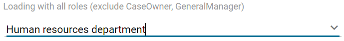
<ic:ch.ivy.addon.portalkit.component.RoleSelection
componentId="floating-label-and-exclude-role-autocomplete" hightlight="false"
selectedRole="#{data.selectedRole}"
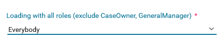
label="Loading with all roles (exclude CaseOwner, GeneralManager)"
excludedRolenames="#{data.excludedRoleNames}"
isRequired="true" floatingLabel="true" />
Tip
Autocomplete element of role selection component allows inserting children and ajax event (Refer to RoleSelection.xhtml of PortalKit project).
Any child in RoleSelection component will be re-parented into this autocomplete at the point of insertChildren tag.
We introduce a facet named event for autocomplete so that ajax event can be nested.
For example:
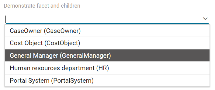
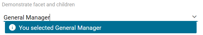
I want to display role in dropdown list with format <Display Name> (<Member Name>) and when I select a role, a message will be displayed.
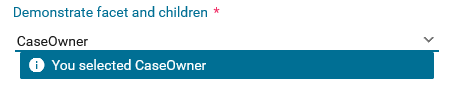
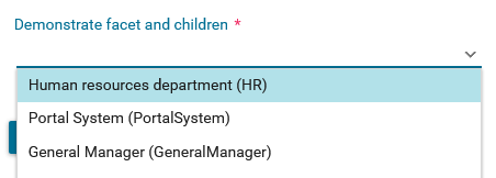
<ic:ch.ivy.addon.portalkit.component.RoleSelection
   id="item-select-event-component"
   componentId="item-select-event-for-role-selection"
   fromRoleNames="#{data.definedRoleNames}"
   selectedRole="#{data.selectedRoleForInsertChildren}"
   label="Demonstrate facet and children"
   autoCompleteStyleClass="width-100"
   autoCompletePanelStyleClass="ui-g-12 floating-label-margin-top"
   isRequired="true" floatingLabel="true">
   <p:column>
      <h:outputText value="#{role.displayName} (#{role.memberName})" />
   </p:column>
   <f:facet name="event">
      <p:ajax event="itemSelect" listener="#{logic.showSelectedRole}"
         update="#{p:component('item-select-event-for-role-selection-message')}" />
   </f:facet>
</ic:ch.ivy.addon.portalkit.component.RoleSelection>
Attributes of this component:
Name |
Default |
Type |
Description |
|---|---|---|---|
fromRoleNames |
null |
List<String> |
Child Role list will be loaded based on this list. All roles will be loaded if you don’t define. |
componentId |
role-selection |
String |
Id of role autocomplete. |
selectedRole |
null |
ch.ivy.addon.portalkit.dto.RoleDTO |
Required input and output value for selected role. |
excludedRolenames |
null |
List<String> |
Roles will be excluded from role selection. This is applied if you use default completeMethod. |
requiredMessage |
This field is required |
String |
Message to be displayed when role autocomplete validation fails. |
forceSelection |
true |
Boolean |
Only accepts role from the list when it’s enabled. |
minQueryLength |
1 |
Boolean |
Number of characters to be typed before starting to query. |
completeMethod |
completeRole |
Method Expression |
method for role autocomplete. |
isDisabled |
false |
Boolean |
Disable Role Selection. |
isRequired |
false |
Boolean |
Marks Role Selection as required. |
isReadOnly |
false |
Boolean |
Cannot change role when it’s enabled. |
isRenderedMessage |
true |
Boolean |
Specify the rendering of message for role field. |
hightlight |
true |
Boolean |
Highlights the first suggested role automatically. |
floatingLabel |
false |
Boolean |
Display label with floating style and labelPanelStyleClass can’t be applied if it’s enabled. |
autocompleteStyleClass |
null |
String |
Style class of role autocomplete. |
autoCompletePanelStyleClass |
null |
String |
Style class of role autocomplete panel. |
inputStyleClass |
null |
String |
Style class of role autocomplete input. |
labelPanelStyleClass |
null |
String |
Style class of label panel. |
labelStyleClass |
null |
String |
Style class of label. |
label |
null |
String |
Text of label for role selection component. |
size |
null |
Integer |
Number of characters used to determine the width of the input element. |
messageStyleClass |
null |
String |
Style class of message. |
itemLabel |
displayName |
String |
Displayed text of selected role item and roles in dropdown list. |
cache |
true |
Boolean |
Autocomplete caches the searched result list if it’s enabled. |
moreText |
More… |
String |
The text shown in panel when the suggested list is greater than maxResults. |
queryDelay |
300 |
Integer |
Delay to wait in milliseconds before sending each query to the server. |
maxResults |
100 |
Integer |
Maximum number of results to be displayed. |
scrollHeight |
400 |
Integer |
scrollHeight attribute of primefaces autocomplete. |
Role Selection
Introduction
This component is used for choosing a role from a role list defined by a role name list. If you don’t define role name list, all roles will be loaded. It includes 1 label, 1 autocomplete and 1 message element to display message related to that autocomplete element.
This component is a part of
portal-componentsproject, which is independent from Portal. You don’t need to import Portal projects to use it.
How to use
You can include this component to any page. This component supports 2 styles of displaying a label.
Default style

Code example:
<ic:com.axonivy.portal.components.RoleSelection
   componentId="role-from-defined-role-autocomplete"
   fromRoleNames="#{data.definedRoleNames}"
   selectedRole="#{data.selectedRoleForDefinedRoles}"
   isRequired="true"
   label="Roles from defined role names"/>
Floating label
Code example:
<ic:com.axonivy.portal.components.RoleSelection
   componentId="floating-label-and-exclude-role-autocomplete" hightlight="false"
   selectedRole="#{data.selectedRole}"
   label="Loading with all roles (exclude CaseOwner, GeneralManager)"
   excludedRolenames="#{data.excludedRoleNames}"
   isRequired="true" floatingLabel="true" />
Tip
Autocomplete element of role selection component allows inserting children and ajax event (Refer to RoleSelection.xhtml of portal-components project).
Any child in RoleSelection component will be re-parented into this autocomplete at the point of insertChildren tag.
We introduce a facet named event for autocomplete so that ajax event can be nested.
For example:
I want to display role in dropdown list with format <Display Name> (<Member Name>) and when I select a role, a message will be displayed.
<ic:com.axonivy.portal.components.RoleSelection
   id="item-select-event-component"
   componentId="item-select-event-for-role-selection"
   fromRoleNames="#{data.definedRoleNames}"
   selectedRole="#{data.selectedRoleForInsertChildren}"
   label="Demonstrate facet and children"
   autoCompleteStyleClass="width-100"
   autoCompletePanelStyleClass="ui-g-12 floating-label-margin-top"
   isRequired="true" floatingLabel="true">
   <p:column>
      <h:outputText value="#{role.getDisplayName()} (#{role.getMemberName()})" />
   </p:column>
   <f:facet name="event">
      <p:ajax event="itemSelect" listener="#{logic.showSelectedRole}"
         update="#{p:component('item-select-event-for-role-selection-message')}" />
   </f:facet>
</ic:com.axonivy.portal.components.RoleSelection>
Please refer to RoleSelectionExample.xhtml in portal-components-examples project for more details.
Attributes of this component:
Name |
Default |
Type |
Description |
|---|---|---|---|
fromRoleNames |
null |
List<String> |
Child Role list will be loaded based on this list. All roles will be loaded if you don’t define. |
componentId |
role-selection |
String |
Id of role autocomplete. |
selectedRole |
null |
com.axonivy.portal.components.dto.RoleDTO |
Required input and output value for selected role. |
excludedRolenames |
null |
List<String> |
Roles will be excluded from role selection. This is applied if you use default completeMethod. |
requiredMessage |
This field is required |
String |
Message to be displayed when role autocomplete validation fails. |
forceSelection |
true |
Boolean |
Only accepts role from the list when it’s enabled. |
minQueryLength |
1 |
Boolean |
Number of characters to be typed before starting to query. |
completeMethod |
completeRole |
Method Expression |
method for role autocomplete. |
isDisabled |
false |
Boolean |
Disable Role Selection. |
isRequired |
false |
Boolean |
Marks Role Selection as required. |
isReadOnly |
false |
Boolean |
Cannot change role when it’s enabled. |
isRenderedMessage |
true |
Boolean |
Specify the rendering of message for role field. |
hightlight |
true |
Boolean |
Highlights the first suggested role automatically. |
floatingLabel |
false |
Boolean |
Display label with floating style and labelPanelStyleClass can’t be applied if it’s enabled. |
autocompleteStyleClass |
null |
String |
Style class of role autocomplete. |
autoCompletePanelStyleClass |
null |
String |
Style class of role autocomplete panel. |
inputStyleClass |
null |
String |
Style class of role autocomplete input. |
labelPanelStyleClass |
null |
String |
Style class of label panel. |
labelStyleClass |
null |
String |
Style class of label. |
label |
null |
String |
Text of label for role selection component. |
size |
null |
Integer |
Number of characters used to determine the width of the input element. |
messageStyleClass |
null |
String |
Style class of message. |
itemLabel |
displayName |
String |
Displayed text of selected role item and roles in dropdown list. |
cache |
true |
Boolean |
Autocomplete caches the searched result list if it’s enabled. |
moreText |
More… |
String |
The text shown in panel when the suggested list is greater than maxResults. |
queryDelay |
300 |
Integer |
Delay to wait in milliseconds before sending each query to the server. |
maxResults |
100 |
Integer |
Maximum number of results to be displayed. |
scrollHeight |
400 |
Integer |
scrollHeight attribute of primefaces autocomplete. |
Migrate from Deprecated Role Selection
Replace the code in HTML files:
ic:ch.ivy.addon.portalkit.component.RoleSelectiontoic:com.axonivy.portal.components.RoleSelection.Use
com.axonivy.portal.components.dto.RoleDTOinstead ofch.ivy.addon.portalkit.dto.RoleDTO.
Note
If you stored ch.ivy.addon.portalkit.dto.RoleDTO class in your database, you must update it manually.
Portal cron job trigger
Portal provides a helpful bean ch.ivy.addon.portalkit.util.CronByGlobalVariableTriggerStartEventBean using the Quartz framework which help trigger cron job by global variable. The global variable should contains the cron job Pattern, to trigger to process on the right time.
There is a online Cron Maker could help you to create your own cron job pattern.
Styles Customization
This customization only supports for new components of portal-components project.
How to customize
You have to add a new css file to your resources and import it into your template.
Code Example:
<ui:composition template="/layouts/basic-8.xhtml">
   <ui:define name="title">test</ui:define>
   <ui:define name="content">
      <ic:com.axonivy.portal.components.ProcessHistory businessEntityId="alpha" chunkSize="12" scrollHeight="600" />
      <h:outputStylesheet name="layouts/styles/process-history-customize.css" />
   </ui:define>
</ui:composition>
Note
You must let
<h:outputStylesheet />below the component to override defined styles.Within this file you can override some styles. For example, the --process-history-description-text-color:
:root {
   --process-history-description-text-color: red;
}
List of css variables that you can override:
1. Process Chain:
Variable |
Default value |
Description |
|---|---|---|
--process-chain-process-step-font-size |
12px |
Size of process step in of process chain component. |
--process-chain-body-background-color |
rgba(0,0,0,0) |
Background color of waiting circle process steps. |
--process-chain-menu-color |
var(--primary-color, hsl(195, 100%, 29%)) |
Color of process steps. |
--process-chain-link-color |
#D9DADA |
Link color between process steps. |
--process-chain-current-circle-horizontal-step-title-font-weight |
bold |
Font weight of circle horizontal process step title. |
--process-chain-current-circle-vertical-step-title-font-weight |
bold |
Font weight of circle vertical process step title. |
--process-chain-current-line-horizontal-step-title-font-weight |
bold |
Font weight of line horizontal process step title. |
--process-chain-current-line-vertical-step-title-font-weight |
bold |
Font weight of line vertical process step title. |
2. Process History:
Variable |
Default value |
Description |
|---|---|---|
--process-history-header-border-bottom-color |
#D9DADA |
Color of bottom header’s border. |
--process-history-unsortable-header-font-size |
1.4rem |
Text size of cell header that is unsortable. |
--process-history-unsortable-header-text-color |
#9C9D9D |
Text color of cell header that is unsortable. |
--process-history-description-text-color |
#9C9D9D |
Text color of item description. |
--process-history-item-background-color |
rgba(var(--white, #000000), 0.2) |
Background color of item. |
--process-history-item-border-bottom-color |
#D9DADA |
Color of bottom item’s border. |
--process-history-item-border-hover |
1px solid #90DDE9 |
Hover color of item’s border. |
--process-history-item-background-hover |
rgba(144, 221, 233, 0.24) |
Hover background color of item. |
--process-history-state-in-progress-color |
rgba(7, 140, 255, 1) |
Color of in-progress state. |
--process-history-state-done-or-resume-color |
#4EB41C |
Color of done or resumed state. |
--process-history-empty-message-label-color |
var(--black, #FFFFFF) |
Text color of message label when there is no item. |
--process-history-empty-message-label-font-size |
1.2rem |
Font size of of message label when there is no item. |