User Selection
Introduction
This component is used for selecting a single user from a list of users defined by a role name list. If you don’t define the role name list, all users will be loaded. It includes a label, an autocomplete and one message element to display a message related to that autocomplete element.
How to Use
You can insert this component into any page. This component supports two styles to display a label.
Default Style

Code example:
<ic:com.axonivy.portal.components.UserSelection componentId="default-user-autocomplete"
   selectedUser="#{data.selectedUser}" label="Default user selection"
   isRequired="true" labelPanelStyleClass="ui-g-6 ui-md-6 ui-sm-12"
   autoCompleteStyleClass="width-100" autoCompletePanelStyleClass="ui-g-6 ui-sm-12" />
Floating Label
Code example:
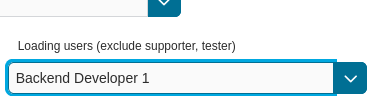
<ic:com.axonivy.portal.components.UserSelection componentId="all-user-autocomplete"
   hightlight="false" selectedUser="#{data.selectedUserForExcludingUsers}"
   label="Loading users (exclude gm1, gm2, admin)" autoCompleteStyleClass="width-100"
   autoCompletePanelStyleClass="ui-g-12 floating-label-margin-top"
   excludedUsernames="#{data.excludedUsernames}" floatingLabel="true" />
Tip
The autocomplete element of the user selection component allows to
insert children and ajax events (Refer to UserSelection.xhtml).
Any child in the UserSelection component will be re-parented into
this autocomplete at the location of the insertChildren tag.
We introduce a facet named event for autocomplete so that the
ajax event can be nested, as well.
An example:
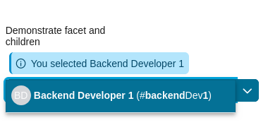
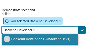
I want to display users in a dropdown list formatted as “<Full name> (<username>)”. When I select a user, a message shall be displayed.
<ic:com.axonivy.portal.components.UserSelection id="item-select-event-component"
   componentId="item-select-event-for-user-selection" floatingLabel="true"
   fromRoleNames="#{data.definedRoleNames}" label="Demonstrate facet and children"
      selectedUser="#{data.selectedUserForInsertChildren}"
   autoCompleteStyleClass="width-100"
   autoCompletePanelStyleClass="ui-g-12 floating-label-margin-top" hasCustomizedSelectionList="true">
      <p:column>
         <pc:securityMemberNameAndAvatar displayName="#{user.getDisplayName()} (#{user.getMemberName()})" securityMember="#{user}" isStandAlone="false" />
      </p:column>
      <f:facet name="event">
         <p:ajax event="itemSelect" listener="#{logic.showSelectedUser}"
            update="#{p:component('item-select-event-for-user-selection-message')}"/>
      </f:facet>
</ic:com.axonivy.portal.components.UserSelection>
Please refer to UserSelectionExample.xhtml in project portal-components-examples for more details.
This component offers the following attributes:
Name |
Default |
Type |
Description |
|---|---|---|---|
fromRoleNames |
null |
List<String> |
User list will be generated based on this list. If empty, all users will be loaded. |
componentId |
user-selection |
String |
Id of user autocomplete. |
selectedUser |
null |
UserDTO |
Required input and output value for selected user. |
excludedUsernames |
null |
List<String> |
Users to be excluded from user selection. This is applied if you use the default completeMethod. |
requiredMessage |
This field is required |
String |
Message to be displayed when user autocomplete validation fails. |
forceSelection |
true |
Boolean |
If true, only accepts user from the list. |
minQueryLength |
1 |
Boolean |
N”umber of characters to be typed before starting to offer autocomplete.” |
completeMethod |
completeUser |
Method Expression |
Method for user autocomplete. |
isDisabled |
false |
Boolean |
If true, disable User Selection. |
isRequired |
false |
Boolean |
If true, User Selection is required. |
isReadOnly |
false |
Boolean |
If true, User Selection cannot be changed. |
isRenderedMessage |
true |
Boolean |
If true, message for user field is rendered. |
hightlight |
true |
Boolean |
If true, highlight the first suggested user automatically. |
floatingLabel |
false |
Boolean |
If true, display label with floating style and labelPanelStyleClass can’t be applied. |
autocompleteStyleClass |
null |
String |
Style class of user autocomplete. |
autoCompletePanelStyleClass |
null |
String |
Style class of user autocomplete panel. |
inputStyleClass |
null |
String |
Style class of user autocomplete input. |
labelPanelStyleClass |
null |
String |
Style class of label panel. |
labelStyleClass |
null |
String |
Style class of label. |
label |
null |
String |
Text of label for User Selection component. |
size |
null |
Integer |
Number of characters used to determine the width of the input element. |
messageStyleClass |
null |
String |
Style class of message. |
itemLabel |
displayName |
String |
Displayed text of selected user item and users in dropdown list. |
cache |
true |
Boolean |
If true, autocomplete caches search result list. |
moreText |
More… |
String |
The text shown in panel when the suggested list is greater than maxResults. |
queryDelay |
300 |
Integer |
Delay in milliseconds before sending a query to the server. |
maxResults |
100 |
Integer |
Maximum number of results to be displayed. |
scrollHeight |
400 |
Integer |
scrollHeight attribute of primefaces autocomplete. |
hasCustomizedSelectionList |
false |
Boolean |
If true, the customized selection list is displayed. |
isShowAvatarInSelectionList |
Boolean |
Boolean value to specify avatar showing. Set to true to show avatar.
The setting will detect Portal setting Portal.ShowAvatar as its default value, refer to HowTo: Update HowTo: Update Portal Settings for more details.
If the Portal setting is not available, defaults to true.
|
|
displayNameRenderedInSelectionList |
true |
Boolean |
If false, the name of security member in the selection list is hidden. |
displayNameInSelectionListStyleClass |
null |
String |
Style class of display name in the selection list |
selectionListContainerStyleClass |
null |
String |
Style class of item’s container in the selection list |
emptyMessage |
No results |
String |
Message to show when there’s no option in selection list. |
Migrate from Deprecated User Selection
Replace code in HTML files: replace
ic:ch.ivy.addon.portalkit.component.UserSelectionwithic:com.axonivy.portal.components.UserSelection.Replace
ch.ivy.addon.portalkit.dto.UserDTOwithcom.axonivy.portal.components.dto.UserDTO.Note
If you stored class
ch.ivy.addon.portalkit.dto.UserDTOin your database, you have to update the database manually.