Role Selection
Introduction
This component is used to select a role from a given list of roles. If you don’t define the role list, all roles will be loaded. It includes one label, one autocomplete and one message element to display messages related to this autocomplete element.
How to Use
You can insert this component into any page. This component offers the following two styles to display its label.
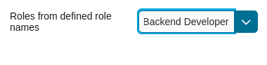
Default Style
Code example:
<ic:com.axonivy.portal.components.RoleSelection
   componentId="role-from-defined-role-autocomplete"
   fromRoleNames="#{data.definedRoleNames}"
   selectedRole="#{data.selectedRoleForDefinedRoles}"
   isRequired="true"
   label="Roles from defined role names"/>
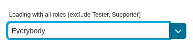
Floating Label
Code example:
<ic:com.axonivy.portal.components.RoleSelection
   componentId="floating-label-and-exclude-role-autocomplete" hightlight="false"
   selectedRole="#{data.selectedRole}"
   label="Loading with all roles (exclude CaseOwner, GeneralManager)"
   excludedRolenames="#{data.excludedRoleNames}"
   isRequired="true" floatingLabel="true" />
Tip
The autocomplete element of the role selection component allows you to
insert children and ajax events (Refer to RoleSelection.xhtml).
Any child in the RoleSelection component will be re-parented into this
autocomplete at the location of the insertChildren tag. We
introduced a facet named event for autocomplete so that the ajax
event can be nested, as well.
For example:
I want to display roles in dropdown list formatted as “<Display Name> (<Member Name>)”. When I select a role, a message shall be displayed.
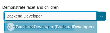
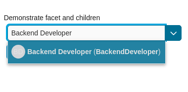
<ic:com.axonivy.portal.components.RoleSelection
   id="item-select-event-component"
   componentId="item-select-event-for-role-selection"
   fromRoleNames="#{data.definedRoleNames}"
   selectedRole="#{data.selectedRoleForInsertChildren}"
   label="Demonstrate facet and children"
   autoCompleteStyleClass="width-100"
   autoCompletePanelStyleClass="ui-g-12 floating-label-margin-top"
   isRequired="true" floatingLabel="true" hasCustomizedSelectionList="true">
   <p:column>
      <pc:securityMemberNameAndAvatar displayName="#{role.getDisplayName()} (#{role.getMemberName()})" securityMember="#{role}" isStandAlone="false" />
   </p:column>
   <f:facet name="event">
      <p:ajax event="itemSelect" listener="#{logic.showSelectedRole}"
         update="#{p:component('item-select-event-for-role-selection-message')}" />
   </f:facet>
</ic:com.axonivy.portal.components.RoleSelection>
Please refer to RoleSelectionExample.xhtml in portal-components-examples project for more details.
This component offers the following attributes:
Name |
Default |
Type |
Description |
|---|---|---|---|
fromRoleNames |
null |
List<String> |
Child Role list will be loaded based on this list. If empty, all roles will be loaded. |
componentId |
role-selection |
String |
Id of role autocomplete. |
selectedRole |
null |
RoleDTO |
Required input and output value for selected role. |
excludedRolenames |
null |
List<String> |
Roles to be excluded from role selection. Applied if you use default completeMethod. |
requiredMessage |
This field is required |
String |
Message to be displayed when role autocomplete validation fails. |
forceSelection |
true |
Boolean |
If true, only accept roles from the given list. |
minQueryLength |
1 |
Boolean |
Number of characters to be typed before starting to offer autocomplete. |
completeMethod |
completeRole |
Method Expression |
Method for role autocomplete. |
isDisabled |
false |
Boolean |
If true, Role Selection is disabled. |
isRequired |
false |
Boolean |
If true, Marks Role Selection is required. |
isReadOnly |
false |
Boolean |
If true, user cannot change role. |
isRenderedMessage |
true |
Boolean |
Specify the rendering of message for role field. |
hightlight |
true |
Boolean |
Highlights the first suggested role automatically. |
floatingLabel |
false |
Boolean |
If true, display label with floating style and labelPanelStyleClass can’t be applied. |
autocompleteStyleClass |
null |
String |
Style class of role autocomplete. |
autoCompletePanelStyleClass |
null |
String |
Style class of role autocomplete panel. |
inputStyleClass |
null |
String |
Style class of role autocomplete input. |
labelPanelStyleClass |
null |
String |
Style class of label panel. |
labelStyleClass |
null |
String |
Style class of label. |
label |
null |
String |
Text of label for role selection component. |
size |
null |
Integer |
Number of characters. usesed to determine the width of the input element. |
messageStyleClass |
null |
String |
Message style class. |
itemLabel |
displayName |
String |
Displayed text of selected role and roles in dropdown list. |
cache |
true |
Boolean |
If true, autocomplete caches the search result list. |
moreText |
More… |
String |
The text shown in panel when the suggested list is greater than maxResults. |
queryDelay |
300 |
Integer |
Delay in milliseconds before sending a query to the server. |
maxResults |
100 |
Integer |
Maximum number of results to be displayed. |
scrollHeight |
400 |
Integer |
scrollHeight attribute of primefaces autocomplete. |
hasCustomizedSelectionList |
false |
Boolean |
If true, the customized selection list is displayed. |
isShowAvatarInSelectionList |
Boolean |
Boolean value to specify avatar showing. Set to true to show avatar.
The setting will detect Portal setting Portal.ShowAvatar as its default value, refer to HowTo: Update HowTo: Update Portal Settings for more details.
If the Portal setting is not available, defaults to true.
|
|
displayNameRenderedInSelectionList |
true |
Boolean |
If false, the name of security member in the selection list is hidden. |
displayNameInSelectionListStyleClass |
null |
String |
Style class of display name in the selection list |
selectionListContainerStyleClass |
null |
String |
Style class of item’s container in the selection list |
emptyMessage |
No results |
String |
Message to show when there’s no option in selection list. |
Migrate from Deprecated Role Selection
Replace code in HTML files: replace
ic:ch.ivy.addon.portalkit.component.RoleSelectionwithic:com.axonivy.portal.components.RoleSelection.Replace
ch.ivy.addon.portalkit.dto.RoleDTOwithcom.axonivy.portal.components.dto.RoleDTO.Note
If you stored class
ch.ivy.addon.portalkit.dto.RoleDTOin your database, you have to update the database manually.