Task item details
TaskItemDetails is a built-in component of Portal which contains the role, user, task, case and time information which users can interact with. In order to show needed task’s information, Portal supports you to override concepts of TaskItemDetails component.
Each TaskItemDetails contains
Data and Description
1Documents
2Histories
3Custom panels (widgets)
Important
All visible widgets will be configured in Global Variable Portal.TaskDetails.
How to configure widgets in task details
Settings of all visible widgets on task details page are saved in Global Variable Portal.TaskDetails.
Cockpit Administrator can configure widgets via global variable Portal.TaskDetails on Cockpit settings page.
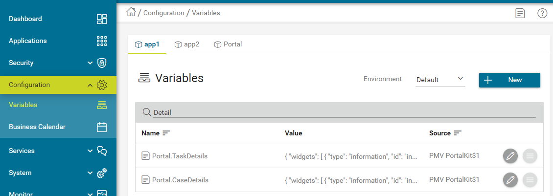
Default configuration includes 3 widgets.
{
   "widgets":
   [
      {
         "type": "information",
         "id": "information",
         "axisX": 0,
         "axisY": 0,
         "width": 6,
         "height": 12
      },
      {
         "type": "document",
         "id": "document",
         "axisX": 6,
         "axisY": 0,
         "width": 6,
         "height": 6
      },
      {
         "type": "history",
         "id": "history",
         "axisX": 6,
         "axisY": 6,
         "width": 6,
         "height": 6
      }
   ]
}
Structure of each widget in variable Portal.TaskDetails:
type: There are 4 types:information,document,history,customid: It’s used to detect custom widgets.axisX: HTML DOM Styleleftwill be calculated by formulaaxisX / 12 * 100%axisY: HTML DOM Styletopwill be calculated by formulaaxisY / 12 * 100%width: HTML DOM Stylewidthwill be calculated by formula60 * width + 20 * (width - 1)height: HTML DOM Styleheightwill be calculated by formula60 * height + 20 * (height - 1)styleClass(optional): add CSS Classes to HTML DOMstyle(optional): add inline style to HTML DOM
Important
Do not change
typeandidof widgets. You can changeaxisX,axisY,widthandheightto update size and position of widgets.axisX,axisY,widthandheightmust be integers.axisX + widthmust not be larger than 12.
How to customize Task item details UI
Refer to portal-developer-examples project for examples.
Introduce an Axon Ivy project which has
PortalTemplateas a required library.To customize task item details, you must customize Portal Home first. Refer to Customize Portal home to set new home page.
Copy the
PortalStartprocess fromPortalTemplateto your project. Point PortalHome element to your custom home page in previous step. This process is new home page and administrator should register this link by Portal’s Admin Settings.Use Axon Ivy HtmlOverride wizard to override
PortalTaskDetailsHTML dialog.After previous steps, you can override Task item details UI elements to show custom panels, show or hide elements.
To show or hide elements, refer to Show or hide elements.
To show custom panels (widgets), refer to Show Custom Panels (Widgets).
Show or hide elements
Refer to list of ui:param tag in PortalTaskDetails.xhtml of
PortalTemplate. If you want to show or hide elements on
TaskItemDetails, you must override ui:param
List of valid ui:param:
ui:param name="showItemDetailsHeader" value="true"To show or hide Task Header, use
showItemDetailsHeader. Default value is true.
Show Custom Panels (Widgets)
Tip
To quickly understand how the JSON of custom task details looks like.
Refer to
variables.Portal.TaskDetails.jsonfile inportal-developer-examples/resources/filesproject.Copy to the corresponding application folder located in the designer.
e.g: AxonIvyDesigner/configuration/applications/designer
Create some tasks and go to the example homepage by the process
Start Processes/ExamplePortalStart/DefaultApplicationHomePage.ivpAnd then go to task details to check the new custom layout.
About how to configure Global Var, refer to Axon Ivy Global Variables
There are two steps for adding new custom panels.
Cockpit admin must configure global variable Portal.TaskDetails on Cockpit Page to add custom widgets.
Example Portal.TaskDetails with including 2 custom widgets configuration:
{
   "widgets":
   [
      {
         "type": "information",
         "id": "information",
         "axisX": 0,
         "axisY": 4,
         "width": 6,
         "height": 12
      },
      {
         "type": "document",
         "id": "document",
         "axisX": 6,
         "axisY": 4,
         "width": 6,
         "height": 6
      },
      {
         "type": "history",
         "id": "history",
         "axisX": 6,
         "axisY": 10,
         "width": 6,
         "height": 6
      },
      {
         "type": "custom",
         "id": "taskItemDetailCustomPanelTop",
         "axisX": 0,
         "axisY": 0,
         "width": 12,
         "height": 4
      },
      {
         "type": "custom",
         "id": "taskItemDetailCustomPanelBottom",
         "axisX": 0,
         "axisY": 16,
         "width": 12,
         "height": 4
      }
   ]
}
Refer to the
taskItemDetailCustomPanel*section inPortalTaskDetails.xhtmlof PortalTemplate.We need to define the
ui:definetag with the valid name such astaskItemDetailCustomPanelTopandtaskItemDetailCustomPanelBottom.The
taskItemDetailCustomPanel*will be displayed base on value of global variable Portal.TaskDetails.Add your custom code into
<ui:define name="taskItemDetailCustomPanel*"></ui:define>tags.Example code for overriding custom panel box of task details:
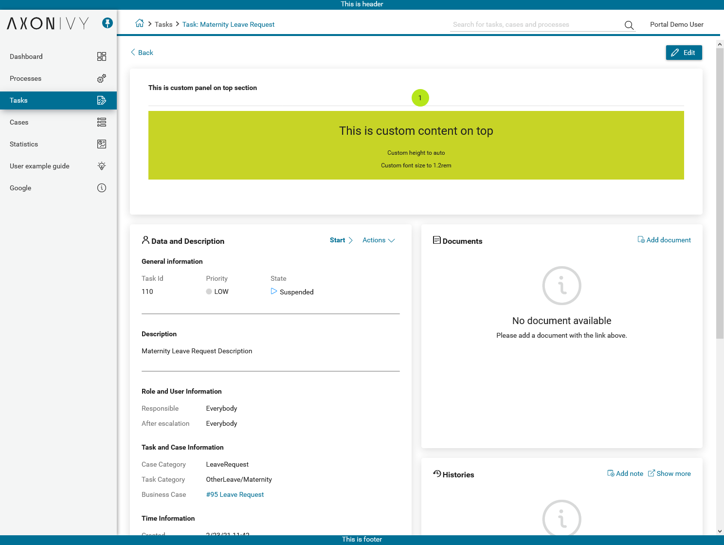
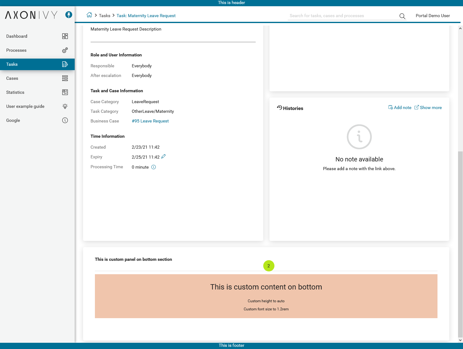
<!-- In this HTML dialog, we override task list header, task header, task filter, and task body -->

<ui:composition template="/layouts/PortalTaskDetailsTemplate.xhtml">
   <ui:param name="task" value="#{data.task}" />
   <ui:param name="dataModel" value="#{data.dataModel}" />
   <ui:param name="portalPage" value="#{data.portalPage}" />
   <ui:param name="isFromTaskList" value="#{data.isFromTaskList}" />
   <ui:param name="isTaskStartedInDetails" value="#{data.isTaskStartedInDetails}" />
   <!-- To show/hidden any sections of Task detail, you can turn true/false for below parameters -->
   <!-- To show the Header component inside Task details body. By default it's true -->
   <ui:param name="showItemDetailsHeader" value="true" />
   <!-- To show the Notes component inside Task details body. By default it's true -->
   <ui:param name="showItemDetailsNotes" value="true" />
   <!-- To show the Documents component inside Task details body. By default, it's true -->
   <ui:param name="showItemDetailDocuments" value="true" />
   <ui:define name="title">#{ivy.cms.co('/Labels/TaskItemDetail')}</ui:define>

   <!--!!!!!!!!!!!!!!!!!!!!!!!!!!!!!!!!!!!!!!!!!!!!!!!!!!!!!!!!!!!!!!!!!!!!!!!!!!!!!!!!!!!!!!!!!!!!!!!!!!!!!!!!!!!!!!!!!!!!!!!!!!!!!!!
      !!!!!!!!!!!!!!!!!!!!!!!!!!!!!!!!!!!!!!!!!!!!!!!!!!!!!!!!!!!!!!!!!!!!!!!!!!!!!!!!!!!!!!!!!!!!!!!!!!!!!!!!!!!!!!!!!!!!!!!!!!!!!!!!!!!
      !!!!!BELOW IS SAMPLE CODE FOR CUSTOMIZATION, WRAPPED IN <ui:remove> TAG. TO ACTIVATE THE CUSTOMIZATION, REMOVE <ui:remove> TAG!!!!!
      !!!!!!!!!!!!!!!!!!!!!!!!!!!!!!!!!!!!!!!!!!!!!!!!!!!!!!!!!!!!!!!!!!!!!!!!!!!!!!!!!!!!!!!!!!!!!!!!!!!!!!!!!!!!!!!!!!!!!!!!!!!!!!!!!!!
      !!!!!!!!!!!!!!!!!!!!!!!!!!!!!!!!!!!!!!!!!!!!!!!!!!!!!!!!!!!!!!!!!!!!!!!!!!!!!!!!!!!!!!!!!!!!!!!!!!!!!!!!!!!!!!!!!!!!!!!!!!!!!!!!-->
   <!-- Add a content as Custom panel for Task Detail on top -->
   <ui:define name="taskItemDetailCustomPanelTop">
      <h:panelGroup styleClass="ui-g-12 ui-sm-12 custom-task-panel">
      <div class="task-detail-section-title u-truncate-text">
         <h:outputText value="This is custom panel on top section" />
      </div>
      <div class="Separator" />

      <div class="custom-task-details-panel-top">
         <h1>This is custom content on top</h1>
         <p>Custom height to auto</p>
         <p>Custom font size to 1.2rem</p>
      </div>
      </h:panelGroup>
   </ui:define>

   <!-- Add a content as Custom panel for Task Detail on top-left-->
   <ui:define name="taskItemDetailCustomPanelBottom">
      <h:panelGroup styleClass="ui-g-12 ui-sm-12 custom-task-panel">
      <div class="task-detail-section-title u-truncate-text">
         <h:outputText value="This is custom panel on bottom section" />
      </div>
      <div class="Separator" />

      <div class="custom-task-details-panel custom-task-details-panel-bottom">
         <h1>This is custom content on bottom</h1>
         <p>Custom height to auto</p>
         <p>Custom font size to 1.2rem</p>
      </div>
      </h:panelGroup>
   </ui:define>

   <ui:define name="css">
      <h:outputStylesheet library="css" name="examples.css" />
   </ui:define>
</ui:composition>
After applied above example xhtml code and example variable Portal.TaskDetails to your custom page, custom panels will be displayed as the below image.
taskItemDetailCustomPanelTop (1)taskItemDetailCustomPanelBottom (2)