Statistic Chart
Introduction
Portal offers an all-new statistic charts widget, designed to empower users with deeper insights into their tasks, cases, overall productivity and more customization capabilities.
How to use
To utilize the Statistic feature on the Dashboard Configuration, follow these steps:
Navigate to Dashboard Configuration of the dashboard where you want to add the widget and select Add Widget for predefined Standard Charts or Create custom statistic widget for configuring new statistic chart.
From the dropdown menu labeled Statistic Widgets, choose from a variety of insightful charts.

Available Standard Charts
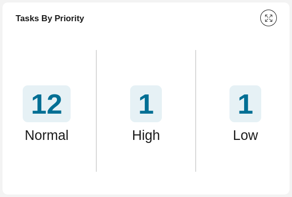
Tasks By Priority

This pie chart displays all tasks by priority.
Chart type: Pie
Top Priority: 3 Days

This chart displays all tasks that the user can work on, grouped by expiry within the next 3 days.
Chart type: Bar
Tasks By Priority

This bar chart displays all tasks that the user can work on grouped by priority.
Chart type: Bar
Case Category Avg. Runtime

This chart shows the average processing time of cases by category.
Chart type: Bar
New Cases Per Day

This chart shows the number of cases started per day for the last 5 days.
Chart type: Line
Completed Cases Per Day

This chart shows the number of cases finished per day for the last 5 days.
Chart type: Line
Running Cases

This chart shows all running cases in which the user is involved.
Chart type: Number
Tasks that expire by the end of the week

This chart shows all tasks that expire by the end of the week.
Chart type: Number
Tasks By Priority
This chart shows all tasks the user can work on by priority.
Chart type: Number
Open Tasks

This chart shows all tasks the user can work on.
Chart type: Number
Tasks Due Today

This chart shows all tasks that are due today.
Chart type: Number
How to configure new statistic chart
Navigate to Dashboard Configuration of the dashboard and select Create custom statistic widget.

From the configuration for statistic chart, fill in the form to create new statistic chart.

Available values for configuring statistic chart
Value |
Usage Guideline |
Name |
Name of the statistic chart.
|
Description |
Description for the statistic chart.
|
Icon |
Icon for custom statistic chart.
Click on the plus icon at the end of the line to see full list of icons.
|
Chart type |
Type of the chart (Bar, Line, Pie, Number).
|
For |
Chart target (Task, Case).
|
KPI |
List of numeric custom fields is shown alongside with Counting.
The calculation using below aggregation method will be performed on selected KPI.
If Counting is selected to count numbers of tasks or cases, the aggregation method
selection will be disabled.
|
Aggregation method |
List of 4 aggregation methods: Sum, Average, Max, Min.
|
Group by |
Aggregation to group all the results, the drop down values depend on the chart target.
Currently we don’t support aggregations have type number.
|
Filters |
Works like complex filter of Portal.
Please refer to Complex Filter for more details.
|
Permissions |
Permission for the current statistic chart.
|
Auto-refresh enabled |
The statistic can be auto-refreshed after a certain prediod.
Click on this button to turn on/off the feature.
|
Auto-refresh interval (seconds) |
The time for statistic chart to be auto-refreshed in second.
Minimum number is 60.
|
X axis title |
X title for the statistic chart.
|
Y axis title |
Y title for the statistic chart.
|
Color 1-8 |
Colors for data in the chart.
|
Hide label |
Toggle to show label of number chart.
|
Sample: KPI Procurement Overview
The dashboards shown in the images below demonstrate the capabilities of Custom Statistics Widgets, which are available starting from version 13.2 of the Axon Ivy Portal. These widgets enable you to visualize KPIs and other information in a fully customizable way.
Specifically, this example is designed for procurement processes, these dashboards provide insights into various aspects of procurement activities.
To access the sample dashboard, follow these steps:
Run the
portal-user-examplesproject in your Axon Ivy Portal installation.Navigate to the left menu and select Sample: KPI Procurement Overview.
Generate data for the charts by clicking the Start Process button in the Process widget on the sample dashboard, or find and run the
Procurementprocess manually. You can run the process multiple times to generate additional data.Once data is generated, you will see the sample dashboards as shown in the image below.

To view the configuration of these example statistic widgets, follow these steps:
In the dashboard configuration page, click the Add widget button.
Look for widgets labeled as Example.
Select Edit to view and review their configurations.
