Configure Case Widget
Define Case Widget
The case widget of the Portal dashboard is an interactive case list. Refer to Case List Widget for details.
Below is a sample JSON definition of the case widget in the Portal dashboard.
{
   "type": "case",
   "id": "case-widget",
   "names": [
      {
         "locale": "en",
         "value": "Your Cases"
      },
      {
         "locale": "de",
         "value": "Ihre Vorgänge"
      }
   ],
   "layout": {
      "x": 0,
      "y": 0,
      "w": 10,
      "h": 9,
      "style": "text-color: blue;",
      "styleClass": "your-widget-class"
   },
   "sortField": "name",
   "rowsPerPage": 20,
   "showWidgetInfo": true,
   "showFullscreenMode": true,
   "isTopMenu": false,
   "columns": [
      {
         "field": "id"
      },
      {
         "field": "name",
         "visible": "false"
      },
      {
         "field": "description"
      },
      {
         "field": "creator"
      },
      {
         "field": "state",
         "headers": [
         {
            "locale": "en",
            "value": "State"
         },
         {
            "locale": "de",
            "value": "Status"
         }
         ]
      },
      {
         "field": "startTimestamp"
      },
      {
         "field": "actions"
      }
   ]
}
The basic JSON structure of the case widget
- type: type of the widget. Use case for a case widget
id: ID of the widgetnames: multilingual name of the widget on the UI.layout: layout definition of the case widgetx: HTML DOM Styleleftis calculated as formulax / 12 * 100%y: HTML DOM Styletopis calculated as formulay / 12 * 100%w: HTML DOM Stylewidthis calculated as formula60 * w + 20 * (w - 1)h: HTML DOM Styleheightis calculated as formula60 * h + 20 * (h - 1)styleClass(optional): add CSS classes to HTML DOM of the Case widgetstyle(optional): add inline style to HTML DOM of the Case widget
sortField: default sort field for the Case widgetsortDescending: sort direction of the default sort field. The default value isfalse(sort ascending)rowsPerPage: maximum number of cases that are displayed on one page of the case widget. The default is 10 rows per pageshowWidgetInfo: visibility of the widget information icon. The default value istrue, set tofalseto hide the iconshowFullscreenMode: visibility of the fullscreen mode icon. The default value istrue, set tofalseto hide the iconisTopMenu: if the value istrue, the dashboard appears as a top-level item in the navigation bar. If the value isfalse, it appears as a sub-item under the Dashboard menu. The default value isfalse.columns: column configurations for each column in the case widget. You can predefine filters, styles, visibility,… of columns and define custom columns, too.field: field name of the columnFor a standard column,
fieldmust be one of these:id: case IDname: case namedescription: case descriptionstate: case business statecreator: case creatorstartTimestamp: creation date and time of the caseendTimestamp: end date and time of the caseowner: list of case ownersactions: for further actions likeaccess case details,case business details,destroy case
For custom columns,
fieldis the name of a case custom field. Portal will use the value of thefieldattribute to get the value of the column.visible: visibility of a column. The default value is “true”. Set to “false” to hide the column.quickSearch: Adds this field to the search scope of the quick search. The default value isfalse. Set it totrueto apply search condition for the column.headers: multilingual header of the column.
Custom Columns
The Portal supports custom fields for a case. You can show them on the case widget as a column.
Traditional Custom Columns
You can predefine which columns to display, along with other attributes such as filters, formats, and styles. Below is a standard JSON example of a custom column.
{
   ...

   "columns": [
      {
         "type": "CUSTOM",
         "field": "HIDE",
         "style": "width: 110px"
      }
   ]
}
Besides the attributes explained in the previous section, a custom column has two differences:
type: type of the widget column. There are two options:STANDARDandCUSTOM.
field: this attribute is the name of the case’s custom field which will be used to get data for the column.
Important
Portal only displays custom fields declared in the custom-fields.yaml file.
Refer to Custom Fields Meta Information for more information.
Custom Action Button Columns
Portal supports creating custom action buttons as a column in case widget for specific needs. By clicking on these buttons, a custom process is triggered.
Follow these steps to implement it:
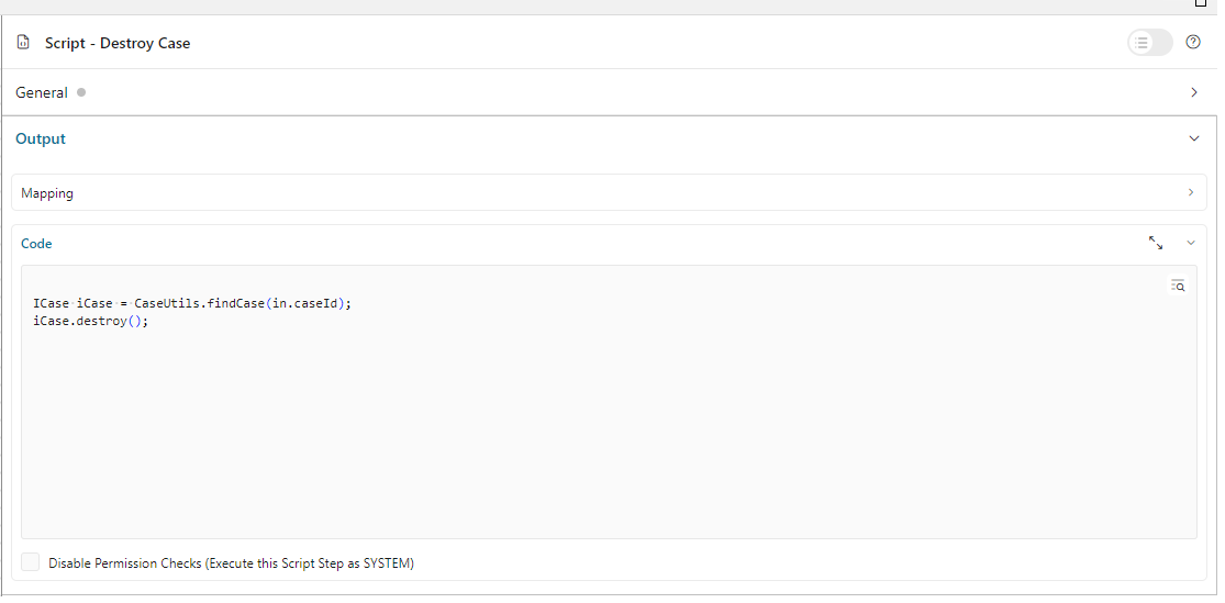
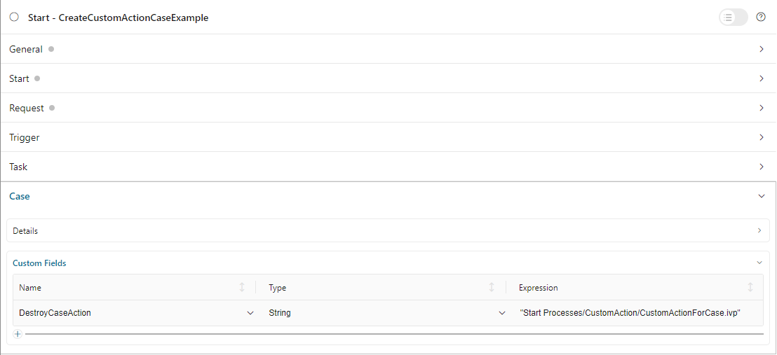
#. Create a new process that will be triggered after clicking on the custom action button. In this process, define a request start event that accepts the
uuidparameter. When theCustom Actionbutton on the case details page is clicked, Portal will call this process and pass the case UUID as theuuidparameter.
Design and implement the action/script for the custom action within this process.
Describe the custom action button in
custom-fields.yaml.CustomFields: Cases: DestroyCaseAction: Label: Destroy Case Action Category: Custom Case Action Icon: si si-controls-play IsCustomAction: true
IsCustomAction: trueis mandatory to inform Portal that it is an action button.For the
Icon, please refer to the streamline icon showcase available in Html Dialog Demos on Axon Ivy Market.On the process start of the main process, assign a custom field to it.
Filter Conditions
You can predefine filter conditions for most columns of the case widget. Each column has different conditions: some accept only a list, some accept only a string, and others require a string in a specific format, such as date-time. Please refer to Complex Filter for more details.
Base structure of filter json:
{
   ...

   "columns": [
      {
         "field": "name"
      }
   ],
   "filters" : [
      {
         "field" : "name",
         "values" : [ "Mike ", "Nam" ],
         "operator" : "contains",
         "type" : "standard"
      }
   ]
}
field: filter field name corresponding with column name
values: filter value, could be a list, a string or a number
operator: filter operator, operators can be difference depend on each field type.
String column: is, is_not, empty, not_empty, contains, not_contains, start_with, not_start_with, end_with, not_end_with
Number column: between, not_between, empty, not_empty, equal, not_equal, less, less_or_equal, greater, greater_or_equal
Date column: today, yesterday, is, is_not, before, after, between, not_between, current, last, next, empty, not_empty
type:standardfor a standard column orcustomfor a custom columnDate type additional field:
periodType: string value,YEAR,MONTH,WEEK,DAY
from: string value. E.g.: “03/19/2024”
to: string value. E.g.: “01/01/2024”Number type additional field:
from: string value. E.g.: “3.0”
to: string value. E.g.: “55.2”
There are additional fields dependent on the operator and many specific filters for each field type. Below is the list of filterable columns and their corresponding filter conditions.
Tip
We encourage utilizing dashboard configurations to edit widgets and then leveraging the export dashboard feature to ensure better expectations when customizing these widgets.
Standard Column:
name{ ... "columns": [ { "field": "name" } ], "filters" : [ { "field" : "name", "values" : [ "Mike ", "Nam" ], "operator" : "contains", "type" : "standard" } ] }This column accepts all operators available for String column. Additionally, it accepts
valuesas a list of strings .
description{ ... "columns": [ { "field": "description" } ], "filters" : [ { "field" : "description", "values" : [ "Leave" ], "operator" : "not_end_with", "type" : "standard" } ] }This column accepts all operators available for String column. Additionally, it accepts
valuesas a list of strings .
state: Case business state{ ... "columns": [ { "field": "state" } ], "filters" : [ { "field" : "state", "values" : [ "DESTROYED", "DONE", "OPEN" ], "operator" : "in", "type" : "standard" } ] }This column only accepts a list of case business state names as the filter value. The available filter operator is
in.Refer to Case business states for available case business states.
creator{ ... "columns": [ { "field": "creator" } ], "filters" : [ { "field" : "creator", "values" : [ "backendDev2", "gm1" ], "operator" : "in", "type" : "standard" }, { "field" : "creator", "operator" : "current_user", "type" : "standard" } ] }This column only accepts a list of usernames as filter value for the case creator’s username. The available filter operators are
in,not_inandcurrent_user. Thecurrent_useroperator does not require value field.
startTimestampandendTimestamp: created date and finished date of the Case{ ... "columns": [ { "field": "creator" } ], "filters" : [ { "field" : "startTimestamp", "to" : "03/12/2024", "operator" : "after", "type" : "standard" }, { "field" : "startTimestamp", "operator" : "current", "periodType" : "MONTH", "type" : "standard" }, { "field" : "startTimestamp", "from" : "03/01/2024", "to" : "03/17/2024", "operator" : "between", "type" : "standard" }, { "field" : "startTimestamp", "operator" : "last", "periods" : 2, "periodType" : "YEAR", "type" : "standard" }, { "field" : "startTimestamp", "from" : "03/19/2024", "operator" : "is", "type" : "standard" }, { "field" : "startTimestamp", "operator" : "empty", "type" : "standard" } ] }This column accepts all operators available for Date column. Fields may vary depending on the operator. The JSON example above covers most use cases for the Date field. Acceptable date formats:
dd.MM.yyyy,dd.MM.yyyy HH:mm,MM/dd/yyyyandMM/dd/yyyy HH:mm.
category{ ... "columns": [ { "field": "category" } ], "filters" : [ { "field" : "category", "values" : [ "LeaveRequest", "Leave_Request_1" ], "operator" : "in", "type" : "standard" } ] }The available filter operators are
in,not_in,no_category,containsandnot_contains. Theno_categoryoperator does not require value field.
Custom Field Column:
Custom Columns are using the same operator as Standard Column
typefield must becustom{ ... "columns": [ { "field": "InvoiceNumber" } ], "filters" : [ { "field" : "InvoiceNumber", "value" : "566.00", "operator" : "less_or_equal", "type" : "custom" } ] }
Quick Search
The Quick search is a useful function for users to quickly search the cases within the case widget. The configuration of the quick search has two attributes:
enableQuickSearch: enables the quick search feature for the widget.
quickSearch: indicates that a column is searchable using the quick search feature.
If you set the enableQuickSearch attribute to false, the quick search feature will be disabled,
regardless of the quickSearch attribute’s value.
Conversely, if you set the enableQuickSearch attribute to true, the quick search feature will
search within the values of all columns that have the quickSearch attribute set to true.
If you haven’t assigned the quickSearch attribute to any column in the case widget,
the quick search feature will default to searching the name and description fields.
Below are the definition of these attributes:
enableQuickSearch: to enable/disable the quick search feature, set theenableQuickSearchfield of the case widget as shown below.{ ... "type": "case", "id": "case_98ae4fc1c83f4f22be5244c8027ecf40" ... "enableQuickSearch": "true", ... }Valid values:
true: show the quick search text box.
false: hide the quick search text box.
not defined: hide the quick search text box.
quickSearch: to choose which columns can be searched by the quick search feature, set thequickSearchfield for each column as shown below.{ ... "type": "case", "id": "case_98ae4fc1c83f4f22be5244c8027ecf40" ... "columns": [ { "field": "id", "quickSearch": "false" }, ... ] ... }Valid values:
true: apply quick search for this column.
false: do not apply quick search for this column.
not defined: thenameanddescriptioncolumns aretrue, other columns arefalseby default.
Multi-Language Support for Custom String Fields
With the Multi-Language Support for Custom Fields feature, we enable the provision of values in a custom field in multiple languages. The field content is displayed based on the language selected in the custom field.
Important
Portal only supports Multi-Language for Custom Fields with TYPE: STRING.
Enabling Multi-Language Support
To allow a custom field to retrieve multilingual values from the CMS, set the HasCmsValue attribute to true in the corresponding custom-field yaml file configuration.
Otherwise, the logic remains unchanged, and the custom field uses the static value.
Additionally, the value must be entered and maintained in the CMS in multiple languages.
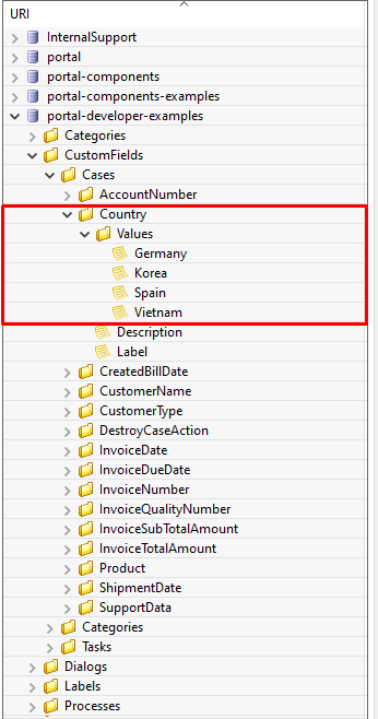
Following this path to add your custom field values: /CustomFields/Cases/{fieldName}/Values/{value}
Please follow this Localize Label, Description, Category
and Values
to get more information.
Example YAML Configuration
Country:
   Label: Country
   Description: Country description
   HasCmsValues: true
   TYPE: STRING
In your CMS, the path should be
/CustomFields/Cases/Country/Values/Vietnam,
/CustomFields/Cases/Country/Values/Korea or
/CustomFields/Cases/Country/Values/Germany.
Result
If
HasCmsValuesis set withtrue, the values from the CMS are used.If the values are entered and translated in the CMS, then the custom field is displayed based on the selected language.
If the translation for a value is missing in the CMS, the static value from the entry is used instead.
Sorting, Filtering, and Searching with Multi-Language Custom Fields
Sorting
HasCmsValues = falseor not set. Sorting is performed as usual based on the stored values.HasCmsValues = true. Sorting is performed based on values translated in the currently selected language.
Note
If HasCmsValues = true but a translation is missing in a specific language, only the translated values are sorted.
Searching
HasCmsValues = falseor not set. The search is performed as usual based on the stored value.HasCmsValues = true. The search is conducted in both the CMS translations and the original value.
Example: When language is Spanish, a user can search for Corea or the original value Korea.
Filtering
HasCmsValues = falseor not set. Filtering is performed as usual based on the stored value.HasCmsValues = true. The filter is conducted in both the CMS translations and the original value.
Important
When enabling the Multi-Language for Custom Fields, only accepted CONTAINS operator.
Tip
If a value needs to be filtered in multiple languages, all corresponding translations must be in the filter.
Conclusion
With Multi-Language Support for Custom Fields, we enable flexible and dynamic provision of field content in multiple languages. The functionalities for searching, sorting, and filtering have been adapted accordingly to ensure consistent behavior for multilingual content.