Additional Components
Global Growl
Introduction
This component is a global growl introduced in BasicTemplate. You can use it to display your messages in Portal using this code:
<p:growl id="portal-global-growl" widgetVar="portal-global-growl" for="portal-global-growl-message" escape="false" showDetail="true" />
Display Growl After Finishing a Task
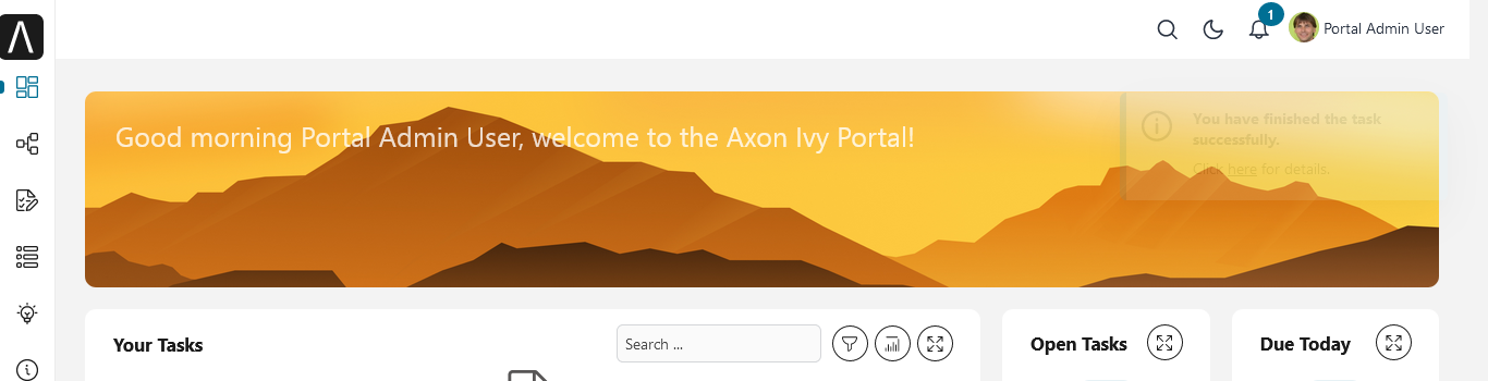
After a task is finished, a growl message appears if Portal.DisplayMessageAfterFinishTask is true.
Display Growl After Leaving a Task
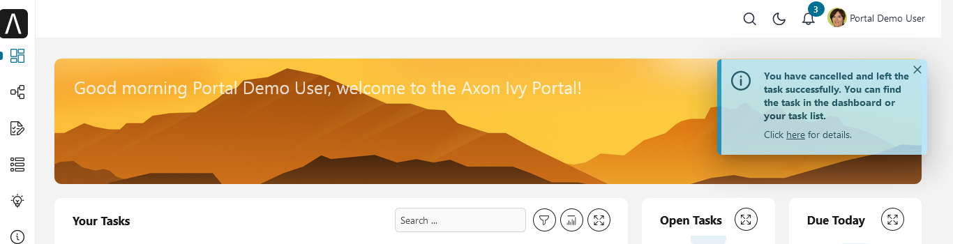
After the user cancels a task, a growl message is displayed if Portal.DisplayMessageAfterFinishTask is true.
Portal Dialog with Icon
Introduction
This decorator is used to display a dialog with a big icon and a header in the middle; the content is shown below.
How to Use
<ui:decorate template="/layouts/decorator/portal-dialog-with-icon.xhtml">
   <ui:param name="id" value="destroy-task-confirmation-dialog" />
   <ui:param name="widgetVar" value="destroy-task-dialog" />
   <ui:param name="appendTo" value="@(body)" />
   <ui:param name="iconClass" value="icon ivyicon-delete-1" />
   <ui:param name="iconStyleClass" value="portal-dialog-error-icon" />
   <ui:param name="dialogContent" value="#{ivy.cms.co('/ch.ivy.addon.portalkit.ui.jsf/taskList/destroyTaskMessage')}" />

   <ui:define name="dialogFooter">
      <p:commandLink value="#{ivy.cms.co('/ch.ivy.addon.portalkit.ui.jsf/common/cancel')}"
         onclick="PF('destroy-task-dialog').hide();" styleClass="u-mar-right-15"/>
      <p:commandButton id="confirm-destruction" value="#{ivy.cms.co('/ch.ivy.addon.portalkit.ui.jsf/common/destroy')}"
         icon="#{visibilityBean.generateButtonIcon('icon ivyicon-remove')}"
         actionListener="#{logic.destroyTask(task)}"
         oncomplete="PF('destroy-task-dialog').hide()"
         update="#{cc.clientId}:task-detail-general-container"
         process="@this"/>
   </ui:define>
</ui:decorate>
Please refer to PortalDialogExample.xhtml in portal-developer-examples
for examples.
This decorator provides two custom sections:
dialogFooter: The footer of the dialog. Required.dialogContentSection: If you want to use your custom style for the dialog content, define this section. Optional.
This decorator offers the following parameters:
Name |
Required |
Default |
Description |
|---|---|---|---|
id |
Yes |
Dialog’s id |
|
widgetVar |
Yes |
Dialog’s widget bar |
|
closable |
No |
false |
Defines if close icon should be displayed or not. |
closeOnEscape |
No |
true |
Defines if dialog should close when escape key is pressed. |
maxWidth |
No |
500px |
Defines max-width of dialog. |
styleClass |
No |
Defines styleClass for dialog. |
|
responsive |
No |
true |
In responsive mode, dialog adjusts itself based on screen width. |
rendered |
No |
true |
If false, component will not be rendered. |
dynamic |
No |
false |
Dynamic mode allows dialog to fetch its contents before it is shown rather than on page load which is useful to reduce initial page load times. |
appendTo |
No |
Alternative to appendToBody. Appends the dialog to the given search expression. |
|
iconClass |
No |
icon ivyicon-information-circle |
Icon classes. |
iconStyleClass |
No |
portal-dialog-info-icon |
Specific additional style for icon, e.g. color. We already provide three classes: portal-dialog-info-icon, portal-dialog-warning-icon, portal-dialog-error-icon |
headerText |
No |
Are you sure? |
Dialog header text. |
dialogContent |
No |
Dialog’s content. If you don’t specify this parameter, please define dialogContentSection |