Additional Components
Task Analysis
Introduction
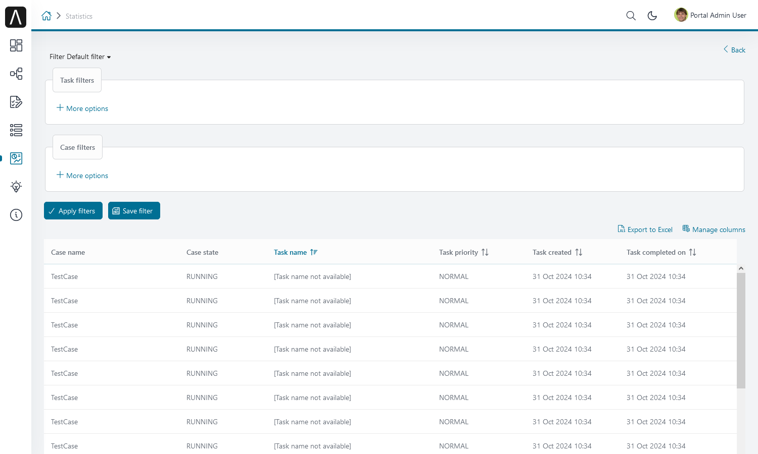
The Portal’s Task Analysis component provides features in accordance with the user’s permission 🔑StatisticAnalyzeTask. Refer to Security section in Cockpit to analyze not only tasks but also cases. These features are:
Sets of filters for both tasks and cases which allow to filter and find tasks and cases easier. Additionally, user can create and manage their own filter sets.
Dynamic result table with lots of information for both task and case.
Export results into an Excel files (currently we only support .xlsx extension).
How to Use
The Task Analysis component is integrated into the Statistics widget. You can use this component directly when opening the Statistics widget. If you want to use this component, you only have to redirect to the Task Analysis component with the following code:
import com.axonivy.portal.components.publicapi.ProcessStartAPI;
import java.util.HashMap;
import javax.faces.context.FacesContext;

String taskAnalysisUrl = ProcessStartAPI.findRelativeUrlByProcessStartFriendlyRequestPath("Start Processes/PortalStart/showTaskAnalysis.ivp");
FacesContext.getCurrentInstance().getExternalContext().redirect(taskAnalysisUrl);
Global Growl
Introduction
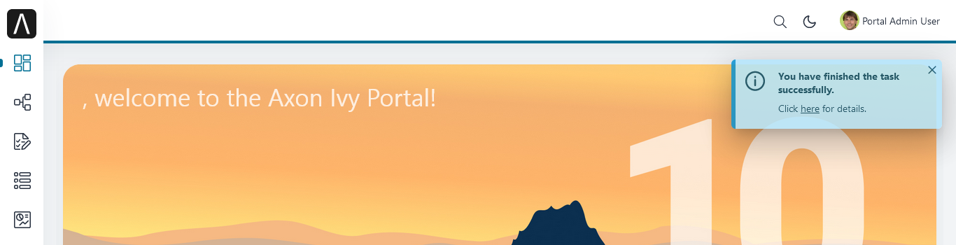
This component is a global growl introduced in BasicTemplate. You can use it to display your messages in Portal using this code:
<p:growl id="portal-global-growl" widgetVar="portal-global-growl" for="portal-global-growl-message" escape="false" showDetail="true" />
Display Growl After Finishing a Task
After a task is finished, a growl message appears if Portal.DisplayMessageAfterFinishTask is true.
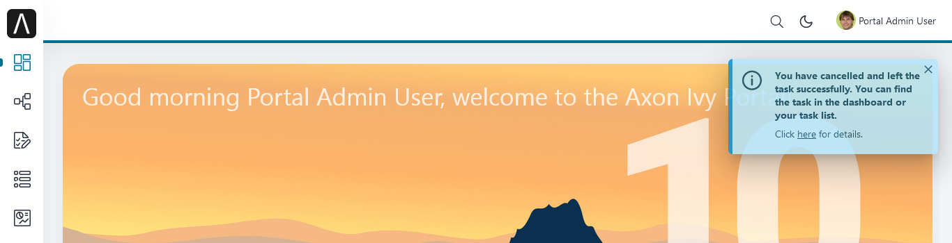
Display Growl After Leaving a Task
After the user cancels a task, a growl message is displayed if Portal.DisplayMessageAfterFinishTask is true.
Customize the Global Growl Message for a Task without using IFrames (Deprecated)
Warning
Deprecated: This feature is marked for removal in version LTS 12.
For each task, you can turn the growl message display off or override it.
Initially, when you submit the form to the interacting task, you need to set the
overridePortalGrowl key in the associated flash object:
Flash flash = FacesContext.getCurrentInstance().getExternalContext().getFlash();
flash.put("overridePortalGrowl", true);
flash.setRedirect(true);
If you want to turn the global growl message off, that is all that is required.
To override the message with your own, add facesMessage to this component.
You can customize the message for finished or cancelled tasks separately.
The message could contain HTML code. To prevent XSS attacks, you need to sanitize the message.
import ch.ivy.addon.portal.generic.navigation.PortalNavigator;
import javax.faces.context.Flash;
import javax.faces.context.FacesContext;
import javax.faces.application.FacesMessage;
import org.primefaces.util.HtmlSanitizer;

String message = "/ch.ivy.addon.portalkit.ui.jsf/common/linkToCaseDetails";
// sanitize the message to prevent XSS attacks
String sanitizedMessage = HtmlSanitizer.sanitizeHtml(message, true, true, true, true, true);

FacesMessage facesMessage = new FacesMessage("Task is done successfully", sanitizedMessage,
     [PortalNavigator.buildPortalCaseDetailsUrl(ivy.case.getBusinessCase().getId())]));
FacesContext.getCurrentInstance().addMessage("portal-global-growl-message", facesMessage);

Flash flash = FacesContext.getCurrentInstance().getExternalContext().getFlash();
flash.put("overridePortalGrowl", true);
flash.setRedirect(true);
flash.setKeepMessages(true);
Customize the Global Growl Message for a Task using IFrames (Deprecated)
Warning
Deprecated: This feature is marked for removal in version LTS 12.
If Portal.DisplayMessageAfterFinishTask is true, before a task is finished
or cancelled, you can trigger the display of a customized message by calling the
API below:
import com.axonivy.portal.components.publicapi.PortalGlobalGrowInIFrameAPI;

PortalGlobalGrowInIFrameAPI api = new PortalGlobalGrowInIFrameAPI();
api.displayCustomizedMessage("Your customized message");
Please refer to GlobalGrowl Start Process in the portal-developer-examples project for details.
Portal Dialog with Icon
Introduction
This decorator is used to display a dialog with a big icon and a header in the middle; the content is shown below.
How to Use
<ui:decorate template="/layouts/decorator/portal-dialog-with-icon.xhtml">
   <ui:param name="id" value="destroy-task-confirmation-dialog" />
   <ui:param name="widgetVar" value="destroy-task-dialog" />
   <ui:param name="appendTo" value="@(body)" />
   <ui:param name="iconClass" value="icon ivyicon-delete-1" />
   <ui:param name="iconStyleClass" value="portal-dialog-error-icon" />
   <ui:param name="dialogContent" value="#{ivy.cms.co('/ch.ivy.addon.portalkit.ui.jsf/taskList/destroyTaskMessage')}" />

   <ui:define name="dialogFooter">
      <p:commandLink value="#{ivy.cms.co('/ch.ivy.addon.portalkit.ui.jsf/common/cancel')}"
         onclick="PF('destroy-task-dialog').hide();" styleClass="u-mar-right-15"/>
      <p:commandButton id="confirm-destruction" value="#{ivy.cms.co('/ch.ivy.addon.portalkit.ui.jsf/common/destroy')}"
         icon="#{visibilityBean.generateButtonIcon('icon ivyicon-remove')}"
         actionListener="#{logic.destroyTask(task)}"
         oncomplete="PF('destroy-task-dialog').hide()"
         update="#{cc.clientId}:task-detail-general-container"
         process="@this"/>
   </ui:define>
</ui:decorate>
Please refer to PortalDialogExample.xhtml in portal-developer-examples
for examples.
This decorator provides two custom sections:
dialogFooter: The footer of the dialog. Required.dialogContentSection: If you want to use your custom style for the dialog content, define this section. Optional.
This decorator offers the following parameters:
Name |
Required |
Default |
Description |
|---|---|---|---|
id |
Yes |
Dialog’s id |
|
widgetVar |
Yes |
Dialog’s widget bar |
|
closable |
No |
false |
Defines if close icon should be displayed or not. |
closeOnEscape |
No |
true |
Defines if dialog should close when escape key is pressed. |
maxWidth |
No |
500px |
Defines max-width of dialog. |
styleClass |
No |
Defines styleClass for dialog. |
|
responsive |
No |
true |
In responsive mode, dialog adjusts itself based on screen width. |
rendered |
No |
true |
If false, component will not be rendered. |
dynamic |
No |
false |
Dynamic mode allows dialog to fetch its contents before it is shown rather than on page load which is useful to reduce initial page load times. |
appendTo |
No |
Alternative to appendToBody. Appends the dialog to the given search expression. |
|
iconClass |
No |
icon ivyicon-information-circle |
Icon classes. |
iconStyleClass |
No |
portal-dialog-info-icon |
Specific additional style for icon, e.g. color. We already provide three classes: portal-dialog-info-icon, portal-dialog-warning-icon, portal-dialog-error-icon |
headerText |
No |
Are you sure? |
Dialog header text. |
dialogContent |
No |
Dialog’s content. If you don’t specify this parameter, please define dialogContentSection |
Portal Cronjob Trigger (Deprecated)
Portal provides the helper bean
ch.ivy.addon.portalkit.util.CronByGlobalVariableTriggerStartEventBean. It
uses the Quartz framework to trigger cron jobs using a variable to define
the trigger schedule. The variable has to contain a cron job pattern to
trigger the process as required.
To generate cron patterns, use the online site Cron Maker. It makes creating your own cron job patterns a breeze.
Important
This component is deprecated. Please use Cron Job on Axon Ivy Market instead.